
The content shared in this article is the method of realizing border shadow with CSS. The content is very detailed. Friends in need can refer to it.
What we need to add a shadow to the border is the box-shadow attribute. Let’s take a look at the syntax formats of the box-shadow attribute
box-shadow: (distance in the horizontal direction) (distance in the vertical direction) (shadow blur) (shadow size) (shadow color) (shadow direction);
(shadow blur) (shadow Size) (Shadow Color) (Shadow Direction) can be omitted or the following format can be used. (Related recommendations: CSS Learning Manual)
box-shadow: (distance in the horizontal direction) (distance in the vertical direction);
box -shadow: (distance in the horizontal direction) (distance in the vertical direction) (blurred shadow);
box-shadow: (distance in the horizontal direction) (distance in the vertical direction) (blurred shadow) ( Shadow size);
box-shadow: (distance in the horizontal direction) (distance in the vertical direction) (shadow blur) (shadow color);
box -shadow: (distance in the horizontal direction) (distance in the vertical direction) (shadow blur) (shadow size) (shadow color);
box-shadow: (distance in the horizontal direction) (vertical Distance in direction) (shadow blur) (shadow color) (shadow direction);
Syntax example:
box-shadow:5px 5px 3px 1px#000000 inset;
Let’s take a look at the code example in detail:
SimpleShadow.html
<!DOCTYPE html>
<html>
<head>
    <meta charset="utf-8" />
    <title></title>
  <link rel="stylesheet" type="text/css" href="SimpleShadow.css" />
</head>
<body>
  <div class="SimpleFrame">php中文网</div>
  </body>
</html>SimpleShadow.css
body {
  background-color:#C0C0C0;
}
.SimpleFrame {
  background-color: #FFFFFF;
  margin-left: 128px;
  margin-top: 64px;
  width: 128px;
  height: 220px;
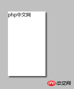
  box-shadow: 4px 4px 5px #404040;
}The effect is as follows:
The shadow effect is attached to the container of the DIV and displays the shadow.
When setting the degree of shadow blur, change the CSS code to the following.
SimpleShadow.css
body {
  background-color:#C0C0C0;
  }
.SimpleFrame {
  background-color: #FFFFFF;
  margin-left: 128px;
  margin-top: 64px;
  width: 128px;
  height: 220px;
  box-shadow: 4px 4px 0px #808080;
}The effect is as follows:

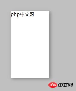
When setting "box-shadow: 4px 4px 4px #808080; ”

When setting “box-shadow: 4px 4px 16px #808080;”
The larger the number, the blurry the outline of the shadow and the display Softer shades.
Set the shadow size
SimpleShadow.css
body {
  background-color:#C0C0C0;
}
.SimpleFrame {
  background-color: #FFFFFF;
  margin-left: 128px;
  margin-top: 64px;
  width: 128px;
  height: 220px;
  box-shadow: 4px 4px 5px 10px #404040;
}If you specify the size of the shadow, the shadow will be the size specified externally Display, the effect is as follows:

Setting of shadow direction
CSS code is as follows:
body {
  background-color:#C0C0C0;
}
.SimpleFrame {
  background-color: #FFFFFF;
  margin-left: 128px;
  margin-top: 64px;
  width: 128px;
  height: 220px;
  box-shadow: 4px 4px 5px #404040 inset;
}The effect is as follows: the shadow is displayed inside the frame

Set shadow color
Specify the shadow color of box-shadow.
body {
  background-color:#C0C0C0;
  }
.SimpleFrame {
  background-color: #FFFFFF;
  margin-left: 128px;
  margin-top: 64px;
  width: 128px;
  height: 220px;
  box-shadow: 2px 2px 10px #ff6a00;
}The effect is as follows: the shadow is tinted and displayed.

This article ends here. For more information about CSS, you can study the CSS Video Tutorial column on the PHP Chinese website! ! !
The above is the detailed content of Introduction to the implementation method of border shadow (box-shadow) in CSS (code example). For more information, please follow other related articles on the PHP Chinese website!