Many websites are using pixel units that are difficult to adjust in more and more different devices. CSS3 introduces some new units, including REM units, which stands for "root em". This article will share with you It's about the use of REM.
So, how do we use REM?
Suppose we have this CSS:
CSS
article h2 {font-size:20px;}
article p {font-size:12px;}First, we need to determine the px size relative to all fonts. For convenience, the best thing I did was make the root font-size 1px like this:
CSS
html {font-size:1px;}Secondly, we need to change the rest of the font-size values from Pixels are replaced with rem units.
CSS
article h2 {font-size:20rem;}
article p {font-size:12rem;}What REM does, takes 20REM and multiplies it with the root element:
20 REM * 1 PX = 20PX.
Browser Support
IE7 and IE8 still need to use PX values. This will force us to write the font size twice, once in PX and a second time in REM.
CSS
article h2 {font-size:20px; font-size:20rem;}
article p {font-size:12px; font-size:12rem;}The example is as follows:
<!DOCTYPE html>
<html>
<head>
<meta charset="utf-8">
	<title></title>
	<style type="text/css">
html{font-size:1px;}
article h2{
  font-size:20px;/*Support IE7 & IE8*/
  font-size:20rem;
}
article p{
  font-size:12px;/*Support IE7 & IE8*/
  font-size:12rem;
}
</style>
</head>
<body>
<section>
  <article>
    <h2>php中文网</h2>
    <p>文字文字文字文字文字文字文字文字文字文字文字文字文字文字文字文字文字文字文字文字文字文字文字文字文字文字文字文字文字文字文字</p>
  </article>
  <article>
    <h2>php中文网1</h2>
    <p>文字文字文字文字文字文字文字文字文字文字文字文字文字文字文字文字文字文字文字</p>
  </article>
  <article>
    <h2>php中文网2</h2>
    <p>文字文字文字文字文字文字文字文字文字文字文字文字文字文字文字文字文字文字文字</p>
  </article>
</section>
</body>
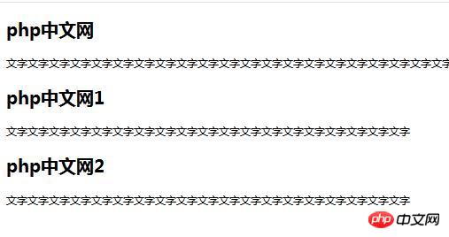
</html>The effect is as follows:

REM has What are the advantages?
Let's assume we need to make all fonts in the website larger by 20%, all we have to do is change the size of the font size in the root element like this:
html {font-size:1.2px;}If You want to reduce the font size by 20%, you would do this:
html{font-size:0.8px;}REM for responsive design
If you want to reduce the font size according to the break in responsive design Click to change all font sizes, it's easier. See example:
@media (min-width: 320px){
    html{
        font-size:1.4px;
    }}
@media (min-width: 600px){
    html{
        font-size:1.2px;
}}Now in smaller screens we can resize all fonts 40% larger, and in medium screens we resize them 20%.
Use less to solve the need to write content twice - for supporting old browsers
In less or sass you can add functions to save you writing twice times all the time.
You can use the less-font-size function and call it
.font-size(@font-size) {
  font-size : @font-size * 1px;
  font-size : @font-size * 1rem;
  }
  article h2 {
  .font-size(20);
}The compiled CSS will look like this:
article h2{
  font-size:20px;
  /*Support IE7 & IE8*/
  font-size:20rem;
}The above is the detailed content of Detailed explanation of the usage of REM units in CSS3 (code example). For more information, please follow other related articles on the PHP Chinese website!