Have you ever thought about how to create all kinds of circular images without using PS? This article will introduce to you how to use css to realize circular images. Without further ado, let’s get straight to it. Look at the specific content.
Basic Code
Let's start with basic HTML and CSS (I'm assuming you can set up a blank HTML document and link a stylesheet to it).
<div class="img-circular"></div>
Let's set a basic style for the class img-circular.
.img-circular{
 width: 200px;
 height: 200px;
 background-image: url('image/flower.jpg');
 background-size: cover;
 display: block;
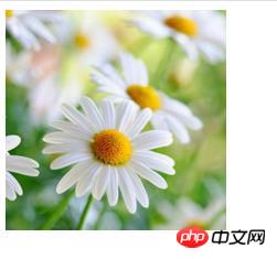
}The effect is as follows:

Explanation: background -size in the above code is a new CSS3 property that can be operated using the size of the background. You can set its width and height by entering exact pixel values, percentages, or make a background cover or make it fit the entire container. Make sure you see the background size document for more information. (Related recommendations: css3 Study Manual)
Next we will explain in detail the css implementation of circular images
Now we have Image that fits our square container. Let's change the CSS code to make a circular frame. We'll use the border-radius attribute, which gives us an opportunity to go around the corners of the element it's applied to. In order for us to achieve a circular image, we have to give the image a value that is half the size of the image. Our CSS code now looks like this:
	.img-circular{
 width: 200px;
 height: 200px;
 background-image: url('image/flower.jpg');
 background-size: cover;
 display: block;
 border-radius: 100px;
 -webkit-border-radius: 100px;
 -moz-border-radius: 100px;
}The effect of the css to achieve the circular image is as follows:

Description: It is now complete Use css to realize circular images! New CSS properties allow us to create effects that save time using Photoshop.
Extensions
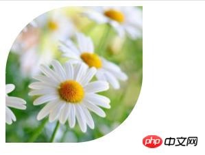
If you look closely at the border-radius property, you can manipulate the corners of the image in an asymmetric way, For details, you can look at the following css code
.img-circular{
 width: 200px;
 height: 200px;
 background-image: url('image/flower.jpg');
 background-size: cover;
 display: block;
 border-top-left-radius: 100px;
 -webkit-border-top-left-radius: 100px;
 -moz-border-top-left-radius: 100px;
 border-bottom-right-radius: 100px;
 -webkit-border-bottom-right-radius: 100px;
 -moz-border-bottom-right-radius: 100px;
}, the effect is as follows:

The above is the detailed content of How to achieve circular image using pure css? (code example). For more information, please follow other related articles on the PHP Chinese website!
 What are the methods of building a mobile website?
 What is the appropriate virtual memory setting?
 PathFileExists usage
 Tutorial on merging multiple words into one word
 How to clean the computer's C drive that is too full
 How to open json format
 How to create a WeChat clone on Huawei mobile phone
 out of range solution