One of the biggest confusions in web design is caused by the font-size attribute. The most commonly used font sizes are pixels (px), em and rem.
First, we will focus on the font size property.
In CSS, multiple units (such as pixels, ems, and rem) can be used, which often causes additional headaches for designers. In this article, we'll detail the usage of these units and any misunderstandings.
PX Unit
The most common and popular unit is the pixel (px). Most people start using pixel (px) units because it gives you complete control over text size. If no font size is specified, the default size for normal text (like paragraphs) is 16px.
The main problem with using pixel (px) units is that, unlike em or rem units, they are not scalable, and changing the font size on different screen sizes can be challenging.
Also, the pixel (px) unit has nothing to do with anything. So if you want to change the size of the entire page based on the screen size, you have to change the font size of each element individually.
EM unit
The em unit is an expandable font size unit. It is related to the font size of the parent container. One em (1em) is equal to the current font size. So for example if the parent element's font size is 16px instead of 1em equals 16px, then 2em equals 32px and so on...
If you use em units instead of px, make the design responsive easier.
However, there is one thing that needs to be taken care of. When using em units, you should be careful with nesting.
For example, suppose you created a section and set its font size to 2em, and now, you want to add a paragraph in the section with a font size of 1em. The font size of a paragraph is related to the font size of the section. If nesting continues, or if it's used on multiple parts of the project, you might just ignore it and lose it entirely.
Now that we have learned about the em unit, now is the perfect time for us to introduce the rem unit.
REM Unit
The rem unit is another scalable font size, but unlike the em unit, it is related to the root element (HTML) rather than the parent element . This is where the rem unit gets its name (root em = rem).
This means that if you use rem units on an element, you can quickly change the font size of the entire project by simply adjusting the root font size. This way is fast, simple, and avoids any nesting complications you might encounter when using em units.
So, which unit should you use?
The best way to answer this question is to use an example.
First, we will use px units.
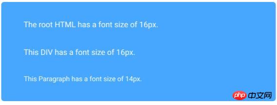
html { font-size: 100% } //usually this equals to 16px
div { Font-size: 16px; }
div>p { font-size: 14px; }The effect is as follows:

Here, you can notice that the font size of each element is set in pixels (px), There is no relationship between them.
Next, we use em units for the same code snippet.
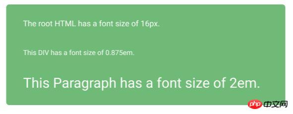
html { font-size: 100% }
div { Font-size: 0.875em; } //this equals to 14px
div>p { font-size: 2em; } // this equals to 28pxThe effect is as follows:

In this example, the difference between px and em units is obvious. The relativity of the em unit is obvious. Just change the font size of the container div and we can see the paragraph font size update accordingly.
Finally, use rem units.
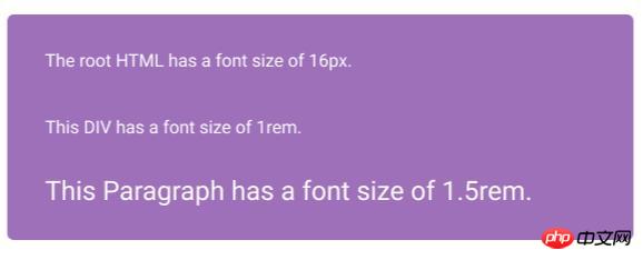
html { font-size: 100% }
div { Font-size: 1rem; } //this equals to 16px
div>p { font-size: 1.5rem; } // this equals to 24pxThe effect is as follows:

When using rem units, it is obvious that all font sizes are related to the root font size. Both div and paragraph font sizes are relative to the root, although the div is the parent of the paragraph.
Summary
There are no right or wrong units. It all depends on your skill level, project type and size, and personal preference.
If you want full control over font size, pixel units are for you. If you want more flexibility when manipulating web pages, em or rem units are the best choice. Either way, the best results will be obtained when the units are fully understood.
The above is the detailed content of Which one should I choose between px, em and rem? Detailed introduction to css relative font size. For more information, please follow other related articles on the PHP Chinese website!
 How to use the atom editor
 resample function usage
 How to use the choose function
 How to create virtual wifi in win7
 How to solve the problem that the device manager cannot be opened
 How to use the length function in Matlab
 What does frame rate mean?
 The difference between console cable and network cable