
By definition: before and :after are CSS pseudo-elements. We can use them to insert content before or after the element content. There are many articles that give their basic knowledge, so I want to write one about: before and :after are used in practical articles, indicating that we are using them.
Syntax
Suppose we have the following simple html tag:
<p>paragraph text</p>
We can use a pseudo-element like this:
p:before {
    content: "this is ";
    font-weight: bold;
    font-style: italic;
}The result is:
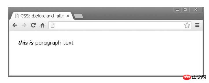
Note that you are actually adding elements before or after the content. It's not something that appears next to the selected element, but rather is related to its content. (Recommended course: css video tutorial)
Icon
Using :before and :after to implement a small icon is very easy to use, because You can add every CSS style attribute, so you can set the newly created element to a block element and attach a background image.
Again, we have the same markup
Paragraph text
Look at the CSS code below:
p:before {
    content: "";
    display: block;
    background: url("icon.jpg") no-repeat;
    width: 20px;
    height: 20px;
    float: left;
    margin: 0 6px 0 0;
}icon.jpg is a 20x20 image exported from Photoshop . Here's what it looks like in the browser:
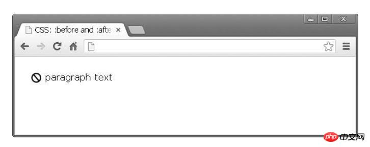
Style External Links
I see this in a lot of products. It's a good practice to set up links to external resources in different ways. This can be easily done using the techniques mentioned above. Suppose we have the following paragraph of text:
<p>Krasimir Tsonev is <a href="http://krasimirtsonev.com">developer</a>who likes to write and <a href="https://twitter.com/KrasimirTsonev">tweet</a>.</p>
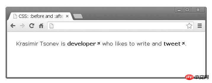
We can add a small icon after the link to indicate that it points to a page outside the current domain.
a {
    text-decoration: none;
    font-weight: bold;
    color: #000;
    }
a:after {
    content: "";
    display: inline-block;
    background: url("icon-external.jpg") no-repeat top right;
    width: 14px;
    height: 12px;
    }
Breadcrumbs (Navigation)
Usually when you do breadcrumbs, there are links and separators between them. Instead of adding elements in the DOM, you can achieve the same effect using pure css.
HTML:
<p>
    <a href="#">Home</a>
    <a href="#">Team</a>
    <a href="#">Developers</a>
</p>Just a few lines of CSS:
a {
    text-decoration: none;
    font-weight: bold;
    color: #000;
    }
a:after {
    content: " /";}
a:first-child:before {
    content: " » ";
    }
a:last-child:after {
    content: "";
}The results are as follows:
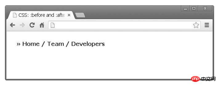
The above results are produced The effect. First, there is a symbol before all links. I combined two pseudo-elements the first child element and the before expression: "Joined » before the first link". Finally, I did the same thing, removing the separator from the last link in the list.
I found this very helpful. Mainly because I don't have to worry about this in the code that generates the navigation. I mean if I have to build the same thing in PHP I should write some extra code. For example:
$links = array('Home', 'Team', 'Developers');
$str = '» ';for($i=0; $i<count($links); $i++) {
$str .= '<a href="#">'.$links[$i].'</a>';
if($i < count($links)-1)
{
$str .= ' / ';
}
}
echo $str;That is, in the above code, I added the symbol before the link and added some logic for the separator in PHP. There's something wrong with this, because PHP code shouldn't be responsible for how things look.
Clear floats
Using the float attribute is still fine. After all, it helps a lot with layout organization. However, once an element is floated, you need another element to clear the float. Otherwise the results are not very good. For example, the following code:
* html
<a href="#">Home</a>
<a href="#">Products</a>
<p>Lorem ipsum dolor sit amet, consectetur adipiscing elit. Donec at purus ac lacus ultrices vehicula.</p>
* css
a {
    float: left;
    display: block;
    width: 100px;
    ... other styling
} will produce the following layout:
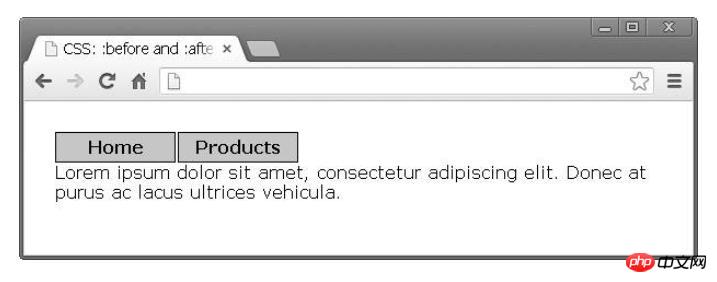
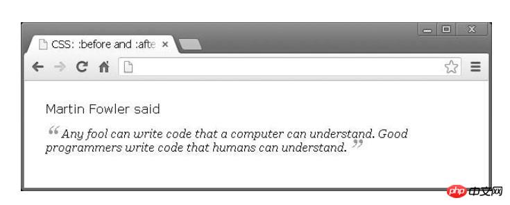
The text should be below the link, and instead of adding a new DOM node, you can Use the pseudo-element :before to clear floats:
p:before {
    content: "";
    display: block;
    clear: both;
    }
Quote
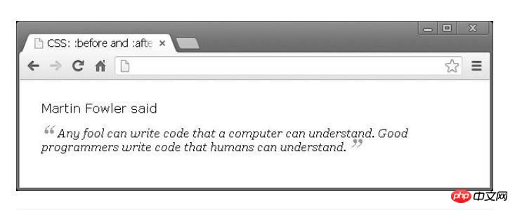
:before and :after are great for quoting text. Let's say we have an idea and we want to format it.
<p>
    Martin Fowler said
    <span class="quoted">Any fool can write code that a computer can understand.
    Good programmers write code that humans can understand.
    </span>
</p>Only by using CSS can the following effects be achieved:
span.quoted {
    font-family: Georgia;
    font-size: 16px;
    display: block;
    margin: 14px 0 0 0;
    font-style: italic;
    }
    span.quoted:before {
    content: "“";
    font-size: 40px;
    color: #999;
    line-height: 0;
    display: inline-block;
    margin: 0 6px 0 0;
    }
    span.quoted:after {
    content: " ”";
    font-size: 40px;
    color: #999;
    line-height: 0;
    display: inline-block;
    margin: 0 0 0 4px;
}Arrow
In web design, there are Sometimes some nice decorations will be added to pop-ups or tooltips. It's a bit difficult to encode them directly. Fortunately, we can solve this problem using CSS files without additional images or JavaScript. Let’s take a closer look below.
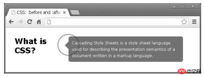
To start, our markup will look like this
<h2>What is CSS?</h2>
<div class="popup">
    Cascading Style Sheets is a style sheet language used for describing
    the presentation semantics of a document written in a markup language.
</div>我们左边有一个标题,右边有弹出窗口。我们需要在描述文本的左侧添加这个小箭头指向标题;怎么解决这个问题呢?我们可以使用简单的边框样式制作箭头并将这样的元素附加到弹出窗口中。
h2 {
    float: left;
    width: 170px;
    }
    .popup {
    float: left;
    width: 340px;
    background: #727272;
    padding: 10px;
    border-radius: 6px;
    color: #FFF;
    position: relative;
    font-size: 12px;
    line-height: 20px;
    }
    .popup:before {
    content: "";
    display: block;
    width: 0;
    height: 0;
    border-top: 12px solid transparent;
    border-bottom: 12px solid transparent;
    border-right: 12px solid #727272;
    position: absolute;
    top: 16px;
    left: -12px;
}设计不同的标题类型
目前有一个单页网站的项目,项目中有不同部分的标题。每个标题都包含两行。以下是最终设计的样子:
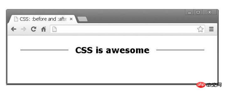
这个就是我们利用:before和:after设计出来的:
h2 {
    width: 100%;
    margin: 0;
    padding: 0;
    text-align: center;
    }
    h2:after {
    display: inline-block;
    margin: 0 0 8px 20px;
    height: 3px;
    content: " ";
    text-shadow: none;
    background-color: #999;
    width: 140px;
    }
    h2:before {
    display: inline-block;
    margin: 0 20px 8px 0;
    height: 3px;
    content: " ";
    text-shadow: none;
    background-color: #999;
    width: 140px;
}最后
伪元素:after和:before元素是你可以设置HTML样式而不添加新的DOM节点最好用的方法。
The above is the detailed content of An explanation of the practical application of :before and :after in css. For more information, please follow other related articles on the PHP Chinese website!
 How to use the atom editor
 resample function usage
 How to use the choose function
 How to create virtual wifi in win7
 How to solve the problem that the device manager cannot be opened
 How to use the length function in Matlab
 What does frame rate mean?
 The difference between console cable and network cable