In the front-end layout, there is a layout called adaptive layout. So, what does adaptive layout mean? How to implement adaptive layout? This article will introduce to you the meaning of adaptive layout and how to implement adaptive layout.
First let’s look at What is adaptive layout?
So-called adaptive layout, we can search the following definition from Baidu. Adaptive design refers to new web design methods and technologies that enable web pages to be adaptively displayed on terminal devices of different sizes. To put it simply, adaptability is to automatically adapt the same page to devices of different sizes, thereby solving the problem of providing different versions of pages for different devices.
Now that we know what adaptive layout is, let’s take a look at How to implement adaptive layout?
The adaptive layout of the page is divided into height-adaptive and width-adaptive. There are actually many ways to implement it. Let's take the three-column layout as an example to see how the implementation of adaptive layout is. Way.
1. Height adaptation of adaptive layout
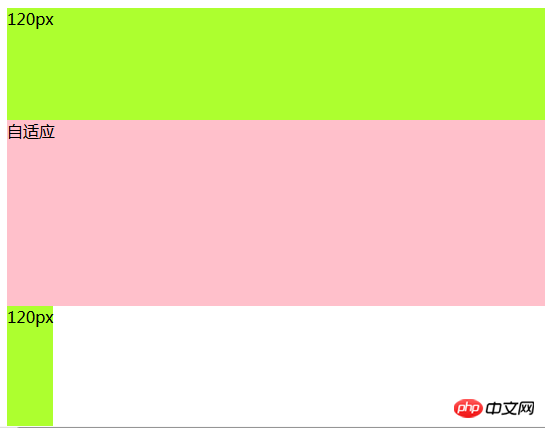
Height adaptation is to set each module to absolute positioning, and then set the middle auto The values of the top and bottom attributes of the adapted module are the heights of the head module and the bottom module respectively, and then the height of the middle module is adapted.
The height adaptive layout code is as follows:
<body>
        <div class="top">120px</div>
        <div class="main">自适应</div>
        <div class="bottom">120px</div>
</body>.top{
width: 100%;
height: 120px;
position: absolute;
background-color: greenyellow;
}
.main{
position: absolute;
width: 100%;
top: 120px;
bottom: 120px;
background-color: pink;
height: auto;
}
.bottom{
position: absolute;
bottom: 0;//别漏了
width: 100%;
height: 120px;
background-color:greenyellow ;
}The height adaptive layout effect is as follows:

2. Adaptive layout Width adaptation
There are three methods for width adaptation, namely using absolute positioning; using margin, the intermediate module is rendered first; and floating itself.
Let’s take a look at the adaptive layout (three columns) implemented by these three methods respectively
1. Use absolute positioning to set the width adaptive layout
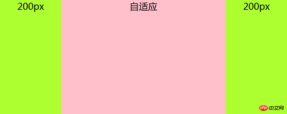
Description: Use absolute positioning for the adaptive module, and set left and right to the width of the left and right columns. In fact, the principle and height are automatically The adaptation is the same, and the left and right columns float left and right respectively.
The absolute positioning setting width adaptive layout code is as follows:
<body>
        <div class="left">200px</div>
        <div class="main">自适应</div>
        <div class="right">200px</div>
</body>html,
body {
margin: 0;
height: 100%;
padding: 0;
font-size: 30px;
font-weight: 500;
text-align: center;
}
.left,
.right {
width: 200px;
display: inline;
height: 100%;
background-color: greenyellow;
}
.left {
float: left;
}
.right {
float: right;
}
.main {
position: absolute;
left: 200px;
right: 200px;
height: 100%;
background-color: pink;
display: inline;
}The width adaptive layout effect is as follows:

#2. Using margin, the middle module is rendered first to set the width adaptive layout
Note: The middle column is rendered first The key to adaptive three-column layout and priority rendering (loading): content must be placed first in HTML. The adaptive div must be placed in front of left and right and contained in a parent div. The parent div, left and right modules all float to the left, and then set margin: 0 200px for the adaptive div (that is, the child div in the parent div), and then set the margin-left attribute value of left to a negative number of 100%. That is, margin-left: -100%; set the attribute value of right's margin-left to the negative number of its own width, which is margin-left: -200px.
Note: The adaptive div must be placed in front of left and right and included in a parent div.
Using margin, the intermediate module first renders the code for setting the width adaptive layout as follows:
<body>
        <div class="main"> <!--看清楚,这里用一个父div包住-->
            <div class="content">自适应</div>
        </div>
        <div class="left">200px</div>
        <div class="right">200px</div>
</body>html,
body {
margin: 0;
height: 100%;
padding: 0;
font-size: 30px;
font-weight: 500;
text-align: center;
}
.main {
width: 100%;
height: 100%;
float: left;
}
.main .content {
margin: 0 200px;
background-color: pink;
height: 100%;
}
.left,
.right {
width: 200px;
height: 100%;
float: left;
background-color: greenyellow;
}
.left {
margin-left: -100%; //important
}
.right {
margin-left: -200px; //important
}The effect of the width adaptive layout is as follows:

3. Use its own floating to set the width adaptive layout
Instructions: Middle column settings The margin attribute is to float the left and right columns respectively. Note: If you use this method to adapt the layout, the adaptive column must be placed behind left and right in the HTML.
The code for setting the width adaptive layout using its own float is as follows:
<body>
        <div class="left">200px</div>
        <div class="right">200px</div>
        <div class="main">自适应</div>
</body>html,
body {
margin: 0;
height: 100%;
padding: 0;
font-size: 30px;
font-weight: 500;
text-align: center;
}
.main {
margin: 0 200px;
height: 100%;
background-color: pink;
}
.left,
.right {
width: 200px;
height: 100%;
background-color: greenyellow;
}
.left {
float: left;
}
.right {
float: right;
}The effect of the width adaptive layout is as follows:

Finally:
This article ends here. If you want to know more about adaptive layout, you can Take a look at the latest 8 responsive and adaptive video tutorial recommendations in 2018, which contains the latest free video tutorials to watch.
The above is the detailed content of What is adaptive layout? How to implement adaptive layout?. For more information, please follow other related articles on the PHP Chinese website!
 The advantages of OTC trading
 attributeusage
 What is the difference between pass by value and pass by reference in java
 How to operate json with jquery
 How to eliminate html code
 Win7 prompts that application data cannot be accessed. Solution
 Commonly used mysql management tools
 how to build a website