There are many attributes in CSS. Some attributes are easy to forget if they are not used for a long time, especially those attributes that require setting multiple values. For example: box-shadow. Every time I use box-shadow in CSS3, I can’t remember how to use box-shadow. I have to look up the information to achieve the corresponding effect. Now let’s summarize, how to use box-shadow and how to use box-shadow. The use of inner shadows makes it easier to view later.
Related recommendations:
1. Online demonstration: "shadowbox-shadow"
2. Video tutorial: " box-shadow》
##1. box-shadow syntax
box-shadow: none | inset (optional value, no Set, for outer projection, set, for inner projection) x-offset (horizontal offset of shadow, positive direction is right) y-offset (vertical offset of shadow, positive direction is bottom) blur-radius (shadow blur radius, is positive, 0 means no blur effect, the larger the value, the blurrier it is) spread-radius (shadow expansion radius, can be positive or negative) color (set the color of the object's shadow) Attribute value description:1. Shadow type: This parameter is optional. The default projection method is outer shadow; if the unique value "inset" is taken, the outer shadow will be turned into an inner shadow.2. X-offset: refers to The horizontal offset of the shadow, its value can be positive or negative, positive value, the shadow is on the right side of the object, negative value, the shadow is on the left side of the object
3. Y-offset: refers to the vertical offset of the shadow, its The value can also be positive or negative. For positive values, the shadow is at the bottom of the object. For negative values, the shadow is at the top of the object.
4. Shadow blur radius: This parameter is optional and can only be positive if its value When it is 0, it means that the shadow has no blurring effect. The larger the value, the blurr the edge of the shadow.
5. Shadow expansion radius: This parameter is optional. Its value can be positive or negative. If it is positive, the entire shadow will be extended. Expand, otherwise, shrink
6. Shadow color: This parameter is optional. When no color is set, the browser will use the default color, but the default color of each browser is different, especially in Safari under the webkit kernel. and chrome browser will be colorless, that is, transparent, it is recommended not to omit this parameter.
Note: Multiple layers of shadow, the innermost layer has the highest priority, and then decreases in sequence. Use commas "," to separate.
2. Practical application of box-shadow
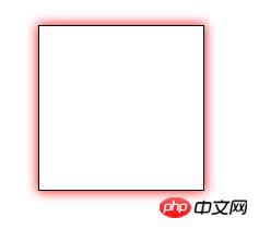
Example 1: Do not set the X-axis and Y-axis, set the shadow blur radius to 15px , it will act within its own radius, color.box-shadow: 0 0 15px #f00;

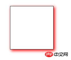
box-shadow:4px 4px 15px #f00;
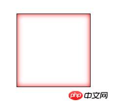
 ##Example 3: box-shadow: inset is the internal shadow of box-shadow. It is the same as the above writing. The only difference is that a inset
box-shadow:0 0 15px #f00 inset;
Rendering:
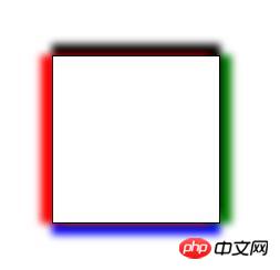
 Example 4: Set the four sides of the square to have different colors, but the shadow blur radius is 10px
box-shadow:-10px 0px 10px red,   /*左边阴影*/
            0px -10px 10px black,  /*上边阴影*/
            10px 0px 10px green,  /*右边阴影*/
0px 10px 10px blue;" /*下边阴影*/ >Rendering:
 The above introduces how to use box-shadow in CSS3, how to use box-shadow: inset internal shadow, and the actual application of box-shadow. As for what kind of effects to set around the box-shadow, it depends on the specific requirements.
The above is the detailed content of Share how to use the box-shadow attribute in CSS3, including inner shadow box-shadow: inset. For more information, please follow other related articles on the PHP Chinese website!