The content this article brings to you is about the implementation of color gradient in CSS (three methods). It has certain reference value. Friends in need can refer to it. I hope it will be helpful to you.
! ! Note that IE9 and earlier versions do not support gradients. Safari needs to be prefixed with -webkit-, Opera needs to be prefixed with -o-, and Firefox needs to be prefixed with -moz-!
1. Linear Gradients (linear gradient)-down/up/left/right/diagonal direction
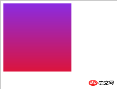
1. Downward code
<!DOCTYPE html>
<html>
<head>
<meta http-equiv="Content-Type" content="text/html" charset="utf-8">
<title>渐变学习</title>
<style>
div{
    width:200px;
    height:200px;
    }
.gradient{
 background:-webkit-linear-gradient(#8A2BE2,#DC143C);/*for safari5.1-6.0*/
 background:-o-linear-gradient(#8A2BE2,#DC143C);/*Opera 11.1-12.0*/
 background:-moz-linear-gradient(#8A2BE2,#DC143C);/*firefox 3.6-15*/
 background:linear-gradient(#8A2BE2,#DC143C);/*标准语法,必须放在最后*/
    }
</style>
</head>
<body>
<div class="gradient"></div>
</body>
</html>Running effect:

#2. Go up and change the order of the two colors of the downward gradient. Replace the above code and the running result is:
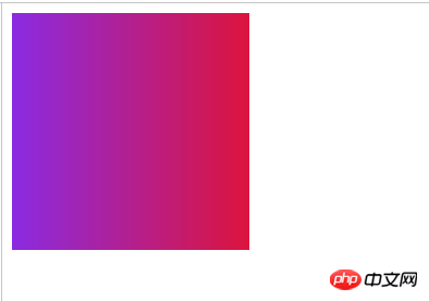
3. Left code
<!DOCTYPE html>
<html>
<head>
<meta http-equiv="Content-Type" content="text/html" charset="utf-8">
<title>渐变学习</title>
<style>
div{
    width:200px;
    height:200px;
    }
.gradient{
 background:-webkit-linear-gradient(left,#8A2BE2,#DC143C);/*for safari5.1-6.0*/
 background:-o-linear-gradient(right,#8A2BE2,#DC143C);/*Opera 11.1-12.0*/
 background:-moz-linear-gradient(right,#8A2BE2,#DC143C);/*firefox 3.6-15*/
 background:linear-gradient(to right,#8A2BE2,#DC143C);/*标准语法*/
    }
</style>
</head>
<body>
<div class="gradient"></div>
</body>
</html>The running result is:

Note: Gradient from left to right, the standard writing method is to add the direction word to right in the brackets of the downward gradient; among them, add left for safari5.1-6.0; add left for Opera11.1-12 and firefox3.6-15 right; According to the browser order in the above code (standard syntax must be placed at the end!!), you can write the first item from the left and the next three items to the right.
4. From right to left, modify the direction word on the gradient code from left to right to get the rendering:
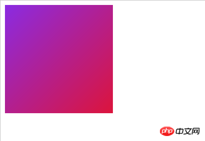
5. Right Angular direction
<!DOCTYPE html>
<html>
<head>
<meta http-equiv="Content-Type" content="text/html" charset="utf-8">
<title>渐变学习</title>
<style>
div{
    width:200px;
    height:200px;
    }
.gradient{
 background:-webkit-linear-gradient(left top,#8A2BE2,#DC143C);/*for safari5.1-6.0*/
 background:-o-linear-gradient(bottom right,#8A2BE2,#DC143C);/*Opera 11.1-12.0*/
 background:-moz-linear-gradient(bottom right,#8A2BE2,#DC143C);/*firefox 3.6-15*/
 background:linear-gradient(to bottom right,#8A2BE2,#DC143C);/*标准语法*/
    }
</style>
</head>
<body>
<div class="gradient"></div>
</body>
</html>Run result:

##Note: The direction words are written in the order of up, down, left and right according to the browser Write the starting position in one item, write the reaching position in the last three items, and add to as the fourth item is the standard item; it should be noted that the reaching item corresponding to the upper left left top is bottom right.
2. Angle gradient1. All the diagonal gradients above, up, down, left and right can be written by angle gradient. Just add angles such as 0deg, 45deg, 90deg, 180deg, etc. to the first item of the bracket indicating the color. 2. Angle refers to the angle between the gradient direction and the horizontal line, calculated in the counterclockwise direction. For example: 0deg refers to the gradient from bottom to top, and 90deg refers to the gradient from left to right. 3. For Chrome, Safari, Firefox, etc., the conversion formula is 90-x=y, and X is the standard degree. 3. Multiple color nodes: Just add more colors in the brackets indicating the direction color. The writing method is still as above, write the direction first and then the color. 4. Gradient with transparency: use rgba (0,0,0,0.2) to represent color, where 0.2 represents transparency. 5. Repeating linear gradient: Use the repeating-linear-gradient() function, and each color in brackets specifies the gradient ratio. 6. Radial Gradient1. Radial gradient: You can specify the center, shape (circle or ellipse), and size (closest-side; farthest-side) of the gradient. ;closest-coner;farthest-corner). The default center is center, the shape is ellipse (ellipse), and the gradient size is farthest-corner (to the farthest corner). Syntax: background:-radial-gradient(center,shape,size,start-color,...,last-clor). 2. Radial gradient of unevenly distributed color nodes: that is, specifying the proportion of each color. 3. Repeating radial gradient: use the repeating-radial-gradient() function. Set the scale for each color. Related recommendations:How to achieve background color gradient in CSS_html/css_WEB-ITnose
The above is the detailed content of Implementation of color gradient in css (three ways). For more information, please follow other related articles on the PHP Chinese website!