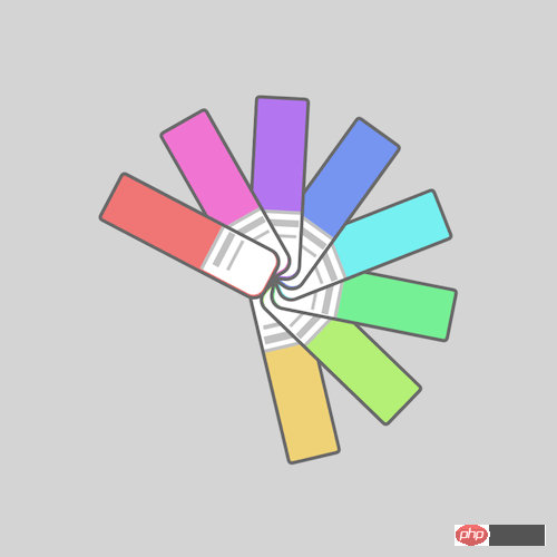
This article mainly introduces how to use pure CSS to achieve the effect of a color card. It has certain reference value. Now I share it with you. Friends in need can refer to it

Please download all the source code of the daily front-end practical series from github:
https://github.com/comehope/front-end- daily-challenges
Define dom, the container contains 8 elements:
Centered display:
body { margin: 0; height: 100vh; display: flex; align-items: center; justify-content: center; background-color: lightgray; }
Redefine the box model:
.cards, .cards > * { box-sizing: border-box; }
Define the container size:
.cards { width: 20em; height: 20em; }
Draw the color card:
.cards span { position: absolute; width: 10em; height: 3em; background-color: lightgreen; top: calc(50% - 3em / 2); border: 0.2em solid dimgray; border-radius: 0.3em 0.8em 0.8em 0.3em; }
Draw the label of the color card with pseudo elements:
.cards span::before { content: ''; position: absolute; width: 35%; height: 100%; background-color: white; right: 0; border-radius: 0 0.6em 0.6em 0; border-left: 0.2em solid silver; }
Draw with pseudo elements Text on the color card label:
.cards span::after { content: ''; position: absolute; width: 0.4em; height: 2em; background-color: silver; left: 6.5em; top: 0.1em; box-shadow: 0.7em 0 0 -0.1em silver; }
Set variables for the color card:
.cards span:nth-child(1) { --n: 1; } .cards span:nth-child(2) { --n: 2; } .cards span:nth-child(3) { --n: 3; } .cards span:nth-child(4) { --n: 4; } .cards span:nth-child(5) { --n: 5; } .cards span:nth-child(6) { --n: 6; } .cards span:nth-child(7) { --n: 7; } .cards span:nth-child(8) { --n: 8; }
Color the color card with HSL color mode:
.cards span { background-color: hsl(calc(360 / 8 * var(--n)), 80%, 70%); }
Define animation effects:
.cards span { transform-origin: right; animation: rotating 3s linear infinite; } @keyframes rotating { 0%, 35% { transform: rotate(0deg); } 90%, 100% { transform: rotate(360deg); } }
Finally, set the animation delay to let the cards rotate in sequence:
.cards span { animation-delay: calc((var(--n) - 8) * 0.15s); }
You’re done!
The above is the entire content of this article. I hope it will be helpful to everyone's study. For more related content, please pay attention to the PHP Chinese website!
Related recommendations:
How to use CSS to achieve a button text sliding effect
The above is the detailed content of How to use pure CSS to achieve the effect of a color card. For more information, please follow other related articles on the PHP Chinese website!


