This article mainly introduces the 3D flipping book effect achieved by CSS3. Based on the new CSS3 properties Animation and transform, a similar flipping book effect is achieved. It has certain reference value. Interested friends can refer to it
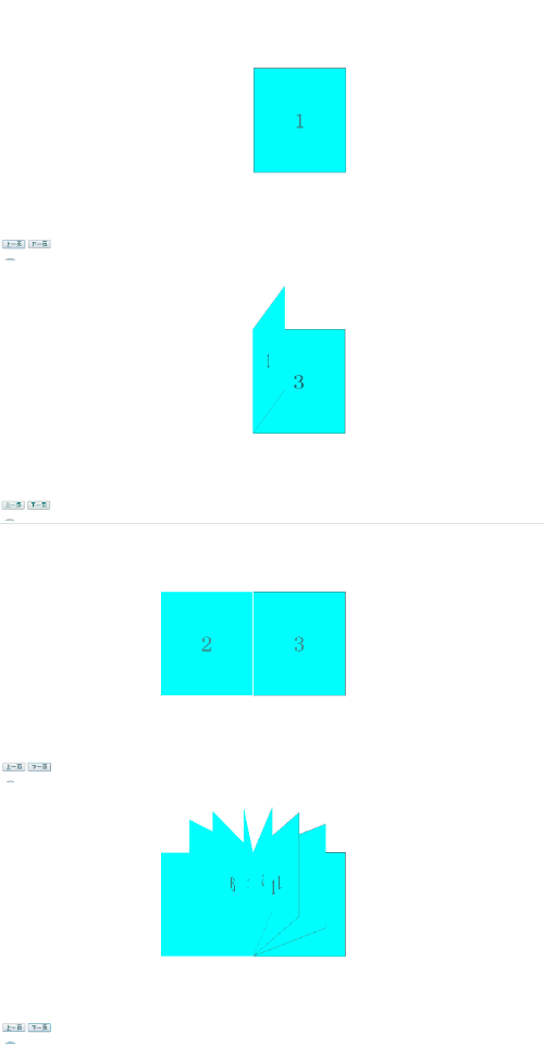
Let’s start with the renderings: (The style is a bit ugly, you can ignore it and it will be fine once the effect comes out. You can add it to other projects later to easily change 0.0)

Similar to the effect of turning a book , the original meaning is to use JS to control. After clicking once, use setInterval to control the animation of turning the book page. When the book page is turned 180°, setInterval is cleared. However, when I click continuously, the book pages that have not been turned 180° before will be If you cannot continue to complete the previous action, you can use the method of clearing setInterval, but I always feel that the animation effect is not good. Of course, there are other solutions, but it suddenly occurred to me that CSS3 provides us with animation. Why don’t we use it? Adding animation animation can directly avoid this problem. By default, animation animation is executed every time. Therefore, when connected dots appear, each page will turn naturally as shown in the picture. Below Paste the code and implementation steps:
Note: The JS part of this example is all written in native JS. If you are not good at using native JS, you can use jQuery and other third-party frameworks to rewrite the
html part: (This part is sincerely... ·, forget it, just be ugly~.~)
<body>
    <!-- 所展示的书的内容 -->
    <p class="book">
        <p class="page">
            <span>1</span>
            <span>2</span>
        </p>
        <p class="page">
            <span>3</span>
            <span>4</span>
        </p>
        <p class="page">
            <span>5</span>
            <span>6</span>
        </p>
        <p class="page">
            <span>7</span>
            <span>8</span>
        </p>
        <p class="page">
            <span>9</span>
            <span>10</span>
        </p>
        <p class="page">
            <span>11</span>
            <span>12</span>
        </p>
        <p class="page">
            <span>13</span>
            <span>14</span>
        </p>
        <p class="page">
            <span>15</span>
            <span>16</span>
        </p>
        <p class="page">
            <span>17</span>
            <span>18</span>
        </p>
        <p class="page">
            <span>19</span>
            <span>20</span>
        </p>
    </p>
    <!-- 用来控制上一页和下一页操作 -->
    <input type="button" value="上一页" id="before"/>
    <input type="button" value="下一页" id="after"/>
</body>CSS part: (By changing the value of rotatey in transform, the flipping effect of the book page can be achieved)
<style>
        .book{
            width: 460px;
            height: 300px;
            position: relative;
            margin: 150px 400px;
            -webkit-transform-style: preserve-3d;
            -moz-transform-style: preserve-3d;
            -ms-transform-style: preserve-3d;
            transform-style: preserve-3d;
            transform: rotatex(30deg);
        }
        .page{
            width: 230px;
            height: 300px;
            border: 1px solid #666;
            position: absolute;
            rightright: 0;
            transform-origin: left;
            transform-style: preserve-3d;
            backface-visibility:hidden;
            font-size: 60px;
            text-align: center;
            line-height: 300px;
        }
        .page span{
            display: block;
            width: 100%;
            position: absolute;
            background-color: #00FFFF;
        }
        .page span:nth-child(2){
            transform: rotatey(-180deg);
            backface-visibility:hidden;
        }
        /*以下两个动画可以只使用第一个,animation中有reverse,可以反向执行动画,
            使用时需要在JS中点击上一页时添加改属性值*/
        /*翻书下一页的动画*/
        @keyframes page {
            0%{
                transform: rotatey(0deg);
            }
            100%{
                transform: rotatey(-180deg);
                z-index: 10;
            }
        }
        /*翻书上一页的动画*/
        @keyframes page1 {
            0%{
                transform: rotatey(-180deg);
                z-index: 10;
            }
            100%{
                transform: rotatey(0deg);
            }
        }
</style>JS part (the JS part mainly implements adding animation attributes to the corresponding p when clicking on the previous/next page)
<script>
    var before = document.querySelector("#before");
    var after = document.querySelector("#after");
    var book = document.querySelector(".book");
    var page = document.getElementsByClassName("page"); 7     rotate();
    function rotate(){
        var middle = 0;12         for(var z=0;z<book.children.length;z++){
            page[z].style.zIndex = book.children.length-z;
        }
        after.onclick = function(){
            if(middle != book.children.length){
                page[middle].style.animation = "page 1.5s linear 1 forwards";
                middle++;
            }else{
                middle = book.children.length;
            }
        };
        before.onclick = function(){
            if(middle != 0){
                page[middle-1].style.animation = "page1 1.5s linear 1 forwards";
                middle--;
        }else{
            middle = 0;
            }
        }
    }
</script> Regarding the last JS part, The main function is to add animation attributes to the corresponding p when clicking on the previous/next page. For detailed explanation of animation, you still need to check the API.
Due to compatibility issues, a better solution here is to add class instead of animation. In order to adapt to more browsers, you need to add the prefixes -webkit-, -moz-···· ···, so write these things in a class and add the class directly, or write a function, encapsulate it, and directly output the required string.
The above is the entire content of this article. I hope it will be helpful to everyone's study. For more related content, please pay attention to the PHP Chinese website!
Related recommendations:
js and CSS3 to achieve card rotation switching effect
Introduction to the use of CSS3 3D rotation rotate effect
The above is the detailed content of How to use CSS3 to achieve 3D flipping book effect. For more information, please follow other related articles on the PHP Chinese website!


