This article mainly introduces some implementation methods of linear color gradients in CSS3, including the webkit kernel of Safari and Chrome and the Gecko kernel of Firefox. Friends in need can refer to it
In order to display Dedicating a gradient to one image is inflexible and can quickly become a bad practice. But sadly, as of this writing, it may still have to be, but hopefully not for much longer. Thanks to Firefox and Safari/Chrome, we can now achieve powerful gradients with minimal effort. In this article, we will show a simple implementation of CSS gradients and how this property differs in Mozilla and webkit browsers.
Webkit
Although Mozilla and Webkit generally adopt the same syntax for CSS3 properties, they unfortunately cannot agree on gradients. Webkit is the first browser kernel to support gradients. It uses the following structure:
/* 语法,参考自: http://webkit.org/blog/175/introducing-css-gradients/ */
-webkit-gradient(<type>, <point> [, <radius>]?, <point> [, <radius>]? [, <stop>]*)
/* 实际用法... */
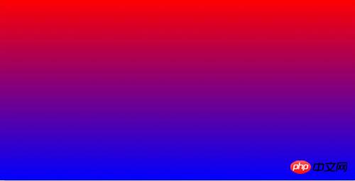
background: -webkit-gradient(linear, 0 0, 0 100%, from(red), to(blue));

Don’t worry that these syntaxes will dazzle you, it’s the same for me. of! Just remember that we need to separate the parameter groups with a comma.
Type of gradient? (linear)
X and Y axis coordinates of the beginning of the gradient (0 0 – or left-top)
X and Y axis coordinates of the end of the gradient (0 100% or left-bottom)
Starting color? (from(red))
Ending color? (to(blue))
Mozilla
Firefox, only from version 3.6 Started supporting gradients, preferring a slightly different syntax from Webkit.
/* 语法,参考自: http://hacks.mozilla.org/2009/11/css-gradients-firefox-36/ */
-moz-linear-gradient( [ <point> || <angle>,]? <stop>, <stop> [, <stop>]* )
/* 实际用法*/
background: -moz-linear-gradient(top, red, blue);

Please note that we put the gradient type - linear - in the attribute prefix
Where does the gradient start? (top - We can also use degrees , such as -45deg)
Starting color? (red)
Ending color? (blue)
Color-Stops
If you don’t need What about a 100% gradient from one color to another? This is when color stop comes into play. A common design technique is to use a short, subtle gradient, such as: 
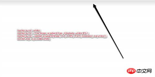
Note the subtle gradient from light gray to white at the top
In the past, the standard What you do is make an image, set it as the background image of an element, and then make it tile horizontally. With CSS3, however, this is a small case.
background: white; /* 为较旧的或者不支持的浏览器设置备用属性 */
background: -moz-linear-gradient(top, #dedede, white 8%);
background: -webkit-gradient(linear, 0 0, 0 8%, from(#dedede), to(white)); border-top: 1px solid white;
This time, we make the gradient end at 8% instead of the default 100%. Note that we also used a border on the header for contrast. This is very commonly used.
If we want to add one more (several) colors, we can do this:
background: white; /* 备用属性 */ background: -moz-linear-gradient(top, #dedede, white 8%, red 20%); background: -webkit-gradient(linear, 0 0, 0 100%, from(#dedede), color-stop(8%, white), color-stop(20%, red);
For the -moz version, we define, starting from 20% of the height of the element It's red.
For -webkit, we use color-stop, which takes two parameters: where to start and which color to use.
The above is the entire content of this article. I hope it will be helpful to everyone's study. For more related content, please pay attention to the PHP Chinese website!
Related recommendations:
About CSS to achieve beautiful drop-down navigation effect
How to use CSS to achieve perspective effect
The above is the detailed content of Implementation of linear color gradient in CSS3. For more information, please follow other related articles on the PHP Chinese website!


