This article mainly introduces the relevant information on the design of the ever-changing text shadow text-shadow effect in CSS3. Interested friends can refer to it.
The example of this article shares the ever-changing text shadow of CSS3 with everyone. Text-shadow effect example for your reference, the specific content is as follows
Syntax:
##none|
or
none|
represents the color;
represents the length value consisting of a floating point number and a unit identifier, which can be a negative value and specifies the horizontal extension distance of the shadow;
represents a length value composed of a floating point number and a unit identifier. It cannot be a negative value and specifies the distance of the blur effect. If you only need a blur effect, set the first two lengths to 0.
Example:
<style type="text/css">
p{
    text-align:center;
    margin:0;
    font-family:helvetica,arial,sans-serif;
    color:#999;
    font-size:80px;
    font-weight:bold;
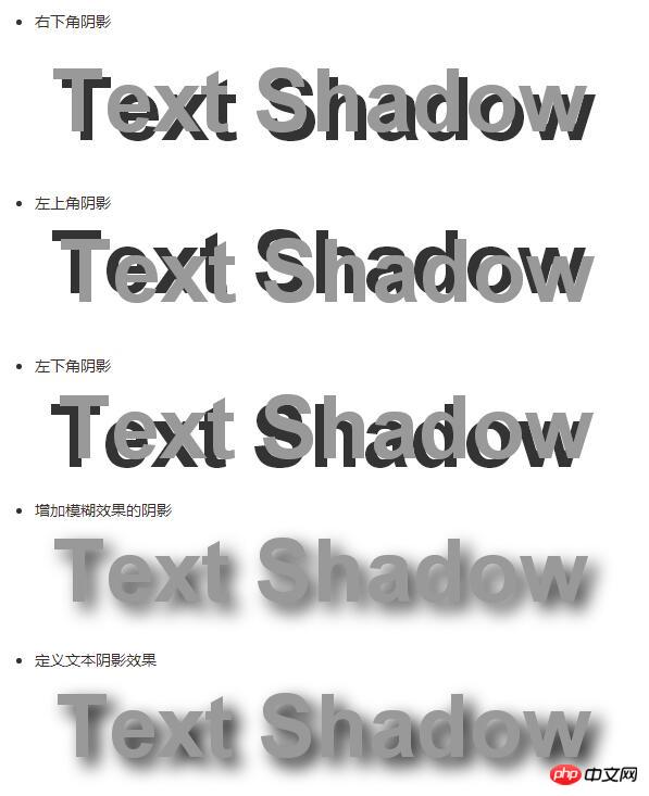
    text-shadow:0.1em 0.1em #333;//右下角阴影
    text-shadow:-0.1em -0.1em #333;//左上角阴影
    text-shadow:-0.1em 0.1em #333;//左下角阴影
    text-shadow:0.1em 0.1em 0.3em #333;//增加模糊效果的阴影
    text-shadow:0.1em 0.1em 0.3em black;//定义文本阴影效果
}
</style>
**Simple summary:**The first value of the text-shadow attribute represents horizontal displacement; the second The value represents the vertical displacement, positive values are shifted to the right or downward; negative values are shifted to the upper or left side; the third value represents the blur radius, this value is optional; the fourth value represents the color of the shadow, this value is optional.
Increase the contrast between foreground and background colors through shadowsp{
text-align:center;
margin:150px auto;
font-family:helvetica,arial,sans-serif;
font-size:80px;
font-weight:bold;
color:#fff;//设置文字颜色
text-shadow:0.1em 0.1em 0.3em black;//通过阴影增加前景色和背景色的对比
}

##Summary:
The shadow offset is specified by two
Example:
Simulate complex text effectsp{
text-align:center;
margin:0;
padding:24px;
font-family:helvetica,arial,sans-serif;
font-size:80px;
font-weight:bold;
color:#000;//设置文字颜色
background:#000;//设置背景颜色
text-shadow:0 0 4px white,
0 -5px 4px #ff3,
2px -10px 6px #fd3,
-2px -15px 11px #f80,
2px -25px 18px #f20;//使用阴影叠加出燃烧的文字特效
}p{
text-align:center;
margin:0;
padding:24px;
font-family:helvetica,arial,sans-serif;
font-size:80px;
font-weight:bold;
color:#D1D1D1;
background:#CCC;
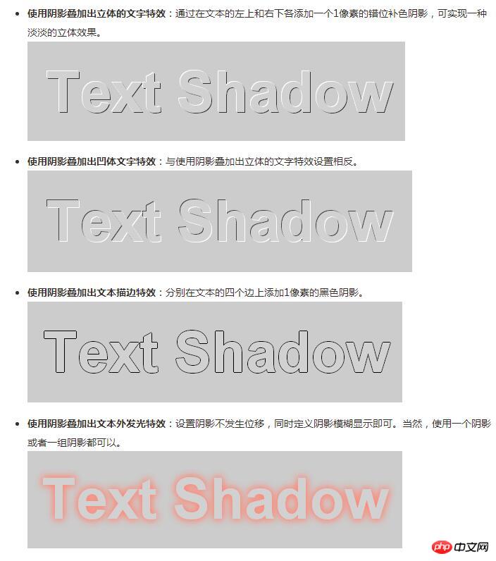
text-shadow:-1px -1px white,
-1px -1px #333;//使用阴影叠加出立体的文字特效
1px 1px white,
-1px -1px #444;//使用阴影叠加出凹体文字特效
-1px 0 black,
0 1px black,
1px 0 black,
0 -1px black;//使用阴影叠加出文本描边特效
0 0 0.2em #F87,
0 0 0.2em #F87;//使用阴影叠加出文本外发光特
}
The above is the entire content of this article. I hope it will be helpful to everyone’s study. For more related content, please pay attention to the PHP Chinese website! 
Related recommendations:
The above is the detailed content of How to use CSS3 to achieve ever-changing text-shadow effects. For more information, please follow other related articles on the PHP Chinese website!
 css3 tutorial
 What are the css3 gradient properties?
 How to solve the problem that localhost cannot be opened
 What are the common testing techniques?
 What are the basic data types in php
 Word document encryption tutorial
 Ranking of the top ten digital currency exchanges
 How to raise a little fireman on Douyin


