


This article mainly introduces the principles of the grid system of bootstrap3.0. It has a certain reference value. Now I share it with you. Friends in need can refer to it.
Bootstrap has a built-in set of responsive , a mobile-first fluid grid system that automatically divides into up to 12 columns as the screen device or viewport size increases. Here I call the grid system in Bootstrap the layout
Grid system (layout)
Bootstrap has a built-in responsive, mobile device-first fluid grid system. As the screen device or viewport size increases, the system will automatically divide it into up to 12 columns.
I call the grid system in Bootstrap a layout here. It creates a page layout through a series of combinations of rows and columns, and then your content can be placed into the layout you created. Here is a brief introduction to how the Bootstrap grid system works:
rows must be included in the .container in order to give them appropriate alignment and padding. Create a set of columns (cpumn) horizontally using rows. Your content should be placed within a column (cpumn), and only a column (cpumn) can be a direct child of a row (row). Predefined grid classes like .row and .cp-xs-4 can be used to quickly create grid layouts. Mixins defined in the Bootstrap source code can also be used to create semantic layouts. Create gaps (gutter) between columns (cpumn) by setting padding. Then offset the impact of padding by setting negative values for the first and last margin. Columns in a grid system represent the range they span by specifying values from 1 to 12. For example, three equal-width columns can be created using three .cp-xs-4.
DW6 coding implementation
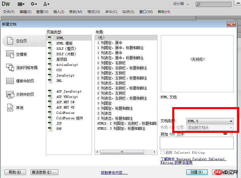
Okay, let’s start writing the code. First, look at the editor I use in the previous picture. I used many tools when I was learning Html CSS in school.

Then create a new HTML document and select the type HTML5
After creating it, save it as the same as the previous section In the same directory of the js and css folders in the explanation.
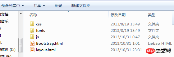
layout.html is the file I just created. Bootstrap.html is also the first html page created in the previous section.
Now you can copy all the code in Bootstrap.html to the layout.html page.
Then add the following code under the body tag
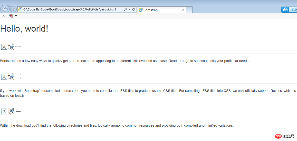
<h1>Hello, world!</h1> <h2class="page-header">区域一</h2> <p>Bootstraphasafeweasywaystoquicklygetstarted,eachoneappealingtoadifferentskilllevelandusecase.Readthroughtoseewhatsuitsyourparticularneeds.</p> <h2class="page-header">区域二</h2> <p>IfyouworkwithBootstrap'suncompiledsourcecode,youneedtocompiletheLESSfilestoproduceusableCSSfiles.ForcompilingLESSfilesintoCSS,weonlyofficiallysupportRecess,whichisTwitter'sCSShinterbasedonless.js.</p> <h2class="page-header">区域三</h2> <p>Withinthedownloadyou'llfindthefollowingdirectoriesandfiles,logicallygroupingcommonresourcesandprovidingbothcompiledandminifiedvariations.</p>
Everyone should be able to understand these tags, they are the most basic and simple.
After adding, all the codes of the layout.html page are as follows
<!DOCTYPE html> <html> <head> <title>Bootstrap</title> <metaname="viewport"content="width=device-width,initial-scale=1.0"> <!--Bootstrap--> <linkhref="css/bootstrap.min.css"rel="stylesheet"media="screen"></p> <p><!--HTML5ShimandRespond.jsIE8supportofHTML5elementsandmediaqueries--> <!--WARNING:Respond.jsdoesn'tworkifyouviewthepageviafile://--> <!--[ifltIE9]> <scriptsrc="<a href="https://oss.maxcdn.com/libs/html5shiv/3.7.0/html5shiv.js"></script">https://oss.maxcdn.com/libs/html5shiv/3.7.0/html5shiv.js"></script</a>> <scriptsrc="<a href="https://oss.maxcdn.com/libs/respond.js/1.3.0/respond.min.js"></script">https://oss.maxcdn.com/libs/respond.js/1.3.0/respond.min.js"></script</a>> <![endif]--> </head> <body> <h1>Hello,world!</h1> <h2class="page-header">区域一</h2> <p>Bootstraphasafeweasywaystoquicklygetstarted,eachoneappealingtoadifferentskilllevelandusecase.Readthroughtoseewhatsuitsyourparticularneeds.</p> <h2class="page-header">区域二</h2> <p>IfyouworkwithBootstrap'suncompiledsourcecode,youneedtocompiletheLESSfilestoproduceusableCSSfiles.ForcompilingLESSfilesintoCSS,weonlyofficiallysupportRecess,whichisTwitter'sCSShinterbasedonless.js.</p> <h2class="page-header">区域三</h2> <p>Withinthedownloadyou'llfindthefollowingdirectoriesandfiles,logicallygroupingcommonresourcesandprovidingbothcompiledandminifiedvariations.</p> <scriptsrc="js/jquery-2.0.3.min.js"></script> <scriptsrc="js/bootstrap.min.js"></script> </body> </html>
Of course the effect is very simple, I still put the screenshot for comparison.
Optimization 1: You can find that the page effect in the picture above takes up the full screen. We can center the above content through the Bootstrap style class.
<p class="container">
 .........之前上面添加在body标签下的代码
</p>
The effect is as follows
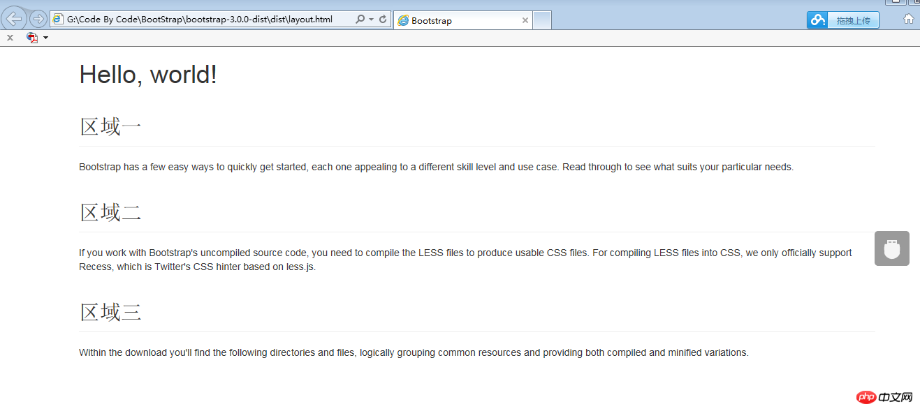
#You can find that the container class sets the width and allows the content to be displayed in the middle of the page.
Optimization 2: Display the three areas in the same row and divide them evenly into three columns.
First add a container for the three areas, you can use p, and add a class for p
.
Then we add a container for each Also add a container p to a small area, and add a class for p
The simple code achieves the following effect
<p class="container"> <h1>Hello,world!</h1> <pclass="row"> <pclass="col-xs-4"> <h2class="page-header">区域一</h2> <p>Bootstraphasafeweasywaystoquicklygetstarted,eachoneappealingtoadifferentskilllevelandusecase.Readthroughtoseewhatsuitsyourparticularneeds.</p> </p> <pclass="col-xs-4"> <h2class="page-header">区域二</h2> <p>IfyouworkwithBootstrap'suncompiledsourcecode,youneedtocompiletheLESSfilestoproduceusableCSSfiles.ForcompilingLESSfilesintoCSS,weonlyofficiallysupportRecess,whichisTwitter'sCSShinterbasedonless.js.</p> </p> <pclass="col-xs-4"> <h2class="page-header">区域三</h2> <p>Withinthedownloadyou'llfindthefollowingdirectoriesandfiles,logicallygroupingcommonresourcesandprovidingbothcompiledandminifiedvariations.</p> </p> </p> </p>
The following
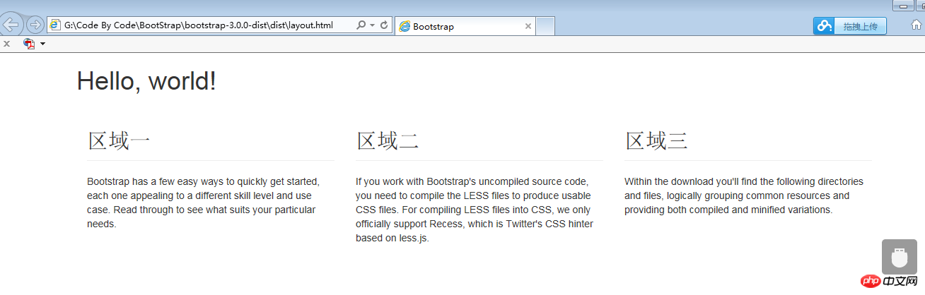
is indeed arranged in one column and then divided into three columns. Let’s combine the 6 principles of the grid system above. Do you understand a little bit? Anyway, I understand a lot. More complex grid layout pages can be created in the same way. Just add the corresponding grid layout class to the container used by the layout. For example, if the content occupies 6 grids, then add a cp-xs-6 class. If it occupies four grids, add a cp-xs-4 class, and then use the row class around the same row. container.
Summary
This section mainly studies the layout (grid system) and understands its working principle through simple examples.
The classes used are:
1..container: Use .container to wrap the content on the page to achieve center alignment. max-width is set for the container in different media queries or value ranges to match the grid system.
2..cp-xs-4: This class is divided into three parts through "-". The number in the third part is used as a general reference, and its range is 1 to 12. That is, an area can be divided into 12 columns. This must be used in conjunction with the row class.
In fact, this layout is very similar to the Table layout TR rows and TD columns in HTMl.
This is the temporary understanding. You can directly copy and paste the code to see the effect. Of course, you must first prepare the css and js files in advance.
The above is the entire content of this article. I hope it will be helpful to everyone's study. For more related content, please pay attention to the PHP Chinese website!
Related recommendations:
How to use CSS to maintain the aspect ratio of page content
##
The above is the detailed content of About the grid system principle of bootstrap3.0. For more information, please follow other related articles on the PHP Chinese website!


![[Web front-end] Node.js quick start](https://img.php.cn/upload/course/000/000/067/662b5d34ba7c0227.png)


