
This article mainly introduces the function of the background-clip attribute in CSS. The popular function of the background-clip attribute is to specify the area where the background of the element is located. Friends who are interested in the relevant knowledge of the background-clip attribute in CSS should take a look. Well, I hope it helps everyone.
The popular function of the background-clip attribute is to specify the area where the background of the element is located. There are four values
1, border-box
border -box is the default value, which means that the background of the element retains the background starting from within the border area (including the border).
The simple code is as follows:
<!doctype html>
<html>
    <head>
        <style>
        *{margin:0;padding:0;}
            .box{width:380px;height:280px;margin:100px auto;background:url("1.jpg") no-repeat -5px;padding:5px;border:5px dotted #000;<br>       background-clip:border-box;}
        </style>
   </head>
   <body>
       <p class="box"></p>
   </body>
</html>The effect is as follows:
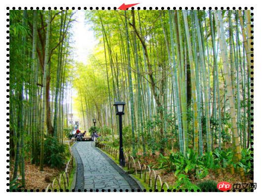
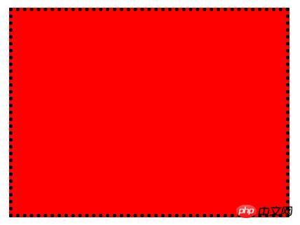
From the picture above We can see that the element background exists in the border and the area by default, but I don’t know why adding a background image cannot cover it all; but the background color does not have this problem.
2. padding-box
padding-box means that the background of the element is retained from within the padding area (including padding).
The simple code is as follows:
<!doctype html>
<html>
    <head>
        <style>
        *{margin:0;padding:0;}
            .box{width:380px;height:280px;margin:100px auto;background:url("1.jpg") no-repeat -5px;padding:5px;border:5px dotted #000;<br>            background-clip:padding-box;}
        </style>
   </head>
   <body>
       <p class="box"></p>
   </body>
</html>The effect is as follows:
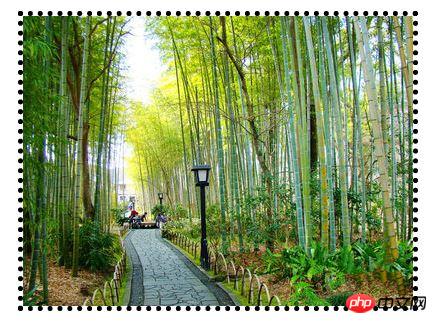
From the picture above We can see that the background image exists in the padding and within the area.
3. content-box
content-box indicates that the background of the element is retained from within the content area.
The simple code is as follows:
<!doctype html>
<html>
    <head>
        <style>
        *{margin:0;padding:0;}
            .box{width:380px;height:280px;margin:100px auto;background:url("1.jpg") no-repeat -5px;padding:5px;border:5px dotted #000;<br>            background-clip:content-box;}
        </style>
   </head>
   <body>
       <p class="box"></p>
   </body>
</html>The effect is as follows:
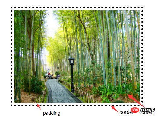
We can see from the picture above The background image exists within the content area.
4. text
content-box means that the background of the element remains in the foreground content (text), which is the same as its shape and size. Currently it only supports Chrome browser
The simple code is as follows:
<!doctype html>
<html>
    <head>
        <style>
        *{margin:0;padding:0;}
            .box{width:380px;height:280px;margin:100px auto;background:red;padding:5px;border:5px dotted #000;<br>             font-size:100px;font-weight;bold;-webkit-background-clip:text;-webkit-text-fill-color:transparent;}
        </style>
   </head>
   <body>
       <p class="box">你 好 你 好</p>
   </body>
</html>The effect is as follows:
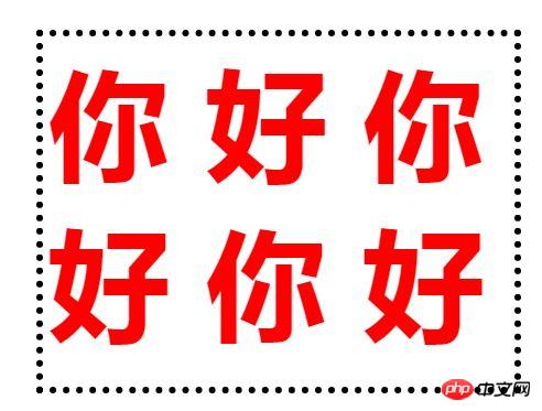
Description: When the current value is text , the compatibility is extremely poor, just know it.
Related recommendations:
CSS3 tutorial: background-clip and background-origin
##
The above is the detailed content of Detailed explanation of background-clip property in css. For more information, please follow other related articles on the PHP Chinese website!


