

This time I will bring you a detailed graphic and text explanation of CSS3 reflection effect. What are the precautions for CSS3 reflection effect? Here is a practical case, let’s take a look.
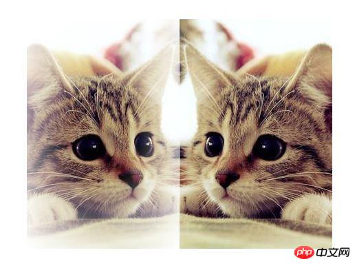
The renderings are as follows:
propertyIt can be easily achieved.
This is the box-reflect attribute we are going to mention today. Let’s first take a look at the box-reflect syntax given by W3C:direction> < offset>?
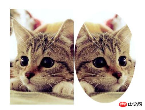
Let’s now implement the projection effect of the example image at the beginning of the article step by step:
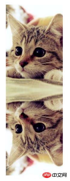
① Give only one attribute value below.
< img class="img" src="imgs/cat.jpg" />
/*CSS代码*/ .img{ -webkit-box-reflect: below; box-reflect: below;}
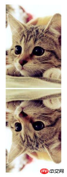
②Add a 5px spacing.
/*CSS代码*/ .img{ -webkit-box-reflect: below 5px; box-reflect: below 5px;}
③Finally add a picture mask.
/*CSS代码*/ .img{ -webkit-box-reflect: below 5px -webkit-linear-gradient(transparent 60%,rgba(0,0,0,.3)); box-reflect: below 5px linear-gradient(transparent 60%,rgba(0,0,0,.3));}
/*CSS代码*/ .img{ -webkit-box-reflect: left 0 -webkit-radial-gradient(#000 30%,transparent); box-reflect: left 0 radial-gradient(#000 30%,transparent);}
/*CSS代码*/ .img{ -webkit-box-reflect: right 0 url(imgs/mask.png); box-reflect: right 0 url(imgs/mask.png);}
 mask.png
It can be seen that the mask image will be completely stretched to fill the reflection image, and the effect is that the completely transparent part will not be displayed (in fact, the CSS3 gradient image mask principle is the same as this).
It should be noted that:All the effects mentioned above can be used not only on pictures, but also on other elements, such as text.
Compatibility: Although box-reflect looks very good, unfortunately, it is currently only compatible with webkit core browsers, but there are basically no problems with the mobile terminal~~
I believe you have mastered the method after reading the case in this article. For more exciting information, please pay attention to other related articles on the php Chinese website!
Recommended reading:
CSS3 to create a large striped background
The above is the detailed content of Detailed graphic and text explanation of reflection using CSS3. For more information, please follow other related articles on the PHP Chinese website!


 ##Example


![[Web front-end] Node.js quick start](https://img.php.cn/upload/course/000/000/067/662b5d34ba7c0227.png)


