
Today I saw an effect written in CSS on Codepen. Each line of text in a paragraph has a gradient effect. It’s not strange to implement a gradient fill effect for a single line of text or a single word, but it is a text gradient fill effect for each line of a paragraph. It is estimated that it will still make many people curious. If you are one of the curious ones, please read on to find out!
Target effect
Today’s target effect is to achieve the following effect, or to understand the tips for making this effect:

Seeing the above effect, I think the first thing many people will think of is background-clip:text, color:transparent and linear-gradient. So is this the case?
How to complete the gradient effect of each line of text in a paragraph
Students who understand CSS know that using:
background-image: linear-gradient(to right, deeppink, dodgerblue);
-webkit-background-clip: text;
color: transparent;
can easily achieve the gradient fill effect of a text. For example, the following example:

Let’s do a small experiment. What will be the effect if the text is not a word or a single line but an entire paragraph?

The effect seems to be perfect. If you change the gradient effect parameters, the gradient effect will be an oblique angle:
background-image: linear-gradient(135deg, deeppink, dodgerblue);
Look at the effects of the two:

Look carefully, both The effect is still different. Let’s first look at the same size container (the p element in this example, its size is 765px * 165px). For two different gradient effects, let’s first look at the filling effect of to right:

Let’s look at the filling effect of 135deg:
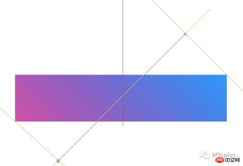
Now that we are here, you may know what is different from the previous example? And also know what the reason is? If we want various gradients to have the same fill effect for each line of a paragraph, how should we achieve it? Before implementation, let’s briefly summarize:
Use to right or to left in linear-gradient, whether it is a single word, a single line of text, or multiple lines of text, the text filling effect will be the same. But for other gradient angle parameters, the effect of each line in a multi-line text fill will be different.
Back to the topic? How to achieve multiple rows and have the same effect regardless of the filling angle? There is a key attribute to achieve this effect: box-decoration-break. To put it simply, the box-decoration-break attribute has two attribute values: slice and clone, and their corresponding effects are as follows:
is used in a paragraph, and its effects are as follows:
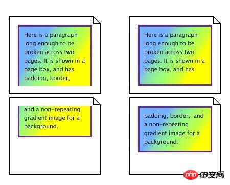
Are we getting closer to our goal? Then use this attribute box-decoration-break:clone for our example:
background-image: linear-gradient(135deg, deeppink, dodgerblue);
background-clip: text;
-webkit-background-clip: text;
box-decoration-break: clone;
-webkit-box-decoration-break: clone;
color: transparent;
The effect is as follows:

Let’s verify whether it matches ours Expected desired effect:

Tips: box-decoration-break is applied to inline elements, and matched with the corresponding line-height, so that there is space between lines a certain spacing.
Looking back, let’s see, using box-decoration-break is the difference between inline elements and block elements:
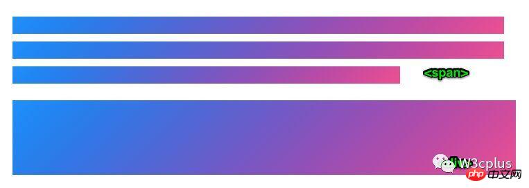
Isn’t it very Perfect. If you like, try it yourself.
Related recommendations:
javascript calculation gradient color example sharing
html5 canvas drawing radioactive gradient color effect code example
div+css background gradient color code example
The above is the detailed content of CSS Tips How to implement the gradient text effect for each line of a paragraph. For more information, please follow other related articles on the PHP Chinese website!


