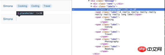
This article mainly shares with you the CSS function of hiding elements when they are too wide and cannot be fully displayed. I encountered a requirement. The style that needs to be implemented is to display several labels in a row in a fixed-width container. The number is variable, and each The length of the label is also variable. When a certain label cannot be fully displayed, it will not be displayed. The general effect is as follows. The labels are only displayed in one row. If there are too many labels, they will not be displayed.

The DOM structure of the tag part is as follows
<p class="labels">
    <span class="label">Cooking</span>
    <span class="label">Coding</span>
    <span class="label">Travel</span>
    <span class="label">Photography</span>
    <span class="label">Reading</span>
</p>At first glance, this problem seems very simple. , based on the principle of not using js to solve style problems as much as possible, I wrote the following styles to achieve the perfect effect. It can be seen that the last two .labels are folded to the next line because they exceed the width of .labels, and are then hidden by the overflow: hidden of .labels.
.label {
    display: block;
    height: 24px;
    line-height: 24px;
    padding: 0 10px;
    background-color: #e1ecf4;
    border-radius: 12px;
    font-size: 14px;
    flex-shrink: 0; // label 不收缩,长度为内容长度

    & + .label {
        margin-left: 5px;
    }
}

.labels {
    height: 24px; // 一行 label 的高度
    overflow: hidden;
    display: flex;
    flex-wrap: wrap;
    justify-content: flex-start;
}But not long after I was happy, I suddenly discovered a problem. If the length of the first label exceeds the width of the container, it will not be completely hidden. The content is truncated, like the following

This problem has troubled me for a long time. I have been thinking about what attributes in css can make the width of the child element exceed that of the parent. Container, hide it entirely (instead of just hiding the part beyond the parent container). All kinds of thinking had no results, and I was about to give up and worry about whether to use js to implement it. Suddenly an idea came to me. Since the wrapped elements can be hidden now, wouldn't it be enough to make the first label also wrap?
So how do you make the first label wrap? I thought of a trickier method. If it is no longer the first element, you can use the characteristics of flex to wrap it~ So, in all. Before the label element, a .placeholder element is added that is only 1px wide and 100% height. If you inspect the element, you can see that the placeholder element indeed occupies the position of the first row, achieving the effect we want~

In fact, using this idea, you can also use float achieve the same effect. Although it is a bit tricky and uses an additional DOM element, the effect is still perfectly achieved~
Related recommendations:
CSS3 realizes dynamic flip effect
Detailed example of using CSS to set an element to be translucent
The above is the detailed content of An example to explain the CSS function of hiding an element when it is too wide to be fully displayed. For more information, please follow other related articles on the PHP Chinese website!


