


CSS feels very simple when you first learn it, but as you learn more, you realize how deep the water of CSS is. You will always encounter various pitfalls. Let’s first summarize some pitfalls that are often encountered. This article mainly introduces the shallow discussion and is easy to be ignored. The editor thinks CSS features are quite good, so I would like to share them with you now and give them a reference. Let’s follow the editor to take a look, I hope it can help everyone.
Case insensitive
Although we usually use lowercase when writing CSS, in fact CSS is not case sensitive
.test{
    background-COLOR:#a00;
    width:100px;
    height: 100px;
}
Although background-color is written as background-COLOR, it will still take effect. The reason why it is written in lowercase is because of the xhtml standard, but even if it is not xhtml It is better to write it in lowercase, which is beautiful, easy to read and can cope with possible conversion needs
Selector priority
When two rules are applied to the same html element, if the defined attributes conflict , then whose value should be used? CSS has a set of priority definitions.
Different levels
Using !important after an attribute will override element styles defined anywhere within the page.
The style written in the element as the style attribute
id selector
class selector
Tag selector
Wildcard selector
Same level
The styles written later in the same level will overwrite the styles written firstThe above levels are still easy to understand, but sometimes Some rules are a combination of multiple levels, like this<!doctype html>
<html lang="en">
<head>
<meta charset="UTF-8">
<title>Document</title>
<style type="text/css">
p.test{
background-COLOR:#a00;
width:100px;
height: 100px;
}
.test.test2{
background-COLOR:#0e0;
width:100px;
height: 100px;
}
</style>
</head>
<body>
<p class="test test2"></p>
</body>
</html>
Some attributes of inline elements
Not all attributes can take effect on inline elements<p style="background-color: #a44;">
<span style="padding:4px; margin:8px; height: 500px; width:1000px; background-color:#0e0;">123456789123456789</span>
</p>
<p style="background-color: #a44;">
<span style="padding:4px; margin:8px; height: 500px; width:1000px; background-color:#0a0;">123456789</span>
</p> 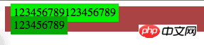
Some mutually exclusive elements
font-size unit
We are writing the size of the font The commonly used units areWhat do these fonts mean?
px是pixel缩写,是基于像素的单位.在浏览网页过程中,屏幕上的文字、图片等会随屏幕的分辨率变化而变化,一个100px宽度大小的图片,在800×600分辨率下,要占屏幕宽度的1/8,但在1024×768下,则只占约1/10。所以如果在定义字体大小时,使用px作为单位,那一旦用户改变显示器分辨率从800到1024,用户实际看到的文字就要变“小”(自然长度单位),甚至会看不清,影响浏览。
pt是point(磅)缩写,是一种固定长度的度量单位,大小为1/72英寸。如果在web上使用pt做单位的文字,字体的大小在不同屏幕(同样分辨率)下一样,这样可能会对排版有影响,但在Word中使用pt相当方便。因为使用Word主要目的都不是为了屏幕浏览,而是输出打印。当打印到实体时,pt作为一个自然长度单位就方便实用了:比如Word中普通的文档都用“宋体 9pt”,标题用“黑体 16pt”等等,无论电脑怎么设置,打印出来永远就是这么大。
em:是相对单位,是一个相对长度单位,最初是指字母M的宽度,所以叫em,现指的是字符宽度的倍数,用法类似百分比,如:0.8em, 1.2em,2em等。通常1em=16px(浏览器默认字体大小16px),em是指父元素的字体大小。在一个页面上给定了一个父元素的字体大小,这样就可以通过调整一个元素来成比例的改变所有元素大小.它可以自由缩放,比如用来制作可伸缩的样式表。类似还有ex的概念,ex 相对于字符“x”的高度,此高度通常为字体尺寸的一半。
rem:rem是CSS新增的,em是相对于其父元素来设置字体大小的,这样就会存在一个问题,进行任何元素设置,都有可能需要知道他父元素的大小,在多次使用时,就会带来无法预知的错误风险。而rem是相对于根元素(r:root),使用rem我们只需要在根元素确定一个参考值,然后就可以控制整个html页面所有字体了。
:checked 选择器范围
我们知道:checked会选择被选中的checkbox和radio,看个例子
<!doctype html>
<html lang="en">
<head>
    <meta charset="UTF-8">
    <title>Document</title>
    <style type="text/css">
        :checked{
            margin: 10px;
        }
    </style>
</head>
<body>
    <input id="t1" type="checkbox" checked/>
    <input id="t3" type="radio" checked/>
    <select>
        <option id="t2">test</option>
        <option id="t4">test2</option>
    </select>
</body>
</html>
对于前两个margin变成10px我们不奇怪,但是当我们看select的option的时候会发现被选中的option的margin业变成了10px,没有被选中的option则没有变化!
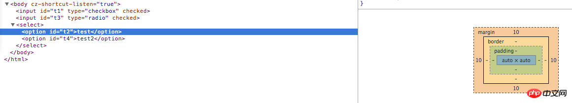
是的:checked也会选择被选中的option
并不是所有图片都会被加载
我们知道写在页面上的img标签,无论显示与否,图片都会被加载(所以试图通过对图片display:none来达到节省网络流量的做法就省省吧。。。),我们也经常使用backgroung-image等css属性为页面添加图片,这些图片是不是一定会被加载呢,看个例子
<!doctype html>
<html lang="en">
<head>
<meta charset="UTF-8">
<title>Document</title>
<style type="text/css">
.useless{
background-image: url(images/0.jpg);
}
.hidden{
background-image: url(images/1.jpg);
}
.none{
background-image: url(images/2.jpg);
}
.parentHidden{
background-image: url(images/3.jpg);
}
.parentNone{
background-image: url(images/4.jpg);
}
</style>
</head>
<body>
<p class="hidden"></p>
<p class="none"></p>
<p style="visibility:hidden;">
<p class="parentHidden"></p>
</p>
<p style="display:none;">
<p class="parentNone"></p>
</p>
<p style="display:none">
</p>
</body>
</html>看一下网络监视情况(怎么柳岩的照片变小后感觉怪怪的。。。)
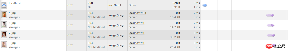
我们可以发现图片0和4没有被下载,0是没有用到的CSS,4是父容器的display被设为none的情况,这两种情况下的CSS引用的图片是不会被加载的,而父容器设置visibility属性为hidden仍然会加载图片,不要搞混了
相关推荐:
即将来到: CSS Feature Queries (CSS特性查询)_html/css_WEB-ITnose
CSS SpecificityCSS特性、权重、优先级-CSS specificity规则、_html/css_WEB-ITnose
The above is the detailed content of A brief discussion on the sharing of CSS features that are easily overlooked. For more information, please follow other related articles on the PHP Chinese website!


![[Web front-end] Node.js quick start](https://img.php.cn/upload/course/000/000/067/662b5d34ba7c0227.png)


