
Flexbox is a powerful and flexible layout. This article mainly introduces the relevant information on the specific usage of CSS Flexbox. The editor thinks it is quite good, so I will share it with you now and give it as a reference. Let’s follow the editor to take a look, I hope it can help everyone.
1. Introduction to Flexbox
The Flexbox layout (Flexible Box) module is designed to provide a more efficient way to formulate, adjust and distribute the layout of items in a container, even if Their size is unknown or dynamic. A simple understanding is that it can automatically adjust, calculate the size of elements in the container space, and perform effective and reasonable layout.
There are two important concepts in Flexbox layout: Flex container and Flex project.
The Flex container contains multiple Flex projects. By setting the specific properties of the Flex container and Flex projects, a variety of flexible layout styles can be achieved.
Using Flexbox
The use of Flexbox is very simple. You only need to set display:flex or display:inline-flex on the Flex container, and you can use Flexbox layout specifically. .
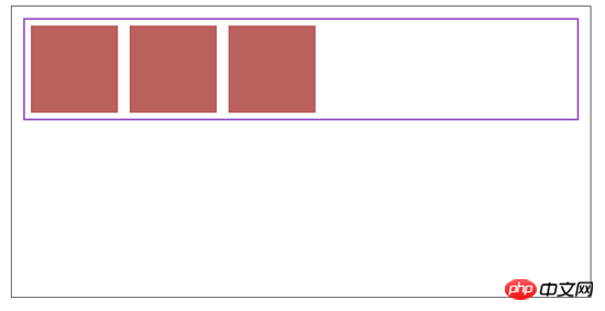
The following is a specific example:
html code
<p class="container">
        <p class="wrap">
            <p></p>
            <p></p>
            <p></p>
        </p>
</p>css code
.container {
    width: 70%;
    height: 500px;
    margin:20px auto;
    border: 1px solid black;
}
.container .wrap {
    display: flex;
    border: 3px solid #a448cf;
    margin:20px;
    width:80%;
    height:80%
}
.container .wrap p {
    width:150px;
    height:150px;
    background-color: #c75a5a;
    margin:10px;
}
2. Flex container
First introduce the specific properties and specific usage of Flex container.
| Attribute | Value | Meaning |
|---|---|---|
| flex- direction | row || column || row-reverse || column-reverse | Control the arrangement direction of Flex items along the main axis (Main Axis) |
| flex-wrap | wrap || nowrap || wrap-reverse | Control whether Flex items are displayed in new lines |
| flex-flow | row wrap|| row nowrap || column wrap || column nowrap etc. | The combined shorthand property of flex-direction and flex-wrap properties |
| justify-content | flex-start || flex-end || center || space-between || space-around | Control the alignment of Flex items on the Main-Axis |
| align-items | flex-start || flex-end || center || stretch || baseline | Control the alignment of Flex items in Cross-Axis |
| align-content | flex-start || flex-end || center || stretch | For multi-line Flex container, control Flex project in Cross-Axis alignment |
1. flex-direction
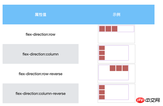
The flex-direction property controls the arrangement direction of Flex items along the main axis (Main Axis), which can be rows (horizontal), columns (vertical) or The reverse of rows and columns.
By default, the attribute value of flex-direction is row, and the specific arrangement is as follows:

But when the attribute value of flex-direction is column, the corresponding The main axis should be vertically downward.
Specific application examples are as follows:
2. flex-wrap
The flex-wrap attribute controls the Flex project Whether to wrap the line. By default, the Flex container will contain all Flex items in one line, because the default value of the flex-wrap property is nowrap, which means no line wrapping.
Specific application examples are as follows:
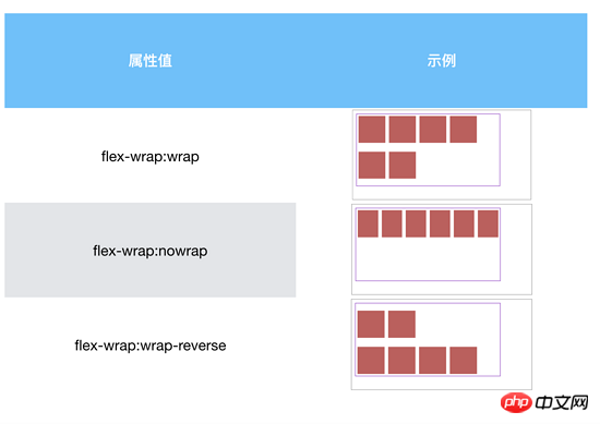
Wrap-reverse means that Flex projects are arranged in multiple rows in the container, but the direction is reversed.
3. flex-flow
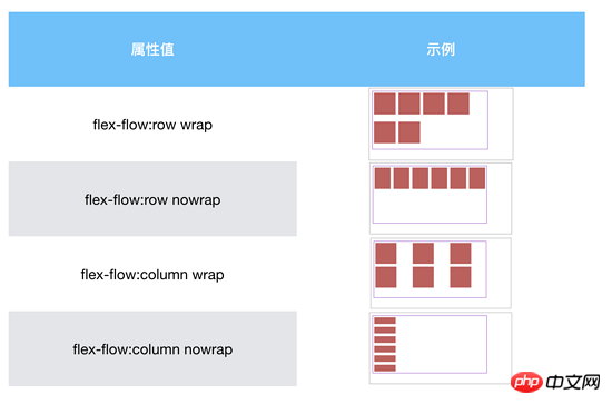
flex-flow is a shorthand property for the two properties of flex-direction and flex-wrap.
No further explanation, just look at the following example:
4. justify-content
justify The -content attribute controls the alignment of the Flex item on the entire Main-Axis.
The default attribute value of justify-content is flex-start.
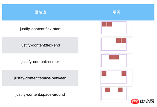
space-between aligns both ends of the flex item.
space-around allows each flex item to have the same space
5. align-items
align-items controls the flex items in Cross- Axis alignment.
The default value of align-items is stretch, which makes all Flex items the same height as the Flex container and spread out.
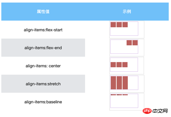
baseline
Align all flex items along their own baseline on the Cross-Axis.
Stretch and baseline will behave as above unless specific height values are set, otherwise a fixed height will be displayed.
The align-content attribute has the same effect as align-items, but this attribute only applies to multiple lines and is invalid for a single line.
3. Flex project
Next, we will continue to introduce the specific properties and usage of the Flex project.
| Attribute | Value | Meaning |
|---|---|---|
| order | Value | Reorder according to order value. From bottom to top. |
| flex-grow | 0 || positive number | Control how to enlarge Flex items if there is extra space in the container |
| flex-shrink | 0 || positive number | Control how Flex items shrink when there is no extra space in the container |
| flex- basis | auto || % || em || rem || px | Specify the initial size of the Flex project |
| align-self | auto || flex-start || flex-end || center || baseline || stretch | Control the alignment of a single Flex item in Cross-Axis |
1. order
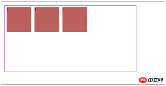
order allows Flex items to be reordered in a Flex container. The default value of the property is 0.
Sort according to the size of the order value, sorting from low to high.
By default, the sorting is as follows:

When block 1 is set to order:1, the sorting is as follows:
If multiple Flex items have the same order value, the Flex items are reordered based on the position of the HTML source file.
As shown below, set both block 1 and block 2 to order:1.

2. flex-grow and flex-shrink
The flex-grow and flex-shrink properties control the size of the Flex item in the container How to enlarge (expand) the extra space, and how to shrink it when there is no extra space.
The values of flex-grow and flex-shrink can be 0 or any positive number greater than 0.
By default, the flex-grow attribute value is set to 0, which means that the Flex item will not grow to fill the available space of the Flex container.
By default, the flex-shrink attribute value is set to 1, which means that the Flex item will shrink to fit the screen width.
If the value of flex-grow is set to 1, as shown below:
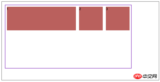
When multiple flex items are in one line, that is, no line breaks, Setting different flex-grow and flex-shrink values will result in different space allocation.
flex-grow
Add all the grow values set for each item to obtain the available space, and then divide it by the total grow value to obtain the unit allocated space.
According to the grow setting of each item, if the grow of an item is 6, then the size of the item on the main axis needs to be extended by 6*the size of the allocated space.
flex-shrink
First add up all the items according to flex-shrink * item-size to get a weighted sum, and then calculate the size of each item Shrink ratio: shrink ratio = flex-shrink * item-size / the previous sum. Finally, each item is subtracted from the shrink ratio * negative available space.
When a flex item has min-width(height) and max-width(height), the corresponding item must consider the upper and lower limit values, and allocate the remaining stretch value to other items.
3. flex-basis
flex-basis specifies the initial size of the flex element in the main axis direction, which determines the width or height of the flex item content (depending on direction of the main axis).
By default, the initial width of the Flex item is determined by the default value of flex-basis, that is: flex-basis: auto. Flex item width is automatically calculated based on the amount of content.
flex-basis and width/height have a certain priority. The specific rules are as follows:
flex-basis has a higher priority than width/height non-auto
width/height auto priority is equal to flex-basis, taking the maximum value of the two.
4. align-self
align-self controls the alignment of individual items along the Cross-Axis.
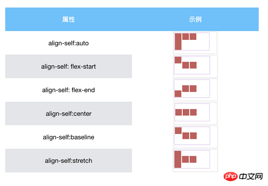
In addition to auto, the flex container in the above example sets align-itmes: center.
auto sets the value of the target flex item to the align-items value of the parent element, or to stretch if the element has no parent element. In the above example align-items: stretch.
Related recommendations:
Example sharing of flexible layout using flexbox
Learning Flexbox Experience Summary
The above is the detailed content of Detailed examples of the specific usage of CSS Flexbox. For more information, please follow other related articles on the PHP Chinese website!


