


The mouse-up icon rotation effect is often used in corporate projects, especially the top navigation bar. This article mainly introduces CSS to implement the mouse-up icon rotation effect. Friends who need it can refer to it. I hope it can help everyone. .

#The next step is to use css to achieve the icon rotation effect when the mouse moves up.
<!DOCTYPE html>
<html>
<head lang="en">
    <meta charset="UTF-8">
    <title></title>
    <style>
        p,img,body{
            margin: 0;
            padding: 0;
        }
        .box{
            height: 150px;
            width:300px;
            background: #1b7b80;
            margin: 0 auto;
            padding: 20px;
        }
        .box:hover img{
            transform: rotate(180deg);
            -webkit-transform: rotate(180deg);
            -moz-transform: rotate(180deg);
            -o-transform: rotate(180deg);
            -ms-transform: rotate(180deg);
        }
        img{
            margin: 0 auto;
            display: block;
            transition: all 0.2s ease-in-out;
            -webkit-transition: all 0.2s ease-in-out;
            -moz-transition: all 0.2s ease-in-out;
            -o-transition: all 0.2s ease-in-out;
        }
    </style>
</head>
<body>
    <p class="box">
        <img src="img/down.png" alt=""/>
    </p>
</body>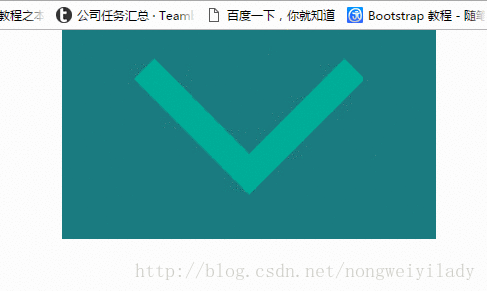
</html>A box is placed here, and a picture is placed in the box. In order to see it more clearly, a larger picture is placed here. The effect to be achieved now is that when the mouse moves over the .box box, the icon img will rotate 180 degrees. In
style, the key is the setting of img and .box:hover img. First, we need to set the transition attribute for img. The attribute here specifies the animation method and duration. Then set the .box to rotate the img 180 degrees when the mouse moves up: hover:
transform: rotate(180deg);
The settings like -webkit- below are mainly for compatibility with various manufacturers set by your browser.
The effect obtained is shown in the figure below:
Related recommendations:
How to make the entire line (tr) change color when the mouse is over in HTML
How to use CSS to make the picture gray when the mouse is hovering over it
htmlThe event attribute onclick triggered by a mouse click on an element
The above is the detailed content of Detailed explanation of how to achieve the rotation effect of icons when moving the mouse up using CSS. For more information, please follow other related articles on the PHP Chinese website!


![[Web front-end] Node.js quick start](https://img.php.cn/upload/course/000/000/067/662b5d34ba7c0227.png)


