


This article mainly introduces a brief discussion of CSS double flying wing layout and Holy Grail layout. The editor thinks it is quite good. Now I will share it with you and give you a reference. Let’s follow the editor to take a look, I hope it can help everyone.
Double Flying Wing Layout and Holy Grail Layout are both ways to achieve an adaptive three-column layout with a fixed middle on both sides. I have recently been sorting out notes on how to implement a three-column layout, and decided to pull out an article to remember these two. Classic layout.
1. Holy Grail Layout
Floating, negative margins, relative positioning, no additional tags
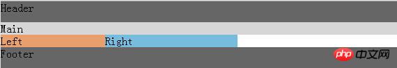
Rendering

DOM structure:
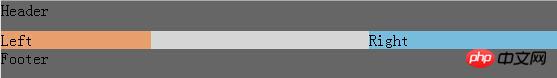
Header
Main
Left
Right
Style:
Style change process of left, middle and right parts
1. The middle part needs to change according to the change of browser width, so 100% is used. Here set *left The middle right floats to the left. Because the middle is 100%, the left and right layers have no position at all
.left{ background: #E79F6D; width:150px; float:left; } .main{ background: #D6D6D6; width:100%; float:left; } .right{ background: #77BBDD; width:190px; float:left; }
2. After reducing the margin of the left layer by 150, I found that the left layer went up. Because it was so negative that there was no room for the window, I could only move it up
.left{ background: #E79F6D; width:150px; float:left; margin-left:-150px; }
3. According to the second step, it can be concluded that it only needs to move the width of the window to reach the leftmost position. Use negative margins to position the left and right columns
.left{ background: #E79F6D; width:150px; float:left; margin-left:-100%; } .right{ background: #77BBDD; width:190px; float:left; margin-left:-190px; }
#4. However, the problem came, the middle was blocked by the left and right sides, so I had to add padding to the outer layer
.bd{ padding-left:150px; padding-right:190px; }

5. But after adding it, the left and right columns were also indented, so I used the relative positioning method to move themselves out relative to themselves to get the final result
.left{ background: #E79F6D; width:150px; float:left; margin-left:-100%; position: relative; left:-150px; } .right{ background: #77BBDD; width:190px; float:left; margin-left:-190px; position:relative; right:-190px; }

2. Double flying wing layout
Without adding additional tags Next, the Holy Grail layout is already perfect. The Holy Grail layout uses relative positioning. In the future, the layout will have limitations, and there are many places to change the width control. So is there any other method that is more concise and convenient?
Under Taobao UED discussion, adding one more p eliminates the need for relative layout and only uses floating and negative margins. This is what we call the double flying wing layout.
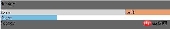
DOM structure: A p
Header
Main
*Left
Right
body{ padding:0; margin:0 } .header,.footer{ width:100%; background:#666; height:30px;clear:both; } .bd{ /*padding-left:150px;*/ /*padding-right:190px;*/ } .left{ background: #E79F6D; width:150px; float:left; margin-left:-100%; /*position: relative;*/ /*left:-150px;*/ } .main{ background: #D6D6D6; width:100%; float:left; } .right{ background: #77BBDD; width:190px; float:left; margin-left:-190px; /*position:relative;*/ /*right:-190px;*/ } .inner{ margin-left:150px; margin-right:190px; }
3. Double flying wing layout and Holy Grail layout The difference between
The solution to the problem of Holy Grail layout and Double Flying Wing layout is the same in the first half, that is:Detailed explanation of the transformation and use of double flying wings layout
Detailed explanation of the Holy Grail layout and double flying wing layout of CSS layout Example,
About Holy Grail layout and double flying wing layout
The above is the detailed content of What is css double flying wing layout and holy grail layout. For more information, please follow other related articles on the PHP Chinese website!


![[Web front-end] Node.js quick start](https://img.php.cn/upload/course/000/000/067/662b5d34ba7c0227.png)


