Holy Grail Layout
html:
center
left
right
css:
#container { padding: 0 100px 0 200px;/*左宽度为200px 右边宽度为100px*/ } .col { float: left; position: relative; height: 300px; } #center { width: 100%; background: #eee; } #left { width: 200px; background: blue; margin-left: -100%; right: 200px; } #right { width: 100px; background: red; margin-right: -100px; }
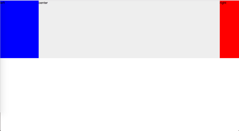
The effect is as shown:

Double Flying Wing Layout
html:
center
left
right
css:
.col { float: left; height: 300px; } #center { width: 100%; background: #eee; } #left { width: 200px; background: blue; margin-left: -100%; } #right { width: 100px; background: red; margin-left: -100px; } #center .wrap { margin: 0 100px 0 200px; }
The effect is as shown:

The difference between the two layouts
These two layouts implement fixed width on both sides, adaptive middle column, and the middle column is placed at the front for priority rendering.
The difference is that the double flying wing layout creates an extra wrapped p, removes relative positioning, and writes less css.
Personally, I think the Holy Grail layout structure is more concise. It depends on everyone’s own choice in daily work.
For more related articles about Holy Grail layout and Double Flying Wing layout, please pay attention to the PHP Chinese website!


