
Prototype design is inseparable from components. If the prototype is a house, then the components are cement and bricks. This article will introduce you to the eight most commonly used interactive components. Open Mockplus and try it now!
1. Pop-up menu
Pop-up menu is the most commonly used component in prototype design. Many components are used similarly to it. Proficient use of pop-up menu will bring you great help. . Next, let's take a look at how to use pop-up menus from a practical case.
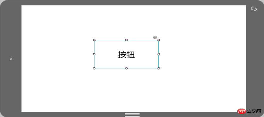
1. Drag out a component at will. Here we take the button component in Mockplus as an example.
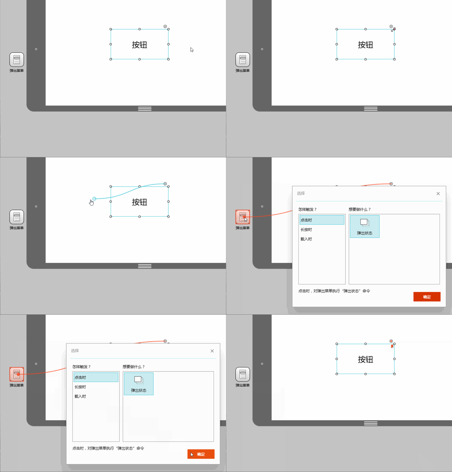
2. Drag out the pop-up menu component and connect the link point in the upper right corner of the button to the menu component.
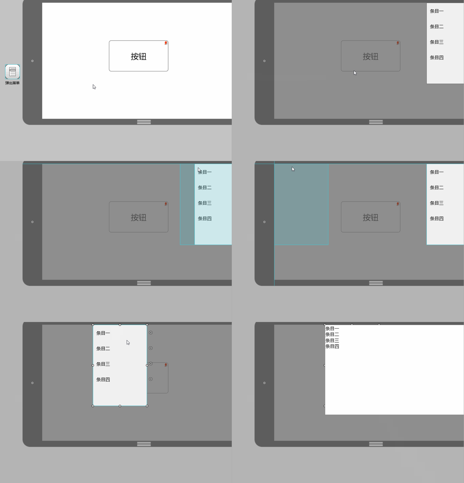
3. Double-click the pop-up menu to edit the menu location and content.
2. Pop-up windows
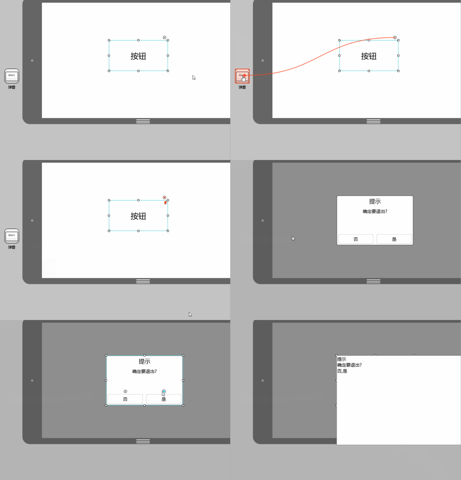
Operations of pop-up windows and pop-up panels The steps are basically the same. The difference is that the four menu items of the pop-up menu can all be set for interactive actions, while the pop-up window only has two options of "Yes" and "No" for setting interactive actions. At the same time, the format of the pop-up window content is also the same as The popup panel is slightly different.
 3. Drawer
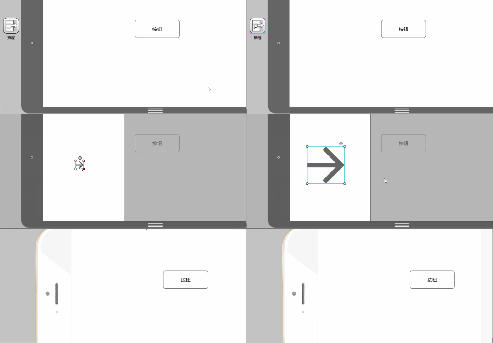
The drawer is a commonly used container component , which is characterized by high encapsulation, high adjustability, and high accommodation. In other words, you don’t need to design the details of the drawer yourself. You only need to set it up in a few simple settings to create a drawer that slides out in a variety of ways and can be loaded in. Drawers for most components.
 After connecting the link point of the button to the drawer, double-click the drawer icon to add the component.
 4. Picture carousel
Number of picture carousel components supported The random rotation and display of pictures is also easy to operate. First drag the picture carousel component into the workspace and double-click to add pictures.
5. Panel

The panel is actually a component that can be placed container.
Drag the capacity panel to the required place, adjust the size, double-click to enter the editing mode, and drag in the required components. Note that components outside the panel boundaries will not be displayed. You will find that: because it is a container, the panel has a border, and the part of the subcomponent that exceeds the border will be "cut off". Another interesting thing is: unlike "Group", when setting up interaction, you can use sub-components in the panel as the interaction target, but "Group" cannot, you can only set the entire group as the interaction target, because a group is a group of several components. After being formed and grouped, they are regarded as a whole.
6. Pop-up panel
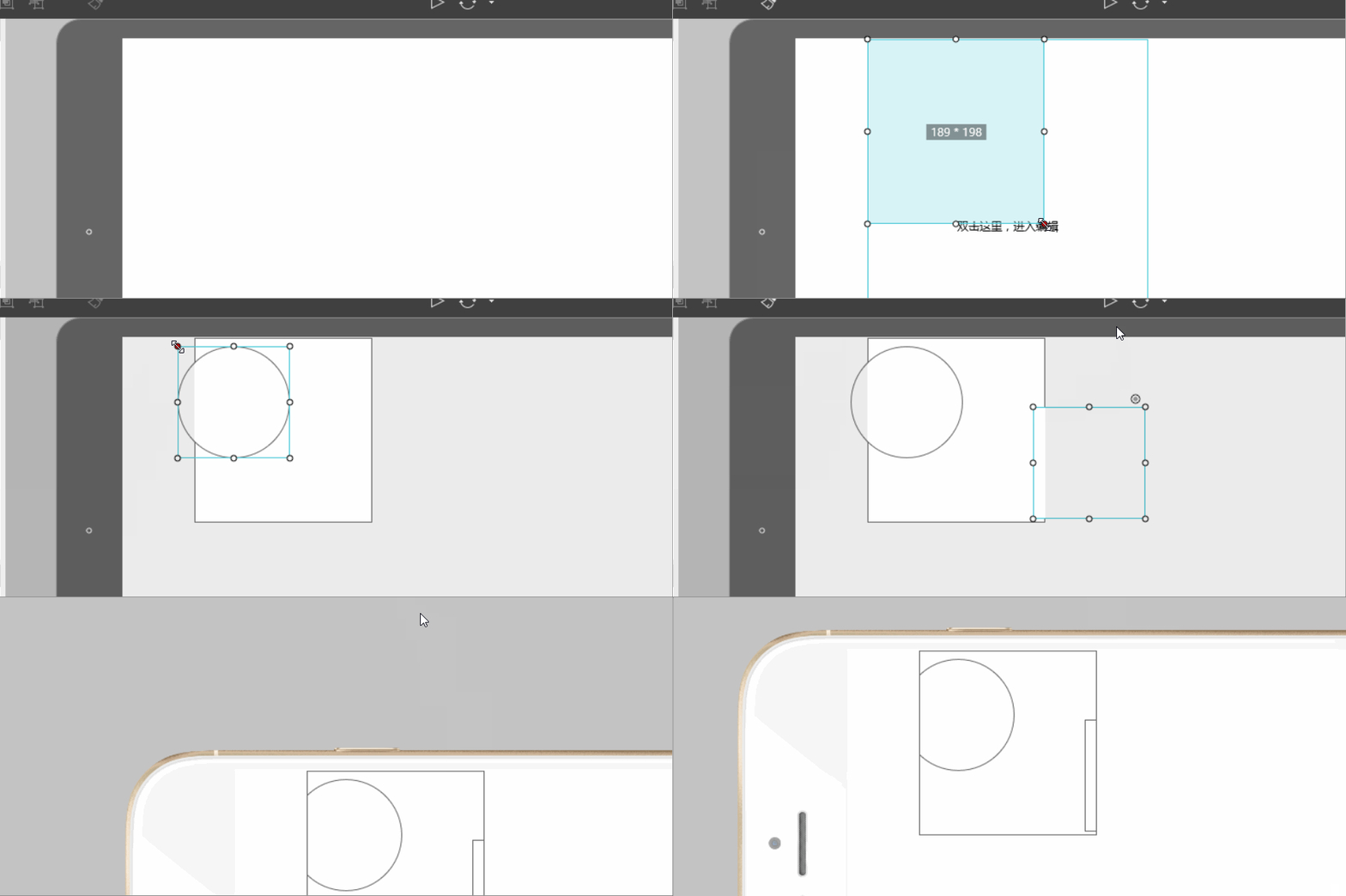
The pop-up panel is the most flexible interaction components. Drag a pop-up panel and double-click to open it. You will find that there is nothing in it, but using it, we can create the required pop-up windows, message boxes, prompt boxes and many other interactive components.
7. Content Panel The content panel is mainly used to achieve quick switching of content. But it is generally not used alone. You can use it to cooperate with menu bars, lists, tabs and other components with multi-select properties to complete content switching.

First set up three layers in the content panel and connect them to the three target pages. Then connect the links on the tab to the three layers one by one, and the content switching is completed.
8. Scroll Area
 When the screen size is not enough to accommodate us When we need to display more content, we can use the scroll area component to display more content in a limited space.
Drag the scroll area component into the workspace, adjust the size, and then double-click to enter editing mode. In the editing mode, drag in the components that need to be added to the scroll area. Click "+" to expand the size of the scroll area. Click "-" to shrink the size of the scroll area. If you press the Ctrl key at the same time, the expansion or contraction can be accelerated.
Interaction is a very important part of prototype design. Flexible use of the above eight interactive components is enough to meet your commonly used interaction designs! In addition to interactive components, there are nearly two hundred encapsulated components in Mockplus. Try it now!
The above is the detailed content of Easily master commonly used interactive components. For more information, please follow other related articles on the PHP Chinese website!


