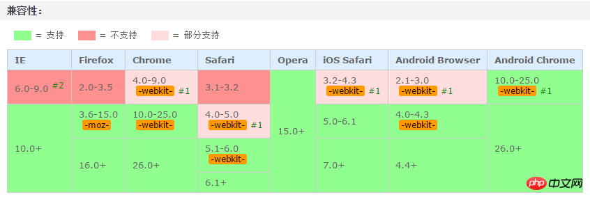
This article mainly shares with you the relevant information on using pure CSS3 to achieve the effect of text looping to the right. Due to compatibility issues, it is often used on mobile terminals, and the effect achieved is very good. The article gives details For the introduction and sample code, friends who need it can take a look below.
This article introduces the relevant information on using pure CSS3 to achieve the effect of text looping to the right. I won’t say much below. Let’s take a look at the sample code first.
Sample code:
<!DOCTYPE html>
<html lang="en">
    <head>
        <meta charset="utf-8">
        <style>
            .shadow {
                text-align: center;
                /* 背景颜色线性渐变 */
                    /* 老式写法 */
                        /* linear为线性渐变,也可以用下面的那种写法。left top,right top指的是渐变方向,左上到右上 */
                        /* color-stop函数,第一个表示渐变的位置,0为起点,0.5为中点,1为结束点;第二个表示该点的颜色。所以本次渐变为两边灰色,中间渐白色 */
                background: -webkit-gradient(linear, left top, right top, color-stop(0, #4d4d4d), color-stop(.4, #4d4d4d), color-stop(.5, white), color-stop(.6, #4d4d4d), color-stop(1, #4d4d4d));
                    /* 新式写法 */
                /* background: -webkit-linear-gradient(left top, right top, color-stop(0, #4d4d4d), color-stop(.4, #4d4d4d), color-stop(.5, white), color-stop(.6, #4d4d4d), color-stop(1, #4d4d4d)); */

                /* 设置为text,意思是把文本内容之外的背景给裁剪掉 */
                -webkit-background-clip: text;
                /* 设置对象中的文字填充颜色 这里设置为透明 */
                -webkit-text-fill-color: transparent;
                /* 每隔2秒调用下面的CSS3动画 infinite属性为循环执行animate */
                -webkit-animation: animate 1.5s infinite;
            }
            /* 兼容写法,要放在@keyframes前面 */
            @-webkit-keyframes animate {
                /* 背景从-100px的水平位置,移动到+100px的水平位置。如果要移动Y轴的,设置第二个数值 */
                from {background-position: -100px;}
                to {background-position: 100px;}
            }
            @keyframes animate {
                from {background-position: -100px;}
                to {background-position: 100px;}
            }
        </style>
    </head>
    <body>
        <p class="shadow">文字向右闪过效果</p>
    </body>
</html>Here is the rendering:

This white gradient flash effect is very easy and convenient to make with CSS3. The only disadvantage is probably the compatibility issue. So now it is generally used on mobile terminals.

Coming, coming! (Knocking on the blackboard) I think the code comments are relatively clear, so just draw the key points! ! !
1. Infinite 2. -webkit-text-fill-color: transparent; The text fill color is transparent. If it is not set, the white gradient effect will not be visible!
3. -webkit-background-clip: text; Cut out the background outside the text content. If you don’t add it, the text will not be displayed and only the gradient color will be displayed!
4. Color-stop() The color-stop function of the gradient represents the position and color of the gradient. It is it. We can make the gradient wherever we want, and then let it move, and a flash will appear. A flash of effect!
Finally, let’s talk about the idea:First, set a gradient background color with white in the middle and gray on both sides;
Secondly, set the text fill color Be transparent (only the white background can be seen);
Then, crop out the background color outside the text (only display the text);
Finally, use @keyframes to make the background white The loop executes from left to right.
The above is the detailed content of How to achieve the effect of text looping to the right in CSS3 and share the example code that can be used on mobile terminals. For more information, please follow other related articles on the PHP Chinese website!


