
CSS is the abbreviation of Cascading Style Sheets, which is called cascading style sheets in Chinese. It is used to control the performance of web page data and can separate the performance of web pages from data content.
1. Three ways to introduce css
2. CSS selector
3. Common CSS properties
4. Box model
5. Document flow and floating
1 Document flow
2 Add float
3 Clear float
4 Positioning
1. Inline
Inline style sets the CSS style in the tag's style attribute. This method does not reflect the advantages of CSS and is not recommended.
2. Embedded
Embedded is to write CSS styles concentratedly on the tag pairs of the web page
label is centered. The format is as follows:
<head>
<style type="text/css">
     ...此处写CSS样式
</style>

</head>
3. Link type
Introduce a .css file into the HTML file
<link href="mystyle.css?1.1.11" rel="stylesheet" type="text/css"/>
Note:
The import type will be loaded after the entire web page is loaded. CSS file, so this leads to a problem. If the web page is relatively large, an unstyled page will appear for a while. After a flash, the style of the web page will appear. This is an inherent flaw of imports. The difference between using the link type and the import type is that it will load the CSS file before loading the main body of the web page file, so the displayed web page will have a style effect from the beginning. It will not display the unstyled web page first like the import type. , and then display the styled web page. This is the advantage of the link type.
The "selector" specifies the object of the "style" in {}, that is, which elements in the web page the "style" acts on
1 Basic selector: . to Matches all elements using the E tag p { color: green; }
.info and E.info:
class selector, matches all elements containing info in the class attribute.info { background:#ff0; } p.info { background:blue; }id selectors, match all elements whose id attribute is equal to footer
#info { background:#ff0; } p#info { background:#ff0; }
E,F
div,p { color:#f00; }
E F
Descendant element selector
#nav li { display:inline; } li a { font-weight:bold; }
E > FSub-element selector, matches all sub-elements F of the E element Level element F
p + p { color:#f00; }
Note the nesting rules:
Block-level elements can contain inline elements or certain block-level elements, but inline elements cannot contain Block-level elements can only contain other inline elements.
There are several special block-level elements that can only contain inline elements and cannot contain block-level elements. For example, h1, h2, h3, h4, h5, h6, p, dt, li can contain div
block-level elements juxtaposed with block-level elements, and inline elements juxtaposed with inline elements.
/*错误的*/
<div><h2></h2><span></span></div>)
E[att]            匹配所有具有att属性的E元素,不考虑它的值。

                   (注意:E在此处可以省略,比如“[cheacked]”。以下同。)                 p[title] { color:#f00; }


E[att=val]     匹配所有att属性等于“val”的E元素                                                   div[class=”error”] { color:#f00; }


E[att~=val]    匹配所有att属性具有多个空格分隔的值、其中一个值等于“val”的E元素      td[class~=”name”] { color:#f00; }


E[att|=val]    匹配所有att属性具有多个连字号分隔(hyphen-separated)的值、其中一个值以“val”开头的E元素,主要用于lang属性,

                  比如“en”、“en-us”、“en-gb”等等                                                    p[lang|=en] { color:#f00; }

E[attr^=val]    匹配属性值以指定值开头的每个元素                       div[class^="test"]{background:#ffff00;}

E[attr$=val]    匹配属性值以指定值结尾的每个元素                       div[class$="test"]{background:#ffff00;}

E[attr*=val] 匹配属性值中包含指定值的每个元素 div[class*="test"]{background:#ffff00;}a:link(没有接触过的链接),用于定义了链接的常规状态。
a:hover(鼠标放在链接上的状态),用于产生视觉效果。
a:visited(访问过的链接),用于阅读文章,能清楚的判断已经访问过的链接。
a:active(在链接上按下鼠标时的状态),用于表现鼠标按下时的链接状态。
/*伪类选择器 : 伪类指的是标签的不同状态:
a ==> 点过状态 没有点过的状态 鼠标悬浮状态 激活状态*/
a:link {color: #FF0000} /* 未访问的链接 */
a:visited {color: #00FF00} /* 已访问的链接 */
a:hover {color: #FF00FF} /* 鼠标移动到链接上 */
a:active {color: #0000FF} /* 选定的链接 */ 格式: 标签:伪类名称{ css代码; }
p:before 在每个 <p> 元素的内容之前插入内容 p:before{content:"hello";color:red}
p:after 在每个 <p> 元素的内容之前插入内容 p:after{ content:"hello";color:red}<div style="color:blueviolet">ppppp</div> <div style="color:#ffee33">ppppp</div> <div style="color:rgb(255,0,0)">ppppp</div> <div style="color:rgba(255,0,0,0.5)">ppppp</div>
font-family:'Helvetica,Arial,"Courier New"'

font-size: 20px/em/larger
default size = 16px
em = pixels/16

font-style:ilatlic/normal/oblique

font-weight: lighter/bold/border/100-900

<h1 style="font-style: oblique">oblique</h1>
background-color: cornflowerblue
background-image: url('1.jpg');
background-repeat: no-repeat;(repeat:平铺满)
background-position: right top(20px 20px);(横向:left center right)(纵向:top center bottom)
简写:
<body style="background: 20px 20px no-repeat #ff4 url('1.jpg')">
<div style="width: 300px;height: 300px;background: 20px 20px no-repeat #ff4 url('1.jpg')">font-size: 10px;
text-align: center;横向排列
line-height: 200px;文本行高 通俗的讲,文字高度加上文字上下的空白区域的高度 50%:基于字体大小的百分比
p { width: 200px;
height: 200px;
text-align: center;
background-color: aquamarine;
line-height: 200px; }
vertical-align:top,middle,bottom/baseline,sub,super,-10px
text-decoration:none/inherit/underline/overline/line-though
text-indent: 150px; 首行缩进,50%:基于父元素(weight)的百分比
text-shadow:阴影
letter-spacing: 10px;
word-spacing: 20px;
direction: rtl;
text-transform: capitalize;border-style: solid; border-color: chartreuse; border-width: 20px; 简写 border: 30px rebeccapurple solid;
ul,ol{ list-style: decimal-leading-zero;

    list-style: none; list-style: circle;

    list-style: upper-alpha;

list-style: disc; }none block inline

Note 1: The body is also a box
The border will be positioned in the upper left corner of the browser window by default, but it is not close to the browser The border of the window, this is because the body itself is also a box (there is also html in the outer layer).body{
border: 1px solid;
background-color: cadetblue;
}
body{
margin: 0;
}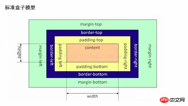 Note 2: margin collapse (border collapse or border overlap)
The overlap of outer margins only occurs at the top and bottom of ordinary flow documents Between margins, this seemingly strange rule actually has practical significance.
When we arrange a series of regular block-level elements (such as paragraph P) up and down, then due to the overlapping margins between the block elements, there will be no double distance between paragraphs.
Brother div: The margin-bottom of the upper div and the margin-top of the lower div will collapse, that is, the maximum value of the upper and lower margins will be taken as the display value
Parent and child div: If the parent There is no border, padding, or inline content in the first-level div. The margin of the child-level div will keep looking upward until you find a tag that includes one of border, padding, and inline content. Then press this div to perform margin
>> ;>Solution:border:1px solid transparent padding:1px over-flow:hidden;
文档流确切的说应该是文档流模型的机制,html的布局机制就是用文档流模型的,即块元素(block)在页面中独占一行、自上而下排列,内联元素(inline)不独占一行。
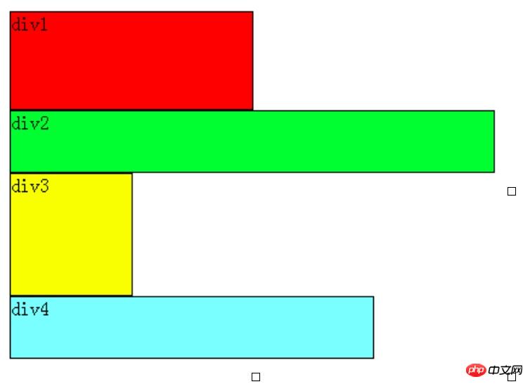 

可以看出,即使div1的宽度很小,页面中一行可以容下div1和div2,div2也不会排在div1后边,因为div元素是独占一行的。注意,以上这些理论,是指标准流中的div。
文档流也可以理解为文档的输出顺序,标准流是我们通常看到的由左到右、由上而下的输出形式,在网页中每个元素都是按照这个顺序进行排序和显示的。float和position两个属性可以将元素从文档流脱离出来显示。
无论多么复杂的布局,其基本出发点均是:“如何在一行显示多个div元素”。浮动可以理解为让某个div元素脱离标准流,漂浮在标准流之上,和标准流不是一个层次。
1 浮动一个div元素
例如,假设上图中的div2浮动,那么它将脱离标准流,但div1、div3、div4仍然在标准流当中,所以div3会自动向上移动,占据div2的位置,重新组成一个流。如图: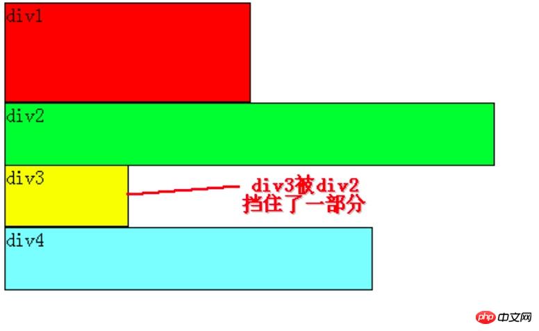 

从图中可以看出,由于对div2设置浮动,因此它不再属于标准流,div3自动上移顶替div2的位置,div1、div3、div4依次排列,成为一个新的流。又因为浮动是漂浮在标准流之上的,因此div2挡住了一部分div3,div3看起来变“矮”了
这里div2用的是左浮动(float:left;),可以理解为漂浮起来后靠左排列,右浮动(float:right;)当然就是靠右排列。这里的靠左、靠右是说页面的左、右边缘。
如果我们把div2采用右浮动,会是如下效果: 

此时div2靠页面右边缘排列,不再遮挡div3,读者可以清晰的看到上面所讲的div1、div3、div4组成的流。
2 浮动多个div元素
把div2和div3都加上左浮动,效果如图: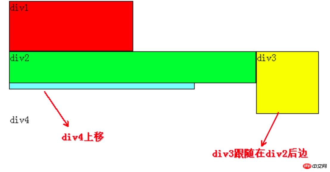 

同理,由于div2、div3浮动,它们不再属于标准流,因此div4会自动上移,与div1组成一个“新”标准流,而浮动是漂浮在标准流之上,因此div2又挡住了div4。
咳咳,到重点了,当同时对div2、div3设置浮动之后,div3会跟随在div2之后,不知道读者有没有发现,一直到现在,div2在每个例子中都是浮动的,但并没有跟随到div1之后。因此,我们可以得出一个重要结论:
假如某个div元素A是浮动的,如果A元素上一个元素也是浮动的,那么A元素会跟随在上一个元素的后边(如果一行放不下这两个元素,那么A元素会被挤到下一行);
如果A元素上一个元素是标准流中的元素,那么A的相对垂直位置不会改变,也就是说A的顶部总是和上一个元素的底部对齐。
div的顺序是HTML代码中div的顺序决定的。
靠近页面边缘的一端是前,远离页面边缘的一端是后。
3 再举几个例子
假如我们把div2、div3、div4都设置成左浮动,效果如下:
 

根据上边的结论:先从div4开始分析,它发现上边的元素div3是浮动的,所以div4会跟随在div3之后;div3发现上边的元素div2也是浮动的,所以div3会跟随在div2之后;而div2发现上边的元素div1是标准流中的元素,因此div2的相对垂直位置不变,顶部仍然和div1元素的底部对齐。由于是左浮动,左边靠近页面边缘,所以左边是前,因此div2在最左边。
假如把div2、div3、div4都设置成右浮动,效果如下: 

道理和左浮动基本一样,只不过需要注意一下前后对应关系。由于是右浮动,因此右边靠近页面边缘,所以右边是前,因此div2在最右边。
假如我们把div2、div4左浮动,效果图如下: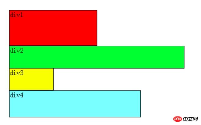 

Still based on the conclusion, div2 and div4 are floating and out of the standard flow, so div3 will automatically move up and form a standard flow with div1. div2 finds that the previous element div1 is an element in the standard flow, so the relative vertical position of div2 remains unchanged and is aligned with the bottom of div1. div4 finds that the previous element div3 is an element in the standard flow, so the top of div4 is aligned with the bottom of div3, and this is always true, because as can be seen from the picture, after div3 moves up, div4 also moves up, and div4 always moves up. It is to ensure that the top of itself is aligned with the bottom of the previous element div3 (an element in the standard flow).
So far, we have mastered adding floats, but there is also clearing floats. Clearing floats is very easy to understand based on the above.
Before the elements are floated, that is, in the standard flow, they are arranged vertically, and after floating they can be understood as horizontally arranged.
Clearing floats can be understood as breaking the horizontal arrangement.
The keyword for clearing floats is clear, which is defined as follows:
none: Default value. Floating objects are allowed on both sides
left : Floating objects are not allowed on the left side
right : Floating objects are not allowed on the right side
both : Floating objects are not allowed
According to the above basis, If there are only two elements div1 and div2 on the page, they are both floating left. The scenario is as follows:  

At this time, both div1 and div2 are floating. According to the rules, div2 will follow div1. , but we still hope that div2 can be arranged below div1, just like div1 is not floating and div2 is left floating.
At this time, clear float (clear) is used. If it is purely based on the official definition, readers may try to write like this: add clear:right; to the CSS style of div1, which means that the right side of div1 is not allowed. There are floating elements. Since div2 is a floating element, it will automatically move down one line to meet the rules.
This understanding is incorrect and has no effect.
Regarding CSS clear float (clear), you must remember: this rule can only affect the element itself that uses clear, and cannot affect other elements.
We want div2 to move, but we use clear float in the CSS style of div1 element, trying to force div2 to move by clearing the floating element on the right side of div1 (clear:right;) Shifting, this is not feasible, because this clear float is called in div1, it can only affect div1, not div2.
Based on the conclusion, if you want div2 to move down, you must use float in the CSS style of div2. In this example, there is a floating element div1 on the left side of div2, so as long as you use clear:left; in the CSS style of div2 to specify that floating elements are not allowed to appear on the left side of the div2 element, div2 will be forced to move down one line.
So what if there are only two elements div1 and div2 on the page, and they are both right-floating? Readers should be able to guess the scene by themselves at this time, as follows:  

At this time, if we want div2 to move down below div1, and we want to move div2, we must add it to the CSS of div2 Floats are called in styles because floats can only affect the element on which they are called.
It can be seen that there is a floating element div1 on the right side of div2, then we can use clear:right; in the CSS style of div2 to specify that floating elements are not allowed to appear on the right side of div2, so that div2 is forced to move down. One row, arranged below div1.
1 static, default value static: No special positioning, the object follows the normal document flow.
Properties such as top, right, bottom, and left will not be applied.
2 position:relative
relative: The object follows the normal document flow, but will be offset in the normal document flow based on top, right, bottom, left and other attributes. And its cascading is defined through the z-index attribute.
absolute: The object is separated from the normal document flow and uses top, right, bottom, left and other attributes for absolute positioning. And its cascading is defined through the z-index attribute.
If you set position:relative, you can use top, bottom, left and right to move the element relative to the position where the element should appear in the document. That is, the element actually still occupies the original position in the document, but is visually moved relative to its original position in the document.
When position:absolute is specified, the element is out of the documentThat is, it no longer occupies a position in the document and can be positioned accurately according to the set top, bottom, left and right.
If an element is absolutely positioned, its reference is based on whether the element closest to itself is set to relative positioning. If it is set, it will be positioned as the element closest to itself. If not, it will look to its ancestor elements for relatively positioned elements. , until html is found.
3 position:fixed
Theoretically, an element set to fixed will be positioned at a specified coordinate in the browser window, and it will be fixed at this position regardless of whether the window is scrolled or not.
fixed: The object is separated from the normal document flow. Use top, right, bottom, left and other attributes to position the window as a reference point. When the scroll bar appears, the object will not scroll with it. And its cascading is defined through the z-index attribute.
Note: If an element is set with position:absolute | fixed;, the element cannot be set to float. This is a common knowledge point, because these are two different streams, one is a floating stream and the other is a "positioning stream". But relative does. Because the space it originally occupied still occupies the document flow.
The above is the detailed content of How can I learn CSS well?. For more information, please follow other related articles on the PHP Chinese website!


