


Achieve the loading effect as shown in the figure: 
html code:
提交订单中<span class="ani_dot">...</span>
css code:
.ani_dot {
    font-family: simsun;
}
:root .ani_dot { /* 这里使用Hack是因为IE6~IE8浏览器下, vertical-align解析不规范,值为bottom或其他会改变按钮的实际高度*/
    display: inline-block;
    width: 1.5em;
    vertical-align: bottom;
    overflow: hidden;
}
@-webkit-keyframes dot {
    0% { width: 0; margin-right: 1.5em; }
    33% { width: .5em; margin-right: 1em; }
    66% { width: 1em; margin-right: .5em; }
    100% { width: 1.5em; margin-right: 0;}
}
.ani_dot {
    -webkit-animation: dot 3s infinite step-start;
}

@keyframes dot {
    0% { width: 0; margin-right: 1.5em; }
    33% { width: .5em; margin-right: 1em; }
    66% { width: 1em; margin-right: .5em; }
    100% { width: 1.5em; margin-right: 0;}
}
.ani_dot {
    animation: dot 3s infinite step-start;
}The result shown in the figure is.
Note:
##1. In IE10+ and other browsers, the dot-dot animation disappears, while IE6-IE9 have ordinary dot-dot text.2: Detailed explanation of animation parametersSince the animation animation was used above, here is a detailed introduction to the parameters of this animation. IntroductionCSS animation (Animations) is simply to secretly change one or some of its CSS values within a certain frequency within a fixed animation time, thereby achieving visual transformation. Animation effects. Many aspects of Animations can be controlled, including animation running time, start value and end value, as well as animation pause and delay its start time, etc. Syntax2. The animate animation is continuous, but here we do it frame by frame, card by card. The effect is not so continuous, so use
step-start.3. The above code also uses the css3 selector
:root. :root is a hack for IE9+ and other modern browsers. Under IE6-7 and even IE8, the vertical-align:bottom analysis of inline-block horizontal elements is different from the inline level, which will cause the height to be stretched. Therefore, display: inline- The block needs to be hacked.
<single-animation> = <single-animation-name> || <time> || <single-animation-timing-function> || <time> || <single-animation-iteration-count> || <single-animation-direction> || <single-animation-fill-mode> || <single-animation-play-state> <' animation-name '>:检索或设置对象所应用的动画名称<' animation-duration '>:检索或设置对象动画的持续时间<' animation-timing-function '>:检索或设置对象动画的过渡类型<' animation-delay '>:检索或设置对象动画延迟的时间<' animation-iteration-count '>:检索或设置对象动画的循环次数<' animation-direction '>:检索或设置对象动画在循环中是否反向运动<' animation-fill-mode '>:检索或设置对象动画时间之外的状态<' animation-play-state '>:检索或设置对象动画的状态。w3c正考虑是否将该属性移除,因为动画的状态可以通过其它的方式实现,比如重设样式
]?): accepts two parameters step function. The first parameter must be a positive integer specifying the number of steps of the function. The value of the second parameter can be start or end, specifying the time point when the value of each step changes. The second parameter is optional and the default value is end.
animation-iteration-count
, which means the animation is played repeatedly in a loop. animation-direction
: Run in the opposite direction
: Animation First run normally and then run in the reverse direction, and continue to run alternately
: The animation first runs in the reverse direction and then runs in the forward direction, and continues to run alternately
: Default value. Do not set the state of the object outside of the animation
: Set the object state to the state at the end of the animation
: Set the object state to the state at the beginning of the animation
: Set the object state to the state at the end or beginning of the animation, before the animation starts Is the "from" or "0%" keyframe; after the animation is completed, it is the "to" or "100%" keyframe state.
. There is also a value paused: paused. <h2>三:animation动画实例</h2><h3><strong><em>实例一使用<code>from to:
p{
    width:100px;
    height:100px;
    background:red;
    position:relative;
    animation:mymove 5s infinite;
    -moz-animation:mymove 5s infinite; /*Firefox*/
    -webkit-animation:mymove 5s infinite; /*Safari and Chrome*/
}
@keyframes mymove{
    from {left:0px;}
    to {left:200px;}
}
@-moz-keyframes mymove { /*Firefox*/
    from {left:0px;}
    to {left:200px;}
}
@-webkit-keyframes mymove{ /*Safari and Chrome*/
    from {left:0px;}
    to {left:200px;}
}@keyframes myfirst{
0% {background: red; left:0px; top:0px;}
25% {background: yellow; left:200px; top:0px;}
50% {background: blue; left:200px; top:200px;}
75% {background: green; left:0px; top:200px;}
100% {background: red; left:0px; top:0px;}
}
@-moz-keyframes myfirst{ /* Firefox */
0% {background: red; left:0px; top:0px;}
25% {background: yellow; left:200px; top:0px;}
50% {background: blue; left:200px; top:200px;}
75% {background: green; left:0px; top:200px;}
100% {background: red; left:0px; top:0px;}
}
@-webkit-keyframes myfirst{ /* Safari 和 Chrome */
0% {background: red; left:0px; top:0px;}
25% {background: yellow; left:200px; top:0px;}
50% {background: blue; left:200px; top:200px;}
75% {background: green; left:0px; top:200px;}
100% {background: red; left:0px; top:0px;}
}
@-o-keyframes myfirst {/* Opera */
0% {background: red; left:0px; top:0px;}
25% {background: yellow; left:200px; top:0px;}
50% {background: blue; left:200px; top:200px;}
75% {background: green; left:0px; top:200px;}
100% {background: red; left:0px; top:0px;}
}只有webkit内核的浏览器才能看到相关3D动画效果。
实现效果如图所示: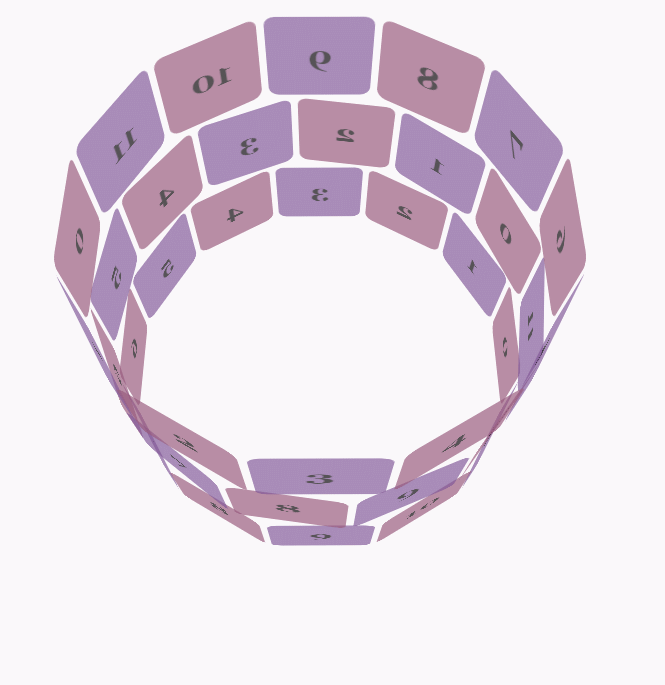
css代码:
body {
        font-family: 'Lucida Grande', Verdana, Arial;
        font-size: 12px;
      }

      #stage {
        margin: 150px auto;
        width: 600px;
        height: 400px;
        -webkit-perspective: 800;
      }

      #rotate {
        margin: 0 auto;
        width: 600px;
        height: 400px;
        -webkit-transform-style: preserve-3d;
        -webkit-animation-name: x-spin;
        -webkit-animation-duration: 7s;
        -webkit-animation-iteration-count: infinite;
        -webkit-animation-timing-function: linear;
      }

      .ring {
        margin: 0 auto;
        height: 110px;
        width: 600px;
        -webkit-transform-style: preserve-3d;
        -webkit-animation-iteration-count: infinite;
        -webkit-animation-timing-function: linear;
      }

      .ring > :nth-child(odd) {
        background-color: #995C7F;
      }

      .ring > :nth-child(even) {
        background-color: #835A99;
      }

      .poster {
        position: absolute;
        left: 250px;
        width: 100px;
        height: 100px;
        opacity: 0.7;
        color: rgba(0,0,0,0.9);
        -webkit-border-radius: 10px;
      }

      .poster > p {
        font-family: 'Georgia', serif;
        font-size: 36px;
        font-weight: bold;
        text-align: center;
        margin-top: 28px;
      }

      #ring-1 {
        -webkit-animation-name: y-spin;
        -webkit-animation-duration: 5s;
      }

      #ring-2 {
        -webkit-animation-name: back-y-spin;
        -webkit-animation-duration: 4s;
      }

      #ring-3 {
        -webkit-animation-name: y-spin;
        -webkit-animation-duration: 3s;
      }

      @-webkit-keyframes x-spin {
        0%    { -webkit-transform: rotateX(0deg); }
        50%   { -webkit-transform: rotateX(180deg); }
        100%  { -webkit-transform: rotateX(360deg); }
      }

      @-webkit-keyframes y-spin {
        0%    { -webkit-transform: rotateY(0deg); }
        50%   { -webkit-transform: rotateY(180deg); }
        100%  { -webkit-transform: rotateY(360deg); }
      }

      @-webkit-keyframes back-y-spin {
        0%    { -webkit-transform: rotateY(360deg); }
        50%   { -webkit-transform: rotateY(180deg); }
        100%  { -webkit-transform: rotateY(0deg); }
}html代码:
<p id="stage">
  <p id="rotate">
    <p id="ring-1" class="ring"></p>
    <p id="ring-2" class="ring"></p>
    <p id="ring-3" class="ring"></p>
  </p>
</p>js代码:
const POSTERS_PER_ROW = 12;
const RING_RADIUS = 200;
function setup_posters (row){
var posterAngle = 360 / POSTERS_PER_ROW;
for (var i = 0; i < POSTERS_PER_ROW; i ++) {
var poster = document.createElement('p');
poster.className = 'poster';
var transform = 'rotateY(' + (posterAngle * i) + 'deg) translateZ(' + RING_RADIUS + 'px)';
poster.style.webkitTransform = transform;
var content = poster.appendChild(document.createElement('p'));
content.textContent = i;
row.appendChild(poster);
}
}
function init (){
setup_posters(document.getElementById('ring-1'));
setup_posters(document.getElementById('ring-2'));
setup_posters(document.getElementById('ring-3'));
}
window.addEventListener('load', init, false);The above is the detailed content of About how CSS3 animate implements the '...' loading animation effect (1). For more information, please follow other related articles on the PHP Chinese website!


![[Web front-end] Node.js quick start](https://img.php.cn/upload/course/000/000/067/662b5d34ba7c0227.png)


