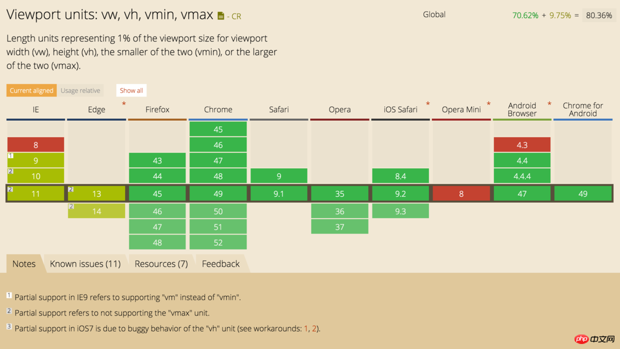

100vh = 100% window height
[lang=stylus]
.box
  width 10vw
  height 10vw
[lang=jade]
.img-box
  img(src="img/a.png")
[lang=stylus]
.img-box
  width 10vw
  height 10vw
  img
    width 100%
    height 100%
    object-fit cover
picture placed in a square box, adaptive centeringHowever, in Android 4.4 mobile phones, the picture will be distorted, and the height is not calculated by .img-box, as shown in the picture on the right (
object-fit cover is also invalid under Android 4.4)
position<a href="//m.sbmmt.com/wiki/902.html" target="_blank"> absolute</a> to the image (object-fit cover is invalid)
[lang=stylus]
.img-box
  width 10vw
  height 10vw
  position relative
  img
    position absolute
    left 0
    top 0
    width 100%
    height 100%
object-fit cover flex vw vh Makes the layout more flexible and more convenient Squares are no longer used
padding-bottom 100% A method that makes it difficult to understand.
Free css online video tutorial
2. 3.php.cn Dugu Jiujian (2)-css video tutorial
The above is the detailed content of Detailed explanation of the new unit (vw) in css3. For more information, please follow other related articles on the PHP Chinese website!


