height: 1.76em;">Among the many new CSS features, there are 3 new features adopted this year that make me uncontrollably excited.
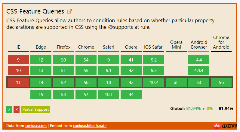
Not long ago, I wrote a CSS feature that I really hoped for, which is about feature query. Now it can basically be said that it already exists! It supports mainstream browsers except Internet Explorer ( Including Opera Mini)
Feature query, using the @supports rule, allows us to include CSS in a conditional block that checks whether the current user agent supports a CSS property Key-value pairs, the content will only take effect if supported. Here is a simple example that only applies display when the browser supports Flexbox: flex -
@supports ( display: flex ) {
  .foo { display: flex; }
}In addition, use like and and not. With this operator, we can even create more complex feature queries. For example, we can detect whether the browser only supports the old Flexbox syntax -
@supports ( display: flexbox )
          and
          ( not ( display: flex ) ) {
  .foo { display: flexbox; }
}
page layouts , and there are many different features between them
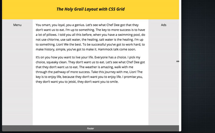
Explicit item positioning Grids are represented by table containers (via display: grid creation) and table items (child components). In our CSS, we can clearly organize the position and order of table items, regardless of their markup (referring to HTML markup). For example. , I wrote an article about using CSS tables for holy layout. This article shows how to create the famous "Holy Grail Layout" through this module.
.hgheader { grid-area: header; }
.hgfooter { grid-area: footer; }
.hgmain { grid-area: main; }
.hgleft { grid-area: navigation; }
.hgright { grid-area: ads; }

.hg {
    display: grid;
    grid-template-areas: "header header header"
                         "navigation main ads"
                         "footer footer footer";
    grid-template-columns: 150px 1fr 150px;
    grid-template-rows: 100px
                        1fr
                        30px;
    min-height: 100vh;
}

@media screen and (max-width: 600px) {
    .hg {
        grid-template-areas: "header"
                             "navigation"
                             "main"
                             "ads"
                             "footer";
        grid-template-columns: 100%;
        grid-template-rows: 100px
                            50px
                            1fr
                            50px
                            30px;
    }
}#. ##It makes it possible for us to allocate height and width to table items according to the available space in the table container. For example, in the Holy Grail Layout, I want the main partition to occupy all the space except the two sidebars. A simple piece of code to do this -
.hg {
    grid-template-columns: 150px 1fr 150px;
}Gap
, which is a percentage of the content area size. For example, if you need a spacing of %5, you can write like this -
.hg {
    display: grid;
    grid-column-gap: 5%;
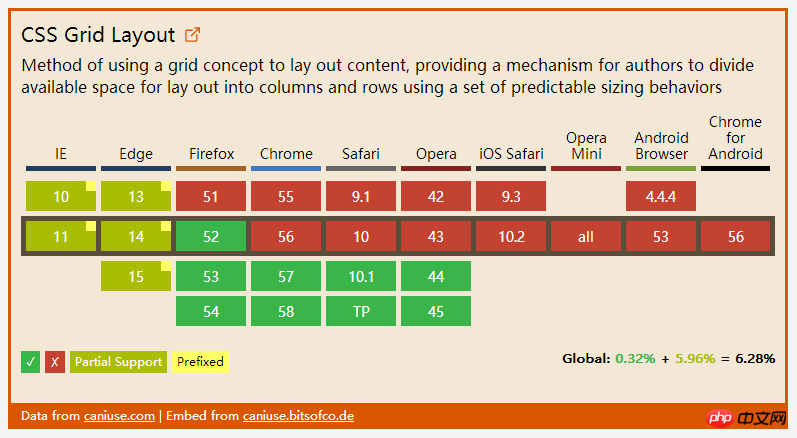
}Support status
 3. Native
For example, if a theme color is used in many places in our style sheet, we can abstract it and save it in a variable, and then reference the variable, instead of writing the actual value directly multiple times. :root {
--theme-colour: cornflowerblue;
}
h1 { color: var(--theme-colour); }
a { color: var(--theme-colour); }
strong { color: var(--theme-colour); }
in real time. For example, to change the value of the --theme-color attribute in the above example, we only need to do this -
const rootEl = document.documentElement;
rootEl.style.setProperty('--theme-colour', 'plum');
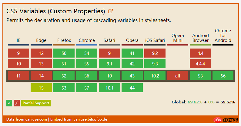
 As you can see, no feature is currently supported by all browsers, so what should we do to use it in production with peace of mind? The answer is: progressive enhancement! Last year I spoke at the Fronteers Conference about doing progressive enhancement related to CSS. Now I put it here -

The above is the detailed content of 3 new CSS features worth learning in 2017 (recommended). For more information, please follow other related articles on the PHP Chinese website!


