Do not consider compatibility when solving problems. The questions are wild and unconstrained. Just say whatever comes to mind. If there are CSS properties that you feel are unfamiliar in the problem solving, go and learn about it quickly.
Keep updating, keep updating, keep updating, say important things three times.
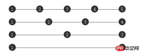
How to achieve the following multi-column uniform layout (the straight line in the picture is to show the container Width, not included):

display:flex CSS3 Flexible Box (Flexible Box or Flexbox) is a layout method that can still ensure that elements have more appropriate arrangement behavior when the page needs to adapt to different screen sizes and device types. .
Of course, flex layout is good for mobile applications. If the PC terminal needs to be fully compatible, the compatibility is not enough, so we will skip it here.
text-align:justify## is defined as follows HTML Style:
<p class="container">
    <p class="justify">
        <i>1</i>
        <i>2</i>
        <i>3</i>
        <i>4</i>
        <i>5</i>
    </p>
</p>We know that there is text-align:justify that can achieve the effect of aligning text on both ends.
text-align
The CSS property defines how inline content (such as text) is aligned relative to its block parent element. text-align does not control the alignment of the block element itself, only the alignment of its inline content.text-align:justify
means the text is aligned to both sides.
At first I guessed that it could be achieved using the following CSS:
.justify{
  text-align: justify;
}

.justify i{
  width:24px;
  line-height:24px;
  display:inline-block;
  text-align:center;
  border-radius:50%;
}The results are as follows:

Demo poke me
I did not get the expected results, and did not achieve the so-called alignment at both ends. I searched for the reason and found this explanation in W3C:
Finally A horizontal alignment attribute is justify
, which brings its own problems. There is no explanation in CSS about how to handle hyphens because different languages have different rules for hyphens. Rather than attempt to reconcile such potentially incomplete rules, the specification simply ignores the issue.
Well, after reading the above paragraph of explanation, I still didn’t understand the meaning. I continued to check and found the reason:
Although the text-align:justify attribute is fully compatible, to use it to achieve alignment at both ends, you need to pay attention to adding [space/newline/tab] between modules to make it work.
That is to say, each 1 gap must have at least one space, line break, or tab character.
Okay, let’s try to update the HTML structure, using the same CSS:
##
<p class="container">
    <p class="justify">
        <i>1</i>

        <i>2</i>

        <i>3</i>

        <i>4</i>

        <i>5</i>

    </p>
</p>啊哦,还是不行啊。 再寻找原因,原来是出在最后一个元素上面,然后我找到了 尝试给容器添加 发现终于可以了,实现了多列均匀布局: 结束了?没有,查看一下 但是一看兼容性,惨不忍睹,只有 IE8+ 和 最新的 chrome 支持 上面说了要使用 我们给 
text-align-last 这个属性,text-align-last属性规定如何对齐文本的最后一行,并且 text-align-last 属性只有在 text-align 属性设置为 justify 时才起作用。text-align-last:justify:.justify{
text-align: justify;
text-align-last: justify; // 新增这一行
}
.justify i{
width:24px;
line-height:24px;
display:inline-block;
text-align:center;
border-radius:50%;
}
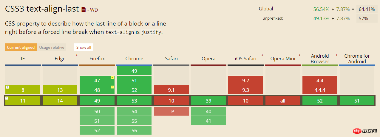
text-align-last 的兼容性:
text-align-last 属性,也就是说,如果你不是在使用 IE8+ 或者 最新版的 chrome 观看本文,上面 Demo 里的打开的 codePen 例子还是没有均匀分布。text-align:justify 实现多列布局,要配合 text-align-last ,但是它的兼容性又不好,真的没办法了么,其实还是有的,使用伪元素配合,不需要 text-align-last 属性。class="justify" 的 p 添加一个伪元素:.justify{
text-align: justify;
}
.justify i{
width:24px;
line-height:24px;
display:inline-block;
text-align:center;
border-radius:50%;
}
.justify:after {
content: "";
display: inline-block;
position: relative;
width: 100%;
}
去掉了 text-align-last: justify 了,增加一个伪元素,效果如下:

通过给伪元素 :after 设置 inline-block 设置宽度 100% ,配合容器的 text-align: justify 就可以轻松实现多列均匀布局了。再多配合几句 hack 代码,可以实现兼容到 IE6+ ,最重要的是代码不长,很好理解。
那么为什么使用了 :after 伪元素之后就可以实现对齐了呢?
原因在于 justify 只有在存在第二行的情况下,第一行才两端对齐,所以在这里,我们需要制造一个假的第二行,而 :after 伪元素正好再适合不过。
最终实现题目初始所示:

The above is the detailed content of CSS fully compatible solution to multi-column uniform layout problem. For more information, please follow other related articles on the PHP Chinese website!


