Home > Web Front-end > CSS Tutorial > CSS to achieve typing effect

CSS to achieve typing effect

高洛峰
Release: 2017-02-10 15:50:31
Original
2067 people have browsed it

JS implementation

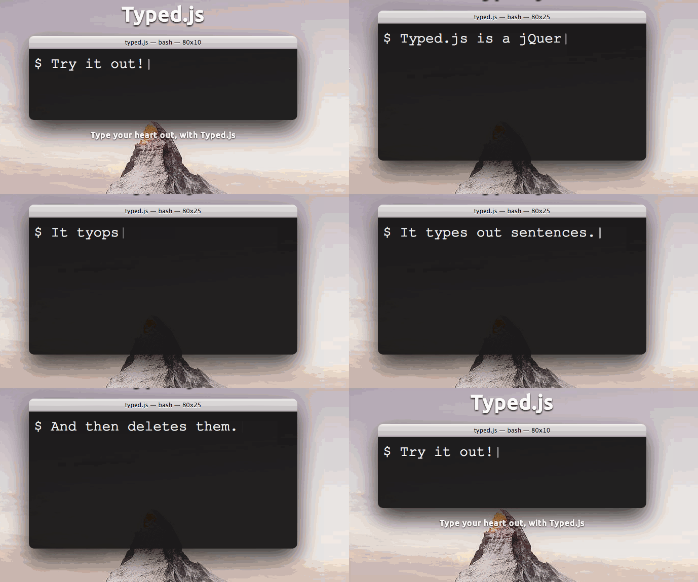
When I was working on a project recently, I needed to achieve the typing effect of characters appearing one by one. I found a good jQuery plug-in Typed.js on the Internet, and the effect was great
CSS 实现打字效果

<p class="element"></p>

<script src="typed.js"></script>
<script>
  $(function(){
      $(".element").typed({
        strings: ["First sentence.", "Second sentence."],
        typeSpeed: 0
      });
  });
</script>
Copy after login

For specific usage, you can check the project address. The annotated source code has more than 200 lines, which is not complicated.

The implementation method is not magical either. Most people can easily think of it. , use js to add characters to the container one by one. The author has done a lot of characters and the speed is amazing. We can make a simple

var s = 'Hello World! Hello World! Hello World!';
var con = $('.container');
var index = 0;
var length = s.length;
var tId = null;

function start(){
  con.text('');
  
  tId=setInterval(function(){
    con.append(s.charAt(index));
    if(index++ === length){
    clearInterval(tId);
    index = 0;
    start()
    }
  },100);
}

start();
Copy after login

JS Bin


CSS implementation

If the details and browser compatibility requirements are not very strict, we can implement

animation-timing-function

CSS3 through CSS3 We have all been exposed to animation, we usually use it like this

animation: animation-name animation-duration animation-iteration-count

animation: name 5s infinite;
Copy after login

In fact, the full version of animation has many parameters, which can also be written as separate attributes

  1. animation-name

  2. animation-duration

  3. animation-timing-function

  4. ##animation-delay

  5. animation-iteration-count

  6. animation-direction

Today we will focus on animation-timing-function, most Animation changes linearly on the timeline. This is the meaning of the liner parameter we use when jQuery animates, but CSS3 provides some other change methods specified by the animation-timing-function attribute

  1. ease

  2. ##linear
  3. ease-in
  4. ease-out
  5. ease-in-out
  6. step-start
  7. step-end
  8. steps
  9. cubic-bezier
  10. Each animation effect can correspond to a Bezier curve cubic-bezier can Help me intuitively look at the Bezier curve effect. I won’t say much here.

steps

Let’s take a look at the effect of steps. In fact, as the name suggests, you can think of what steps means, just like Tetris. The small grid falling down is also animated, but it is not continuous, more like frame by frame. Steps is the way to achieve this effect.

The syntax of steps

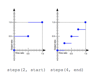
steps(number_of_steps, [start|end])
Copy after login

    number_of_steps How many steps the animation is divided into
  • direction animation display status, end: default value, displayed before the start of the first frame, start: displayed after the end of the first frame
  • Look at a scientific picture to help understand

CSS 实现打字效果Take two steps

With these we can create interesting effects

JS Bin

.walk {
  width: 125px;
  height: 150px;
  background: url(//m.sbmmt.com/) left;
  -webkit-animation:anima 1s steps(16) infinite ;
}

@-webkit-keyframes anima{
    from { background-position:2000px 0;}
    to {background-position:0px 0;}
}
Copy after login

Typing effect

The typing effect can be imagined, just change the container width (only When using a single line, you have to increase the length of each step to be consistent with the letter width. JS is better actually)

.typing{
    width:250px;
    white-space:nowrap;
    overflow:hidden;
    -webkit-animation: type 3s steps(50, end) infinite;
  animation: type 3s steps(50, end) infinite;
}


@-webkit-keyframes type{
    from { width: 0;}
}

@keyframes type{
    from { width: 0;}
}
Copy after login

JS Bin

For more articles related to CSS to achieve typing effects, please pay attention to the PHP Chinese website!

Related labels:
css
source:php.cn
Statement of this Website
The content of this article is voluntarily contributed by netizens, and the copyright belongs to the original author. This site does not assume corresponding legal responsibility. If you find any content suspected of plagiarism or infringement, please contact admin@php.cn
Popular Tutorials
More>
Latest Downloads
More>
Web Effects
Website Source Code
Website Materials
Front End Template