Hello! The previous article introduced you to the CSS3 tutorial-2D conversion. I wonder how you learned it? Next, I will introduce to you the CSS3 tutorial-3D conversion.
3D Transforms:
CSS3 allows you to use 3D transforms to format elements.
In this article, you will learn two 3D transformation methods:
rotateX();
rotateY().
How does it work?
Transformation is an effect that causes an element to change its shape, size, and position.
You can transform your elements using 2D or 3D transformations.
Browser support:

Internet Explorer 10 and Firefox support 3D conversion.
Chrome and Safari require the prefix -webkit-.
Opera still does not support 3D conversion (it only supports 2D conversion).
rotateX() method:

#With the rotateX() method, an element is rotated by a given degree around its X-axis.
Instance:
div
{
transform: rotateX(120deg);
-webkit-transform: rotateX(120deg); /* Safari and Chrome */
}rotateY() method:

rotateY() method, rotate around its Y-axis at a given degree Elements.
Example:
div
{
transform: rotateY(130deg);
-webkit-transform: rotateY(130deg); /* Safari and Chrome */
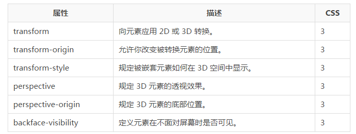
}Conversion attributes:
The following table lists all conversion attributes:

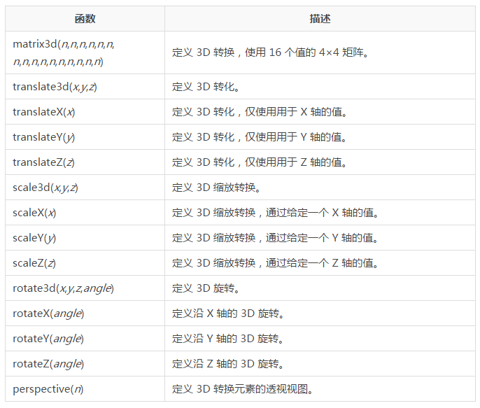
3D conversion method:

The above is the content of CSS3 tutorial-3D conversion. For more related content, please pay attention to the PHP Chinese website (m.sbmmt.com)!


