*The following techniques are all derived from "CSS Secrets" written by Lea Verou
Parallelogram
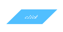
The construction of a parallelogram can be obtained by diagonally pulling the rectangle through the deformation attribute of skew() (the coordinate system used by skew, vertical is the X-axis, and the horizontal direction is the Y-axis, which is opposite to the common coordinate system).
<!DOCTYPE html>
<html>
<head>
    <meta charset="UTF-8">
    <title>Title</title>
    <style>
        .location{
            position: relative;
            top: 150px;
            left: 150px;
        }
         .button{
             color: white;
             background-color: #51bfff;
             width: 120px;
             height: 50px;
             line-height: 50px;
             text-align: center;
             transform: skewX(-45deg);
         }
    </style>
</head>
<body>
    <div class="location button">click</div>
</body>
</html>
But the content skew may not be the effect we need. A conventional solution is to nest a div in the inner layer, and then add a lifting transform in the opposite direction: skewX(45deg); But there is People who are obsessed with code say they cannot accept it.
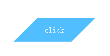
Another idea is to apply all styles to pseudo-elements. Then transform the pseudo element.
<!DOCTYPE html>
<html>
<head>
<meta charset="UTF-8">
<title>Title</title>
<style>
.location{
position: relative;
top: 150px;
left: 150px;
}
.button{
width: 120px;
height: 50px;
line-height: 50px;
text-align: center;
color: white;
}
.button:before{
content: '';
position: absolute;
top: 0; right: 0; bottom: 0; left: 0;
background-color: #51bfff;
transform: skewX(-45deg);
z-index: -1;
}
</style>
</head>
<body>
<div class="location button">click</div>
</body>
</html>
This not only solves the problem of skewed content, but the html structure is still as clean as before. However, please note that the pattern generated by the pseudo element overlaps the content. Once a background is set to it, it will cover the content, so z-index: -1 must be added.
Diamond picture
If it is based on a square, the diamond is a square pattern rotated 45 degrees. It is easy for us to think of rotating the outer div 45 degrees and then rotating the inner img 45 degrees in the opposite direction. The following pattern is obtained.
<!DOCTYPE html>
<html>
<head>
    <meta charset="UTF-8">
    <title>Title</title>
    <style>
        .location{
            position: relative;
            top: 150px;
            left: 150px;
        }
         .picture{
             width: 600px;
             transform: rotate(45deg);
             overflow: hidden;
         }
        .picture>img{
            max-width: 100%;
            transform: rotate(-45deg);
        }
    </style>
</head>
<body>
    <div class="location picture"><img  src="1.jpeg" alt="css parallelogram and rhombus transformation" ></div>
</body>
</html>
It’s a pretty regular octagon. If you can convince the product manager, then the work is done. Well, I guess you can't be convinced. . .
Since the rotation direction is inconsistent here, the outer div intercepts the excess part (note overflow:hidden), and then part of it is empty again. As long as the empty part is filled in, it will be a rhombus. Here you can draw a sketch and use the Pythagorean theorem to calculate.
The calculated result is that the magnification is 1.42 times and the filling is complete. We change the transform attribute of img to transform: rotate(45deg) scale(1.42); and get the following picture:

This scheme of constructing a diamond has a flaw, that is, when the original picture is not a square, a larger magnification is required. coefficient, the intercepted picture content is even more limited.
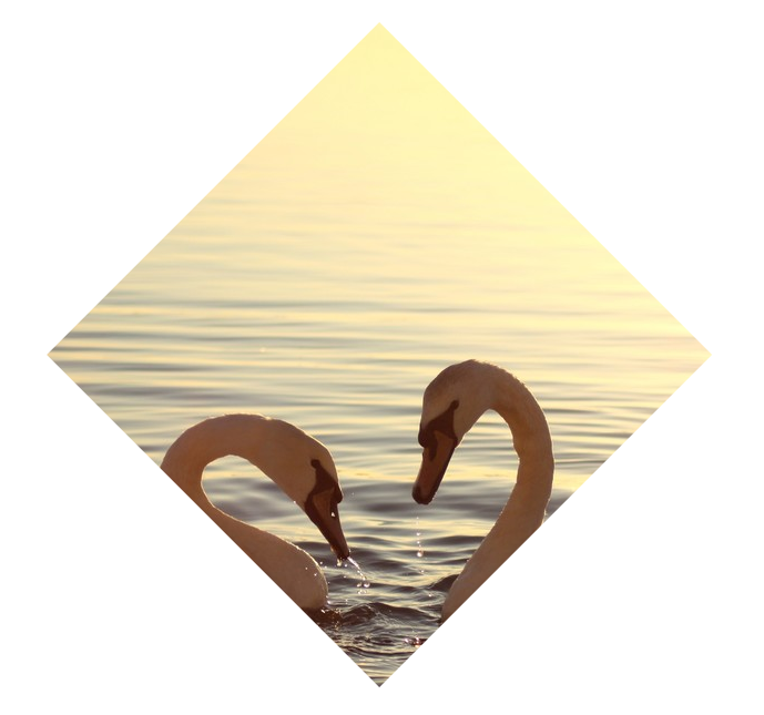
And the plan itself is not simple and elegant. Here we introduce to you a property clip-path (unfortunately, the support does not seem to be good), which can cut the picture into any polygon by passing in a fixed position point.
<!DOCTYPE html>
<html>
<head>
    <meta charset="UTF-8">
    <title>Title</title>
    <style>
        .location{
            position: relative;
            top: 150px;
            left: 150px;
        }
        .picture{
            -webkit-clip-path: polygon(50% 0, 100% 50%, 50% 100%, 0 50%);
            -moz-clip-path: polygon(50% 0, 100% 50%, 50% 100%, 0 50%);
            clip-path: polygon(50% 0, 100% 50%, 50% 100%, 0 50%);
            transition: 1s clip-path;
        }

    </style>
</head>
<body>
<img  class="location picture" src="1.jpeg" alt="css parallelogram and rhombus transformation" >
</body>
</html>
I hope that the clip-path attribute will be better supported in various browsers in the near future.


