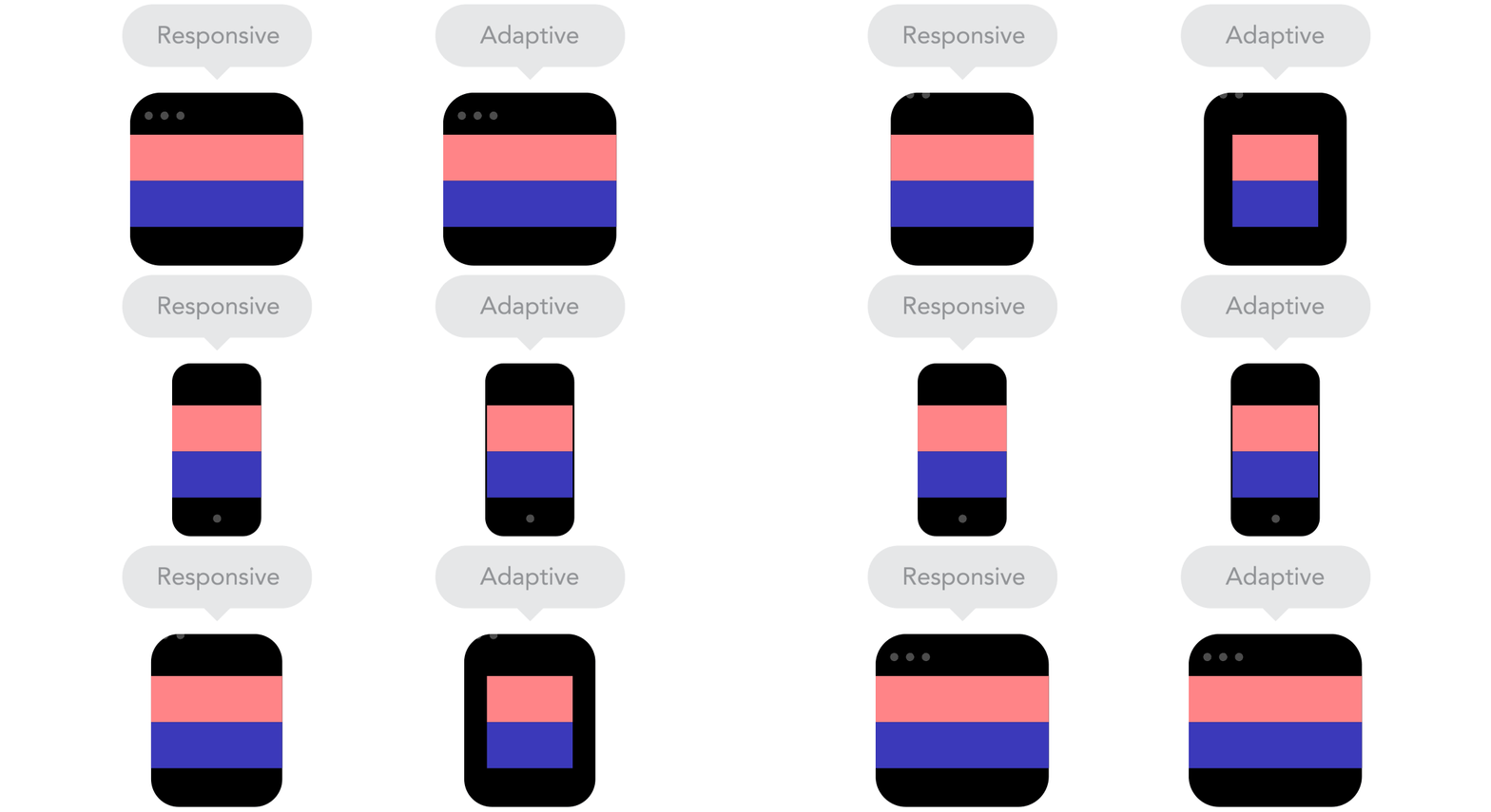

Responsive Web design is a good solution to solve the problem of multiple types of screens, but from a printing perspective, it has many difficulties. There are no fixed page sizes, no millimeters or inches, no physical limitations that can feel overwhelming. With the increasing number of gadgets available for building websites, the limitation of pixel design to desktop and mobile devices has become a thing of the past. So, now let’s explain how to apply the basic principles of responsive web design to achieve, rather than resist, a smooth web experience. For the sake of simplicity, we will focus on layout.
Responsive design vs adaptive design
Looks like the same thing, but it’s not. These two design methods complement each other, so there is no right or wrong. The specific situation depends on the content.
Content flow
As the screen size gets smaller and smaller, the content takes up more and more vertical space, that is, the content will extend downwards, which is called content flow. If you're used to designing with pixels and points, you may find this a bit difficult to master. But it doesn’t matter, it’s easy to understand once you get used to it.
Relative units
Your design object may be a desktop, a mobile screen, or any screen type in between. Pixel densities will also differ from each other, so we need to use units that are flexible and adaptable to various situations. Well in this case, relative units like percentages come in handy. When using percentages, when we say a width of 50%, it means that the width occupies half of the screen size (or viewport, which refers to the size of the open browser window).
Breakpoints
Breakpoints allow the page layout to deform at preset points, that is, displaying 3 columns on a desktop and only 1 column on a mobile device. Most CSS properties can be transformed between breakpoints. Where breakpoints are placed usually depends on the content. For example, if a sentence needs to break into a new line, you may need to add a breakpoint. But you need to be careful when using breakpoints - if you don't understand the logical relationship between the content, it is easy to make a mess.
Maximum and minimum values
Sometimes it is good for the content to fill the entire screen width (for example, on a mobile device), but it seems unreasonable if the same content also fills up the TV screen. That's why there are max/min values. For example, if the width is 100% and the maximum width is 1000px, then the content will fill the screen with no more than 1000px width.
Nested Objects
Remember the relative position? If a large number of factors are closely related to each other, it will be difficult to control. Therefore, placing elements into containers makes them more understandable and concise. In this case, static units such as pixels need to be used. Static units are useful for things like logos and buttons that don't need to be extended.
Mobile first or desktop first
Strictly speaking, there is not much difference whether the project starts with a small screen and transitions to a large screen (mobile first), or whether it starts with a large screen and transitions to a small screen (desktop first). However, starting on mobile gives you some additional constraints that can help with your decision-making. Usually people will start from both aspects at the same time, so you still have to see which method is best for you.
Web Fonts vs System Fonts
Want your website to have cool Futura or Didot effects? Then use web fonts. Although web fonts look cool, you have to remember that these fonts require users to download them. The more fonts, the longer it will take for users to load the page. On the other hand, system fonts load much faster (provided the user has them locally), but are too common.
Bitmap vs Vector
Does your icon have a lot of detail and a lot of flashy effects applied? If so, then use bitmaps. If not, consider using vector graphics. If it's a bitmap, use jpg, png or gif. For vector graphics, it’s best to use SVG or icon fonts. Each has its pros and cons. But you should always keep icon size in mind - images that are not optimized cannot be posted online. Vector images, on the other hand, are usually smaller, but some older browsers may not support vector images. Also, if the icon has a lot of curves, it may be larger than the bitmap, so choose wisely.


