1. Source of the problem
When you write your own carousel picture switch, when the previous picture slides, there will be a blank space behind it. The second picture will not appear until all the previous pictures slide out. When the problem first started, I searched online and found that some people said that timer animation might cause this situation, so I commented out the timer in the code debugging, so that the picture would stop after taking only one step. I found that there was still a blank space behind it, so I was sure It's not a timer issue. So I checked the box model and found that the width of the container div#main that wraps the img is not the sum of the widths of the six pictures I ideally wanted. It turns out that I did not explicitly set the width of the container div#main. But here comes the problem. Without explicitly setting the container width, you may rationally think that the width of the container should not be adapted to the filling of its content? According to the phenomenon mentioned above, the answer is naturally no. It can also be said that this is not the case in all cases, because in fact positioning also has an impact on the width of the container. Let’s discuss the relationship between the size and placement of absolutely positioned elements.
2. Containing blocks
First, let’s review the basic concept of containing blocks (positioning context):
1. The initial containing block (the containing block of the root element) is determined by the user agent.
2. The floating element containing block is defined as the nearest block-level ancestor element.
3. The containing block of a relatively positioned or statically positioned element is formed by the content boundary of the nearest block-level box, table cell, or inline block box ancestor element (any type).
4. Absolutely positioned elements containing blocks are set to the nearest positioning that is not static to the border bounds (for block-level parent elements) or content bounds (for inline parent elements) of an ancestor element (of any type).
3. Width and offset
Generally, the size and position of an element depend on its containing block. Positioning means that the margin boundaries of an element are offset relative to the corresponding sides of its containing block (the inner border and the adjacent side of the border), which affects everything in the element (margins, borders, padding, content) will move. Therefore, for a positioned element, there is the following equation (the following calculations are based on this equation):
left+margin-left+border-left-width+padding-left+width+padding-right+border-right-width+margin-right+right=width of the containing block (Formula 1-1)
According to this, when the width and height of an element are undefined, their values will be affected by positioning. For positioned elements, whether you need to set its width and height should be determined based on the situation. Consider the rules for determining the width and height of the following situations:
1. If the offset attributes top, left, bottom, and right are all determined, but the margins, padding, and borders are not set, whether the width and height are explicitly set, the values are determined by the offset attributes. ; on the contrary, if the margins or padding are set (auto also counts), the height and width of the border are the explicitly set values. If the width and height are not explicitly set, they are still determined by the offset attribute.
2. Horizontal axis behavior for non-replaced elements:
1) If left, width, and right are all auto, and no inner and outer margins or borders are set, then after calculation, the left side of the element is at its static position (reading from left to right), and the width is "properly expanded", according to the above equation right is the remaining horizontal distance;
2) When all values in the equation are fixed values, if the element is "over-restricted", right will be reset according to the above formula;
3) When only one attribute value in the above equation is auto, this attribute value will be reset to satisfy the equation when the element is "over-restricted";
4) The rules for the vertical axis are similar, but please note that only top can take a static position, bottom cannot.
3. For replacement elements (note that there is no concept of "proper expansion" here, because the replacement element has an inherent width and height):
1) First check whether its width (height) is explicitly declared. If it is explicitly declared, it is the value. Otherwise, it is determined by the actual size (width and height) of the element content;
2) Look at left again. If top is auto, replace it with a static position;
3) If the left and bottom values are still auto, set the auto of margin to 0. If they are not set to 0, set them to be equal to left and right, and equal to top and bottom;
4) After this, if there is only one auto value left, it is similar to the non-replaced element, and the auto value is reset according to the equation.
5) When an element is "overly constrained", the user agent ignores right (reading from left to right) and bottom as with non-replaced elements.
The above is an analysis of the influencing factors of the actual displayed width and height of an absolutely positioned element. When you find that the interface display effect is inconsistent with what you expected, you can consider analyzing it from the above perspective to see if you need to re-determine the width and height value of the element. , or the value of other attributes above.
4. Analysis of a common situation
Now let’s analyze the actual examples of width and height problems I encountered in the project. The hypothetical situation discussed here is: the outermost div#rel with width and height is set to relative positioning, and its child div#abs only sets left to a fixed value without setting the width (provided there are no inner and outer margins and borders), div#abs The interior contains different types of elements.
1. Let’s first discuss the case where the innermost layer is wrapped with block-level elements. See the code below:
<span style="color: #0000ff"><</span><span style="color: #800000">div </span><span style="color: #ff0000">id</span><span style="color: #0000ff">="rel1"</span><span style="color: #0000ff">></span>
    <span style="color: #0000ff"><</span><span style="color: #800000">div </span><span style="color: #ff0000">id</span><span style="color: #0000ff">="abs1"</span><span style="color: #0000ff">></span>
        <span style="color: #0000ff"><</span><span style="color: #800000">div </span><span style="color: #ff0000">id</span><span style="color: #0000ff">="box1"</span><span style="color: #0000ff">></</span><span style="color: #800000">div</span><span style="color: #0000ff">></span>
        <span style="color: #0000ff"><</span><span style="color: #800000">div </span><span style="color: #ff0000">id</span><span style="color: #0000ff">="box2"</span><span style="color: #0000ff">></</span><span style="color: #800000">div</span><span style="color: #0000ff">></span>
    <span style="color: #0000ff"></</span><span style="color: #800000">div</span><span style="color: #0000ff">></span>
<span style="color: #0000ff"></</span><span style="color: #800000">div</span><span style="color: #0000ff">></span>
Copy after login
<span style="color: #800000">*</span>{<span style="color: #ff0000">margin</span>:<span style="color: #0000ff">0</span>;<span style="color: #ff0000">padding</span>:<span style="color: #0000ff"> 0</span>}<span style="color: #800000">
#rel1</span>{<span style="color: #ff0000">position</span>:<span style="color: #0000ff"> relative</span>;<span style="color: #ff0000">width</span>:<span style="color: #0000ff"> 120px</span>;<span style="color: #ff0000">height</span>:<span style="color: #0000ff"> 50px</span>;<span style="color: #ff0000">background-color</span>:<span style="color: #0000ff"> yellow</span>;}<span style="color: #800000">
#abs1</span>{<span style="color: #ff0000">position</span>:<span style="color: #0000ff"> absolute</span>;<span style="color: #ff0000">top</span>:<span style="color: #0000ff"> 0</span>;<span style="color: #ff0000">left</span>:<span style="color: #0000ff"> -15px</span>}<span style="color: #800000">
#box1</span>{<span style="color: #ff0000">width</span>:<span style="color: #0000ff"> 50px</span>;<span style="color: #ff0000">height</span>:<span style="color: #0000ff"> 50px</span>;<span style="color: #ff0000">background-color</span>:<span style="color: #0000ff"> red</span>}<span style="color: #800000">
#box2</span>{<span style="color: #ff0000">width</span>:<span style="color: #0000ff"> 50px</span>;<span style="color: #ff0000">height</span>:<span style="color: #0000ff"> 50px</span>;<span style="color: #ff0000">background-color</span>:<span style="color: #0000ff"> blue</span>}
Copy after login
![]()
![]()
It can be seen from the code that we set the margin and padding of the absolutely positioned element to 0, and there is no border, then the above formula 1-1 is simplified to:
绝对定位元素div#abs的 left+width+right = 包含块div#rel的 width
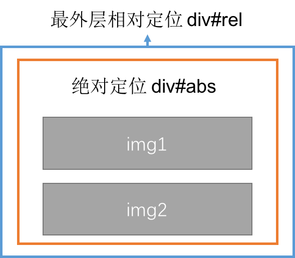
由于绝对定位元素的left是定值,而未设width和right,所以后两个都是初始值auto,根据非替换轴的水平行为1)可知,先将width恰当收放,也就是以绝对定位元素的子元素内容刚好放好为准,再自动计算right的值,使三个属性之和刚好等于绝对定位的包含块div#rel的宽度120px。因此,此时绝对定位的元素div#abs的宽度width的值由其内容决定,在如下图两种情形下(通过代码改变子div#box1的宽度进行测试),绝对定位元素的width始终等于子div中宽度最大的那个值。且不受left值的影响,因为无论left值为多少,其right的值都会自动调整,从而不影响width的值。
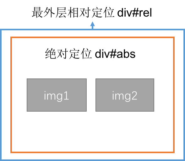
2.再来看最内层包裹的是替换行内元素的情况,代码及示意图如下:
![]()
<span style="color: #0000ff"><</span><span style="color: #800000">div </span><span style="color: #ff0000">id</span><span style="color: #0000ff">="rel2"</span><span style="color: #0000ff">></span>
    <span style="color: #0000ff"><</span><span style="color: #800000">div </span><span style="color: #ff0000">id</span><span style="color: #0000ff">="abs2"</span><span style="color: #0000ff">></span>
        <span style="color: #0000ff"><</span><span style="color: #800000">img </span><span style="color: #ff0000">src</span><span style="color: #0000ff">="images/pic1.jpeg"</span><span style="color: #ff0000"> alt</span><span style="color: #0000ff">=""</span><span style="color: #ff0000"> id</span><span style="color: #0000ff">="img1"</span><span style="color: #0000ff">></span>
        <span style="color: #0000ff"><</span><span style="color: #800000">img </span><span style="color: #ff0000">src</span><span style="color: #0000ff">="images/pic2.jpeg"</span><span style="color: #ff0000"> alt</span><span style="color: #0000ff">=""</span><span style="color: #ff0000"> id</span><span style="color: #0000ff">="img2"</span><span style="color: #0000ff">></span>
    <span style="color: #0000ff"></</span><span style="color: #800000">div</span><span style="color: #0000ff">></span>
<span style="color: #0000ff"></</span><span style="color: #800000">div</span><span style="color: #0000ff">></span>
Copy after login
<span style="color: #800000">*</span>{<span style="color: #ff0000">margin</span>:<span style="color: #0000ff">0</span>;<span style="color: #ff0000">padding</span>:<span style="color: #0000ff"> 0</span>}<span style="color: #800000">
#rel2</span>{<span style="color: #ff0000">position</span>:<span style="color: #0000ff"> relative</span>;<span style="color: #ff0000">width</span>:<span style="color: #0000ff"> 120px</span>;<span style="color: #ff0000">height</span>:<span style="color: #0000ff"> 50px</span>;<span style="color: #ff0000">background-color</span>:<span style="color: #0000ff"> yellow</span>;}<span style="color: #800000">
#abs2</span>{<span style="color: #ff0000">position</span>:<span style="color: #0000ff"> absolute</span>;<span style="color: #ff0000">top</span>:<span style="color: #0000ff"> 0</span>;}<span style="color: #800000">
img</span>{<span style="color: #ff0000">float</span>:<span style="color: #0000ff">left</span>}<span style="color: #800000">
#img1</span>{<span style="color: #ff0000">width</span>:<span style="color: #0000ff"> 50px</span>;<span style="color: #ff0000">height</span>:<span style="color: #0000ff"> 50px</span>}<span style="color: #800000">
#img2</span>{<span style="color: #ff0000">width</span>:<span style="color: #0000ff"> 50px</span>;<span style="color: #ff0000">height</span>:<span style="color: #0000ff"> 50px</span>}
Copy after login
其中,绝对定位元素的left将被设为定值,而width根据“恰当收放”的原则,它的最大值应该是行内子元素宽度之和,最小值应该是子元素中宽度最大者的宽度值,而right的值情况有一点复杂,因为默认情况下,块级元素是垂直排列而行内元素都是一个挨着一个(中间的缝隙可以用:float:left清除)从左向右排列,且中间没有换行符。所以行内元素放在绝对定位的块级元素内作为元素内容宽度过宽时,会由于其行内元素的特点将内容撑开一直到其包含块内容区右边界(从左向右读),因此当行内子元素(即绝对元素的内容)受限出现折行时right的值为0,式1-1便简化为如下:
绝对定位元素div#abs的 left+width = 包含块div#rel的 width
当然这种情况应该是在left设定值在一定范围内的前提下(因为宽度没有设置,是auto的),那么如何确定这个范围呢?当绝对定位元素的宽度刚好等于其最小值和最大值时,利用上面的公式求出left的范围设置在(包含块width-最大绝对定位元素width)~(包含块width-最小绝对定位元素width)之间时,绝对定位元素的宽度是受left值影响的,可以通过上面的公式求出当left为某一特定值时的绝对定位元素的width。
When the value of left is set outside the range mentioned above, the width of the absolutely positioned element has reached the extreme value and will no longer be affected by changes in left. At this time, right will no longer be 0, but will Calculations are automatically performed to satisfy the following formula:
D Absolute positioning element DIV#ABS's
Left+Width+Right = width
3. In summary, under the premise assumptions:
1) If an absolutely positioned element wraps a block-level element, its width value is always equal to the value of the largest width among the child elements.
2) If an inline element is wrapped by an absolutely positioned element, the maximum width value is the sum of the widths of the sub-elements, and the minimum value is the value of the largest width of the sub-elements; and the left interval that affects the width value needs to be found first, and then used to include it Use the width-left value of the block to find its width.
5. Summary
了 Turning up so much is actually the truth. If you are worried that there is a problem with the width of the absolute positioning element, it is best to set it to set a width fixed value, because according to the rules 1, there are no four in four in the four, there are no four in the four, there are no four in four, there are no four in four, there are no four in four, no four will be four. Under the premise that the offset attributes are all set, the explicit width value is effective. However, in the actual environment, setting the width and height is not necessarily necessary for positioning elements, so understanding the influencing factors of width and height will help you encounter some problems. The question about effects display is more helpful. This is my first time writing a technology blog. First of all, I would like to express my most sincere gratitude to my elegant boyfriend who reviewed it for me. I also want to thank the author of the O'Reilly series "The Definitive Guide to CSS, Third Edition" and For its relevant staff, a large amount of the content in this article was written with reference to the book and based on their own understanding. If there are any problems in this first post, please criticize and correct me. Thank you very much~
🎜
🎜🎜


