Start this series and discuss some interesting CSS topics. Putting aside practicality, some topics are designed to broaden the ideas for solving problems. In addition, they involve some CSS details that are easily overlooked.
Compatibility is not taken into account when solving problems. The questions are wild and wild. Just say whatever comes to mind. If there are CSS properties that you feel are unfamiliar in the problem solving, go and study them quickly.
Keep updating, keep updating, keep updating, say important things three times.
All topics are summarized in my Github.

Suppose our single tag is div:
<div></div>
Define the following universal CSS:
div{
    position:relative;
    width: 180px;
    height: 180px;
}This question mainly tests the relationship between the box model Box Model and the background background, and the use of background-clip to change the filling method of the background.
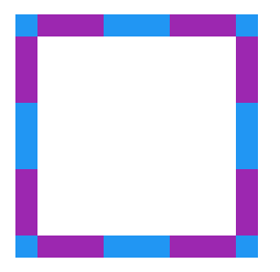
background In the Box Model, it covers the entire box area of the element. It does not start from the inside of the padding (that is to say, it starts from the border), but the solid border (solid) Partially covers part of background, so we use the dashed border (dashed) to see that the background color starts from inside border.
We add the following style to div:
div{
    background:#9c27b0;
    border:20px dashed #2196f3;
}结果如下:
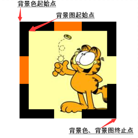
但有一点需要注意,background-color 是从元素的边框左上角起到右下角止,而 background-image 却不一样,他是从 padding 边缘的左上角起而到 border 的右下角边缘止。
background image 的绘制中有两个因素决定了绘图区域:
background positioning area。background-origin 属性决定了这个相对定位位置,默认为 padding-box。所以默认的背景图片绘制是从 padding box 的左上顶点开始的。
background painting area。background-clip 属性决定了绘制区间,默认为 border-box。所以在background-repeat: repeat 的情况下:
The image is repeated in this direction as often as needed to cover the background painting area.
嗯,什么意思呢,你可以戳进这个 demo 看看,正常情况下的背景图填充如下:

当然,这个填充规则是可以通过 background-clip 改变的。
background-clip设置元素的背景(背景图片或颜色)是否延伸到边框下面。
语法:
{
	background-clip: border-box;  // 背景延伸到边框外沿(但是在边框之下)
	background-clip: padding-box; // 边框下面没有背景,即背景延伸到内边距外沿。
	background-clip: content-box; // 背景裁剪到内容区 (content-box) 外沿。
}继续说回本题,接下来,只需要将中间部分填充为白色即可,这个用伪元素可以轻松完成,所以,其中一个方法如下:
div{
    background:#9c27b0;
    border:20px dashed #2196f3;
}
div::after{
    content:"";
    position:absolute;
    top:0;
    left:0;
    bottom:0;
    right:0;
    background:#fff;
}上面的方法,我们使用了 div 的背景色默认情况下从 border 开始填充,及伪元素设置白色背景色填充div 的中间的 padding-box 区域完成图形。
也可以反过来,使用伪元素背景色从 border-box 开始填充,使用 div 的背景色填充中间 padding-box区域。
div{
    background:#fff;
    background-clip:padding-box;
    border:20px dashed #cccc99;
}
div::before{
    content:"";
    position:absolute;
    top:-20px;
    left:-20px;
    bottom:-20px;
    right:-20px;
    background:#996699;
    z-index:-1;
}Click here for the specific Demo.
The above Method 2 not only uses background-clip to change the filling area of the background, but also uses z-index to trigger the element to generate a stacking context (stacking context) and change the stacking order of the elements (stacking levle) , let the pseudo-element background color overlap under the div background color. These two concepts will be mentioned in the next question.
This question mainly wants to discuss the relationship between the CSS box model Box Model and the background background. In fact, this question is about a dashed border, which can be filled with color inside. It is similar to the first question above, using shadows and gradients. All can be completed. If you are interested, you can try other solutions yourself.
Here are some of the solutions I listed:
All the topics are summarized in my Github and posted to the blog in the hope of getting more exchanges.
This is the end of this article. If you still have any questions or suggestions, you can communicate more. It is an original article. The writing style is limited and the knowledge is shallow. If there is anything wrong in the article, please let me know.


