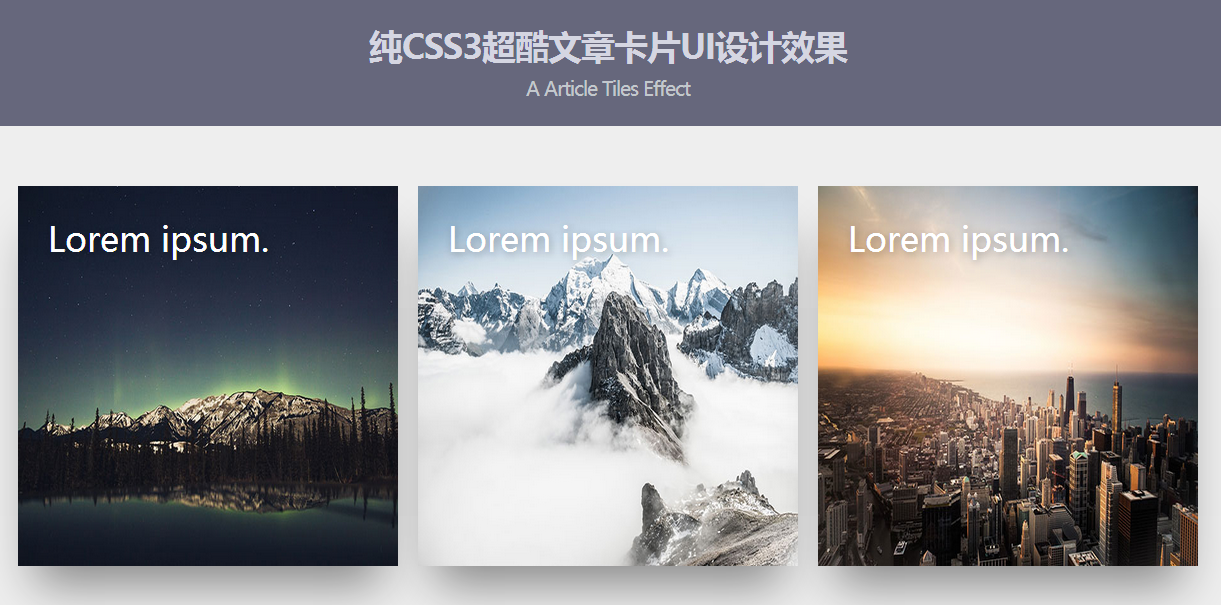
This is a cool article card UI design effect made using pure CSS3. The article card has a shadow effect. When the mouse slides over the card, the article description information will be displayed in the card in a sliding animation.

Online preview Source code download
The HTML structure of a card is as follows:
<div class="tile">
    <img src="img/1.jpg"/>
    <div class="text">
    <h1>文章标题</h1>
    <h2 class="animate-text">文章子标题</h2>
    <p class="animate-text">文章的描述信息</p>
    <div class="dots">
        <span></span>
        <span></span>
        <span></span>
    </div>
  </div>
</div>
The entire card wrapping container is laid out with flex.
.wrap{
  margin:50px auto 60px auto;
  width:100%;
  display:flex;
  align-items:space-around;
  max-width:1200px;
}
The width and height of each card are set to 380 pixels. And use the box-shadow property to set a large shadow effect for the card, and set a transition animation of the ease-out effect for all animations.
.tile{
  width:380px;
  height:380px;
  margin:10px;
  background-color:#99aeff;
  display:inline-block;
  background-size:cover;
  position:relative;
  cursor:pointer;
  transition: all 0.4s ease-out;
  box-shadow: 0px 35px 77px -17px rgba(0,0,0,0.44);
  overflow:hidden;
  color:white;
  font-family:'Microsoft YaHei',sans-serif;
}
The image in the card uses absolute positioning, with the width and height being 100%, occupying the entire card.
.tile img{
  height:100%;
  width:100%;
  position:absolute;
  top:0;
  left:0;
  z-index:0;
  transition: all 0.4s ease-out;
}
The text layer page in the card uses absolute positioning, and the text is placed on top of the image through the z-index attribute. The h2 text and p text are moved by -200% through the translateX function, that is, they are moved outside the card and are initially invisible.
.tile .text{
  z-index:99;
  position:absolute;
  padding:30px;
  height:calc(100% - 60px);
}
.tile h1{
  font-weight:300;
  margin:0;
  text-shadow: 2px 2px 10px rgba(0,0,0,0.3);
}
.tile h2{
  font-weight:100;
  margin:20px 0 0 0;
  font-style:italic;
   transform: translateX(200px);
}
.tile p{
  font-weight:300;
  margin:20px 0 0 0;
  line-height: 25px;
  transform: translateX(-200px);
  transition-delay: 0.2s;
}
.animate-text{
  opacity:0;
  transition: all 0.6s ease-in-out;
}
When the mouse slides over the card, the shadow of the card is modified and the card is enlarged 1.05 times. The transparency of the image in the card is set to 0.2, the text returns to its original position, and the transparency is set to 1.
.tile:hover{
box-shadow: 0px 35px 77px -17px rgba(0,0,0,0.64);
  transform:scale(1.05);
}
.tile:hover img{
  opacity: 0.2;
}
.tile:hover .animate-text{
  transform:translateX(0);
  opacity:1;
}
Online Preview Source code download


