Home > Web Front-end > HTML Tutorial > A simple summary and effect of two-dimensional, three-dimensional and gradient processes in CSS 3 (animations are difficult to post)

A simple summary and effect of two-dimensional, three-dimensional and gradient processes in CSS 3 (animations are difficult to post)

WBOY
Release: 2016-08-08 08:49:55
Original
1429 people have browsed it
1. Not moving, changes within the area (essentially producing a picture)

/*Gradient

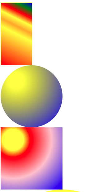
                  1 For the gradient of the rectangle, first define the width and height of the rectangle (it is best to add a border for better observation)
                                                                                                                                                                                                            ”
                             Using
background-image: -webkit-linear-gradient(right top,red 50%,blue 50%);
2 The big, medium and small circles change color. First make a big circle
圆/*Fill in the color from the inside to the outside in turn*/
                                                                                                                            background-image: -webkit-radial-gradient(50% 50%, yellow 20% , red 50%
, pink 55%, blue 100% );               /*You can also use circular gradient in the rectangle*/
3 Reflection

.testb{

background-image: url(img/5.jpg);

height: 200px;

/*Direction Spacing Gradient*/

/*above above below*/

/*1 Reflection does not occupy the space of the document flow. The level is higher than the document flow

2 The reflection is based on the label (width and height)*/

-webkit-box-reflect: above 20px -webkit-linear-gradient(top,rgba(0,0,0,0) 0% ,rgba(0,0,0,0.5) 100%);

}

宽 The 4 borders are relatively wide and the color of the 4 frames is different. In the corner of the encounter, a triangle of different colors will be formed.

5

border-radius: 50px 0 50px 50px; used for cutting round corners

                                                                                                                                                                          making

          .textG{

width: 200px;

height: 100px;

border-radius: 100px 100px 100px 100px/50px 50px 50px 50px;

}

2. Movement in a two-dimensional plane

        .test{

transform:rotate(0deg) translate(0px,0px) scale(1);(rotate translate scale)

                                                                                                                                                                                             .test:hover{transform:rotate(720deg) translate(500px,300px) scale(2);}

分 The three effects can also be used separately, and the effects of different sequential effects are different.

3. Animation effects in three-dimensional space

P Body {Perspective: 1000px;}/*Add perspective points to body*/

                                                                                                                                                                                                                                                               .

                                                                     St.test {

Transform: Rotate (0Deg) Translate (0px, 0px) scale (1);


              .test:hover{transform:rotate(720deg) translate(500px,300px) scale(2);}(changed position)

D /*can set the Z -axis effect on the 3D effect* /

Four. Frame animation

R @Keyframes Animation Name (self -taken) {

              0%(from){transform:…}


          100%(to){transform:…}

}

.test:hover{

/*The animation effect is assigned in the same way as the transition*/

animation:movet 1s ease; /*Infinite loop of word count for animation execution infinite */

animation-iteration-count: infinite;

}
source:php.cn
Statement of this Website
The content of this article is voluntarily contributed by netizens, and the copyright belongs to the original author. This site does not assume corresponding legal responsibility. If you find any content suspected of plagiarism or infringement, please contact admin@php.cn
Popular Tutorials
More>
Latest Downloads
More>
Web Effects
Website Source Code
Website Materials
Front End Template