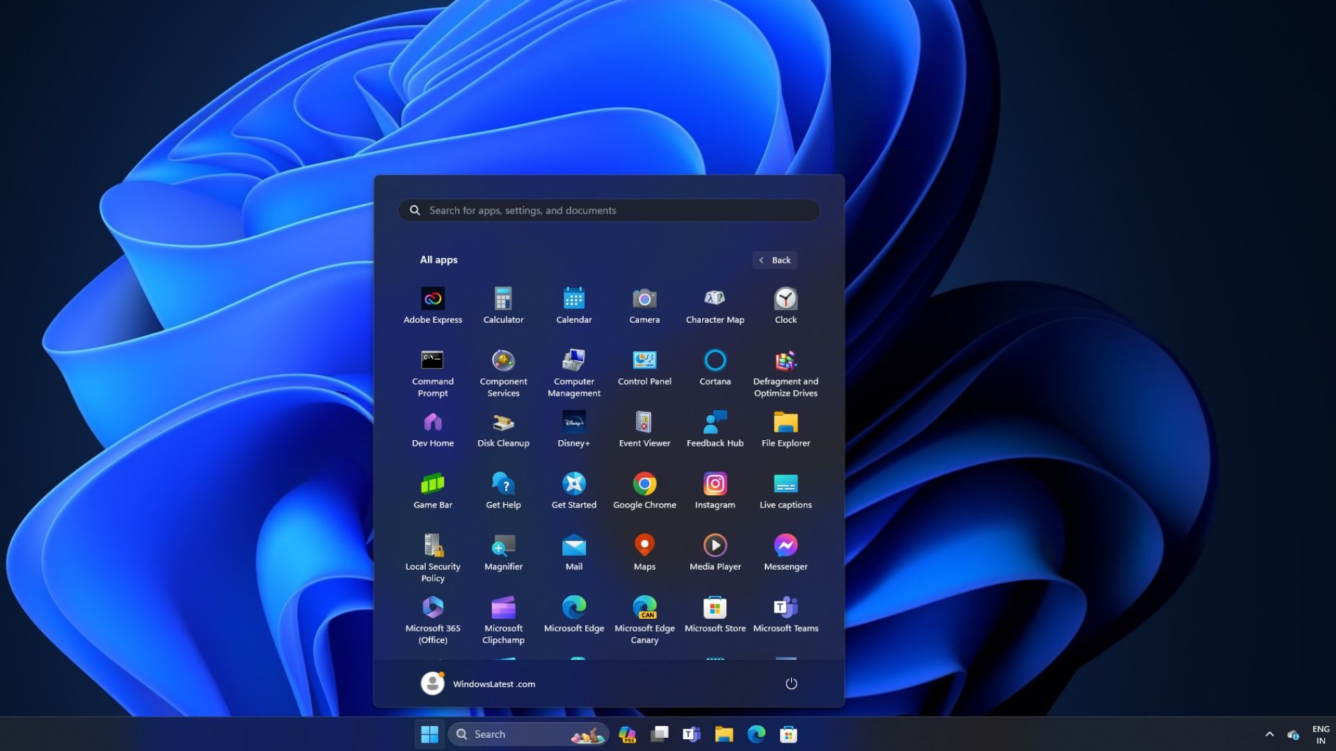

As shown above from the latest beta, once a user selects the all apps option, the Windows 11 Start Menu expands into something similar to the Microsoft Launcher on Android. From here, you'll see larger and easier-to-find app icons in a 6x6 grid layout.
All your Windows applications are still listed alphabetically, but seeing over 30 apps in the start menu at once is certainly handy. Then, you'll be able to continue scrolling to view the rest. As you can imagine, this makes better use of all the screen real estate, but it's also a big change from what we're used to dealing with.
If Microsoft ends up delivering this new interface for the Start Menu and apps, we're hopeful there's a way for users to toggle between either option. That way, only those who'd like the change can take advantage of it. Microsoft is still testing this layout, meaning it could change or never arrive at all. We'll have to wait and see.
Source: Windows Latest
The above is the detailed content of The Windows 11 Start Menu Has a New Grid Layout. For more information, please follow other related articles on the PHP Chinese website!


