Recently during development, I discovered some problems with mobile pixels that I have never noticed before. This article mainly introduces you to relevant information about pixel display problems in mobile development tutorials. The article uses sample code The introduction is very detailed and has certain reference value for everyone's study or work. Friends who need it can follow the editor to study together.
Preface
I believe that in the process of mobile terminal development, everyone will find that the display on the mobile terminal is generally different from that on the desktop terminal. For example, when a block element with a size of 1334x750 pixels is displayed on the iPhone 6, although the nominal screen pixel density of the iPhone 6 on Apple's official website is 1334x750, we found that this block element with a size of 1334x750 pixels cannot cover the entire screen.
Then why? Let’s discuss it from several aspects.
Pixel density (PPI)
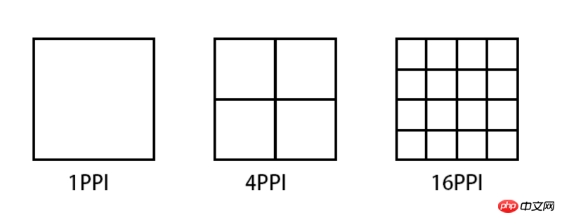
PPI (Pixel Per Inch), which means how many pixels per inch, similar to population Density and building density, the following figure illustrates several PPI representations.

Taking iPhone6 as an example, the general calculation formula for pixel density is: Math.sqrt(1366*1366 + 640*640)
But to calculate this PPI, we first need to know how many pixels there are on the device's screen, which is the first Pixel in Pixel Per Inch.
Device pixel (DP) && Device pixel ratio (DPR)
Device pixel (Device pixel), also called physical pixel (Physical pixel) ), which is the screen specifications of iPhone 6 mentioned at the beginning of this article. The pixels referred to in pixel density are device pixels. For general display devices, one pixel corresponds to a luminous point on the screen, so PPI is also called DPI (dots per inch), but this is only true on display devices. Equivalently, for example, it is different on a printer.
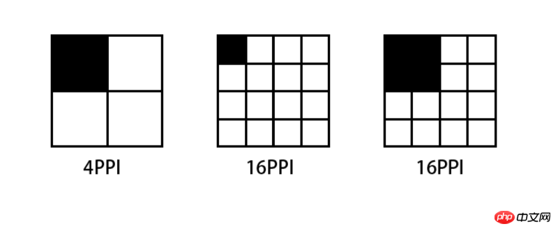
Since the screen specifications of each mobile phone on the market are different, some are 720P, some are 1080P, even 2K, etc. Some of the screens of these devices have more pixels and some have less pixels. If the same pixel is displayed , a situation like the following will occur:

The higher the PPI screen, the smaller the area that displays one pixel. A picture composed of 4x4 pixels If it is displayed on a screen with a PPI of 64, then the display will be reduced to half of the original size when switched to a screen with 256PPI.
Conversely, if you want to display the same effect on a screen with a PPI of 256 as a screen with a PPI of 64, you have to enlarge the image by 2 times.
Therefore, for mobile phones equipped with high-definition screens, manufacturers must ensure that all types of materials are displayed on their devices in the same way as standard-definition devices for the usability of their devices, that is, icons and text can be correctly recognized and clicked accurately. The solution is to enlarge all sizes several times. This magnification ratio is called Device Pixel Ratio (DPR). Generally, DPR corresponds to the following table:
| Ȧ | ##ldpi | mdpi | hdpi | xhdpi |
##ppi
| 120 |
160 |
240 |
320 |
| ##dpr
0.75 | 1.0 | 1.5 | 2.0 |
|
Therefore, the high-definition device should be equipped with a high-definition picture display. Otherwise, after the picture is enlarged on the high-definition device, there are not enough pixels to show its details, and the picture will look blurry.
CSS Pixel
After talking about so many concepts, it seems that the problem at the beginning of the article is still not well explained. After discussing CSS pixels below, I think everyone will have a clearer concept.
We will use the pixel unit px when writing CSS all night, but this pixel unit does not always correspond to the device pixels one-to-one, that is to say, 1px (pixel) in CSS does not correspond to the device screen a pixel in . In order to distinguish it from device pixels, the pixel px referred to in CSS is generally called CSS pixel. In other words, CSS pixel is a virtual and relative unit.


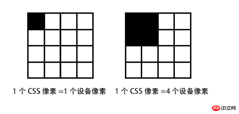
For example, if you draw a 300px wide block element on the page, it will only occupy part of the screen on a normal monitor, but If we manually enlarge the page, this block element will soon fill the entire page. This shows that under normal circumstances, CSS pixels are equal in size to pixels in system resolution, that is, in standard definition devices, one CSS pixel should be equal in size to one device pixel. However, in the case of high-definition devices or user scaling, one CSS pixel may be equal to multiple device pixels.
To give another example, in mobile native application development, if you have to develop in units of one device pixel, it will be a very painful thing, because Not every mobile device's system resolution corresponds to a device pixel. Some are 1:2 and some are 1:2.46. It is precisely because of this difference that in Android development there are units such as dp and dt ( There are pt units in iOS). When we define the size of an element, we only need to give a dp value. The system will convert it based on this value with the ratio of the system resolution to the device pixels (i.e. DPR). Finally, Calculate the actual device pixels displayed on the screen.
The abstract unit of dp pointed out above is called device independent pixel. Of course, CSS pixels are also device-independent pixels. When we write CSS pixels, we don’t need to care about how many device pixels one CSS pixel corresponds to. The system will automatically convert it for us based on DPR. All we need to care about is how to ensure that web page elements are clearly displayed on the device when they are enlarged due to system conversion.
Viewport
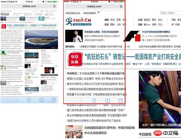
Normally speaking, when opening a page on the mobile terminal, if the browser will first open it in a normal proportion Render the page, and then automatically set a ratio to zoom the page. The purpose is to better display the content, that is, the page content just covers the entire mobile phone screen. Of course, if the page does not prohibit the user from zooming, you can also use two Use fingers to zoom the page back to its original proportions. This whole process is implemented through the viewport. After the original page is rendered, the viewport is scaled to be the same as the system width, so that the page can be fully displayed.
(Picture from tgideas team blog)
We can control the scaling of the window during rendering by adding the initial-scale attribute to the content and set it to 1 There is no scaling.
<meta name="viewport" content="initial-scale=1">
Copy after login
We can also define the device-width attribute to control the width of the viewport
<meta name="viewport" content="width=device-width">
Copy after login
Generally in mobile development, we will set up not allowing users to zoom, and set the maximum and minimum zoom ratio to 1
<meta name="viewport" content="width=device-width, initial-scale=1, minimum-scale=1, maximum-scale=1, user-scalable=no">
Copy after login
##Summary (Summary)
After several days of reading and exploring, I finally have a complete and accurate understanding of the most introductory aspects of mobile development. Before, I had only used meta Just copy the code in and use it. I haven't figured it out yet. This time I took advantage of my free time and happened to have relevant information on hand. I went through it as a whole and finally recorded it as this document. I hope it will be helpful to others in the future. Everyone is helpful.
Related recommendations:
##Summary html title, paragraph, line break , horizontal lines, special characters
Implementation of table mouse drag sorting function in HTMLhtmlImplementation code for adding quantity subscripts on message buttons
The above is the detailed content of Summary of pixel display problems in mobile development tutorials_Experiences and tips_Web page production. For more information, please follow other related articles on the PHP Chinese website!

