


In CSS, you can use the calc() function to achieve adaptability. You only need to add "Element:calc(100%-pixel size);" to the element. The calc() function is a new function of CSS3. It uses calculation to specify the length of the element, so you don't have to worry about the problems caused by adding margins or borders.

The operating environment of this tutorial: Windows 7 system, CSS3&&HTML5 version, Dell G3 computer.
The operating environment of this tutorial: windows7 system, CSS3&&HTML5 version, Dell G3 computer.
With the emergence of adaptive layout, when we create pages, we often encounter situations where the width of an element is 100%. Friends who know the box model can easily imagine that if this element has margin, padding, and border, the overall width of the element at this time will be greater than the width of the parent element, which will lead to a series of layout problems such as disordered page structure. To solve this problem, I can use calc().
First of all, calc is the abbreviation of calculate (calculation). Secondly, it looks like a function. It is a new function of CSS3, used to specify the length of elements. , and it is specified through calculation, so there is no need to worry about the problems caused by adding margins or borders.
Since calc() can set the length of elements through calculation, how to implement it?
We know that the height and width of elements can be defined by units such as percentage, px, etc., and calc() can calculate the height and width. As follows:
width: calc(100% - 10px);
You can use the "", "-", "*", "/" operators to perform operations
Can be mixed Calculate using units such as percentage, em, px, rem
Note the use of spaces before and after the operator
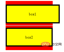
Is the above usage very simple? Let’s take a look at a complete example:
Note: The following example only shows the usage and effect of calc. The actual project will choose the optimal implementation method according to the needs.
html code snippet
css code snippet
.warpper { width: 200px; margin: 0 auto; padding: 15px 0; background-color: #f00; } .box1, .box2 { height: 50px; line-height: 50px; text-align: center; padding: 10px; border: 5px solid #000; background-color: #ff0; } .box1 { width: 100%; } .box2 { width: calc(100% - (10px + 5px) * 2); }
The above is the detailed content of How to implement adaptive css. For more information, please follow other related articles on the PHP Chinese website!


![[Web front-end] Node.js quick start](https://img.php.cn/upload/course/000/000/067/662b5d34ba7c0227.png)


