
Gradient attributes include: 1. Linear gradient "linear-gradient()", the syntax is "linear-gradient(angle, color, color)"; 2. Radial gradient "radial-gradient()", The syntax is "radial-gradient(position, color, color)".

The operating environment of this tutorial: Windows 7 system, CSS3&&HTML5 version, Dell G3 computer.
Gradient can make the element background more spiritual and lively. Although we can use background images to present gradient effects, it is not flexible enough. When we want to change the color, we need to use a picture editor to re-edit. For gradients, you can change the color directly in the code. CSS3 provides two gradient methods, namely linear gradient (linear-gradient) and radial gradient (radial-0gradien).
Linear gradient is a color gradient along a certain direction. You can use left, right, up, down, and diagonal lines.
Linear gradient syntax:
background: linear-gradient(direction, color1, color2 [stop], color3...);
1. direaction: indicates the direction of linear gradient. There are the following three expression methods.
(1) Gradient direction
It can also be the four diagonal directions: to left top, to left bottom, to right top, to right bottom.
(2) Direction starting point
It can also be the four diagonal directions of left top, left bottom, right top, and right bottom.
(3) Angle (angle)
Angle is expressed in numerical units, and the unit is deg. All colors start from the center, 0deg is the direction to top, clockwise is positive, counterclockwise is negative.
. Correspondingly, there are 45deg, 135deg, 225deg, and 315deg to represent the diagonal direction, but using angles to represent the direction is more flexible than the given horizontal and vertical direction. It can be used as needed. to adjust the angle to achieve the desired effect.
2. color- *: Represents the transition color in the gradient. Generally, the first one represents the starting color of the gradient, the last one represents the ending color of the gradient, and the middle represents the intermediate transition color.
3. Stop: Stop can be added after color. Stop can be a percentage value or a pixel value, indicating that a certain color is fixed at the stop position, as follows:
background: linear-gradient(to right, blue, green 20%, yellow 50%, purple 80%, red); //渐变起始颜色是蓝色,当过度到20%时为绿色,也就是说在20%处恰好是绿色,然后继续渐变过度到黄色,到50%处恰好是黄色,后面同个道理,直到结束颜色红色,正好处于100%处。
Speaking of linear gradients, we have to mention repeating linear gradients. Sometimes we want to generate the stripe effect as shown below. Our most convenient The method is to repeat the linear gradient.
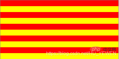
Grammar code:
background: repeating-linear-gradient(#f00 0,#f00 10%,#ff0 10%,#ff0 20%);
The above red color starts from 0 and is still red when it reaches 10%, so a red stripe is formed, which changes to red after 10% Yellow is still yellow until 20%, so yellow stripes are formed at this time, and then the 20% red and yellow stripes will be repeatedly gradient during rendering, giving the effect of alternating red and yellow stripes.
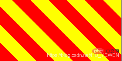
We can also add the direction
background: repeating-linear-gradient(45deg,#f00 0,#f00 10%,#ff0 10%,#ff0 20%);
A radial gradient starts from a central point and creates a gradient effect along all sides. It is defined by its center point, edge shape outline and position, and color value end points (color stops).
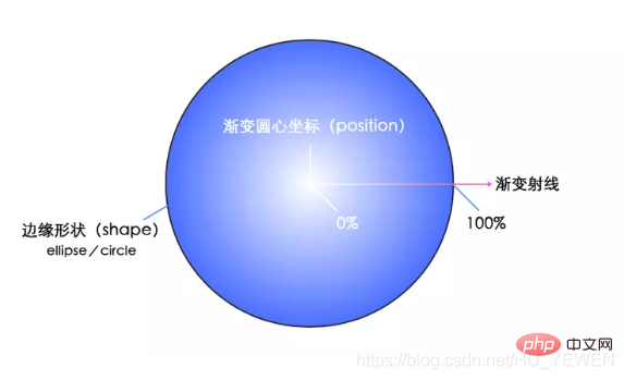
When we set multiple colors for a gradient, they will equally divide the 100% area to gradient. Of course, in addition to percentages, we can also use specific pixels to set this size. The size of the pixel setting refers to the distance extending outward from the center of the gradient circle.
Radial gradient syntax:
= radial-gradient([ [ || ] [ at ]? , | at , ]? [stop]?[ , [stop]?]+)
The meanings of various attributes are as follows:
// 圆心位置= [ | | left | center | right ]? [ | | top | center | bottom ]? //默认处于中心点 // 渐变形状 = circle | ellipse //默认是ellipse // 渐变大小 = | [ || ] = closest-side | closest-corner | farthest-side | farthest-corner = = [ | ]{2} = | // 渐变颜色及颜色位置 [stop]? = [ | ]?
The above needs to be explained in detail
When we define the gradient You can directly define the shape of the gradient, but in addition to this method, you can also determine the shape of the gradient by passing in a specific value for size. The specific instructions are as follows:
1. When passing in a size parameter size or two identical When it is worth size, it means that the gradient shape is a circle.
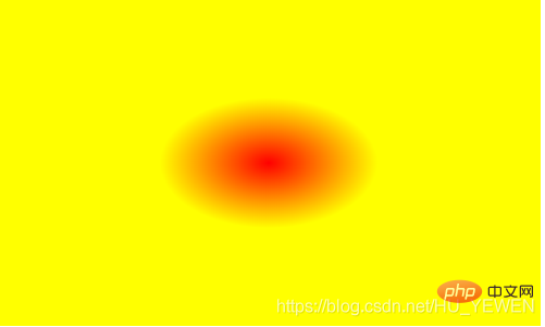
background: radial-gradient(60px,#f00 0,#ff0 100%);
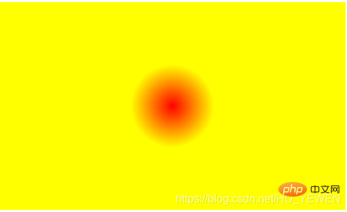
2. When two size parameters with different sizes are passed in, it means that the gradient shape is an ellipse.
background: radial-gradient(100px 60px,#f00 0,#ff0 100%);
四、重复径向渐变(repeating-radial-gradient)
上面再说线性渐变时有说到线性渐变具有重复线性渐变,为径向渐变同样具有重复径向渐变,先看一个简单例子。
background: repeating-radial-gradient(circle at center,#f00 0,#f00 10%, #ff0 10%,#ff0 20%);
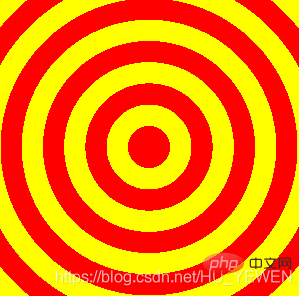
重复径向渐变总体上与重复线性渐变差不多,只是重复线性渐变是一个方向上的重复渐变,不论是水平垂直还是对角线,如下图,左边为0%,右边为100%。
然而重复径向则是以圆心为中心点,以放射性方式渐变,中心点为0%,圆边界为100%。
关于上面重复径向渐变是如何生成条纹相间的就 不多加述说,原理和重复线性渐变相同。
下面给出一个重复径向渐变的实用例子,使用重复径向渐变生成一个唱片的效果 。
HTML:
CSS:
.record-container { display: inline-block; overflow: hidden; width: 400px; height: 300px; border-radius: 10px; box-shadow: 0 6px #99907e; background: #b5ac9a; } .record { position: relative; margin: 19px auto; width: 262px; height: 262px; border-radius: 50%; background: linear-gradient(30deg, transparent 40%, rgba(42, 41, 40, .85) 40%) no-repeat 100% 0, linear-gradient(60deg, rgba(42, 41, 40, .85) 60%, transparent 60%) no-repeat 0 100%, repeating-radial-gradient(#2a2928, #2a2928 4px, #ada9a0 5px, #2a2928 6px); background-size: 50% 100%, 100% 50%, 100% 100%; } .record:after { position: absolute; top: 50%; left: 50%; margin: -35px; border: solid 1px #d9a388; width: 68px; height: 68px; border-radius: 50%; box-shadow: 0 0 0 4px #da5b33, inset 0 0 0 27px #da5b33; background: #b5ac9a; content: ''; }

推荐学习:css视频教程
The above is the detailed content of What are the gradient attributes in css3. For more information, please follow other related articles on the PHP Chinese website!