When browsing a website, you will often encounter the page "Loading, please wait" situation. At this time, a circle will appear on the page and keep rotating until the loading is completed. Friends who are learning html and CSS, can you use html and CSS to achieve page loading animation effect? This article will study CSS3 page loading animation with everyone, and share the code of page loading animation with everyone. Interested friends can refer to it.
To achieve the loading animation effect of the page, you need to use many attributes in CSS, such as: animation animation, keyframes, border-radius rounded corners, border attributes, etc. If any friends do not know these attributes, you can Refer to the relevant manuals on the PHP Chinese website:CSS Manual, I hope it will be helpful to you.
The following is a detailed example of how to use HTML and CSS3 to implement page loading (loading) animation effects:
HTML part
Create a div to display the loading animation, and give the div a class name to facilitate styling it. (If there are not many styles, you can also set the style within the tag.) The specific code is as follows:
CSS加载样式
CSS part
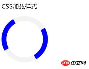
The basic framework of the page is already there. Now you need to use CSS to style it. Set the length and height of the div to 120px, and set the border-radius attribute value to 50%. Turn it into a circle, and use border-top and border-bottom to set the upper and lower arcs to facilitate subsequent animation settings.
Finally, in order to make it rotate, you need to use animation and @keyframes attributes. The specific code is as follows:
Note: When using animation and @keyframes animation, pay attention to browser compatibility. (For example, add the prefixes -webkit- and -ms-)
.load { border: 16px solid #f3f3f3; border-radius: 50%; border-top: 16px solid blue; border-bottom: 16px solid blue; width: 120px; height: 120px; -webkit-animation: spin 2s linear infinite; animation: spin 2s linear infinite; } @-webkit-keyframes spin { 0% {-webkit-transform: rotate(0deg);} 100% {-webkit-transform: rotate(360deg);} } @keyframes spin { 0% {transform: rotate(0deg);} 100% {transform: rotate(360deg);} }
Loading effect renderings:

The above is shared with everyone How to use HTML and CSS3 to achieve page loading (loading) animation effects. The HTML and CSS parts are explained in detail. It is relatively easy to understand. Friends who have not been exposed to page loading animation before must try it yourself to see if your code can achieve it. Page loading effect, I hope this article will be helpful to you!
【Recommended related tutorials】
1.CSS3 latest version reference manual
2.CSS3 tutorial
3.bootstrap tutorial
The above is the detailed content of How to use html and CSS to achieve page loading animation effect. For more information, please follow other related articles on the PHP Chinese website!