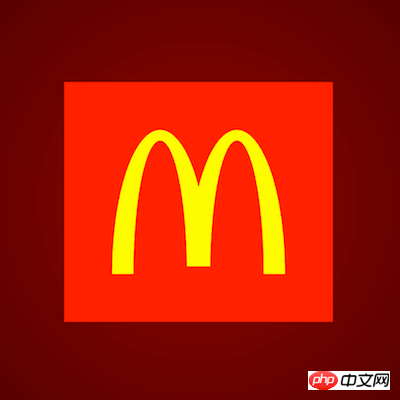
The content of this article is about how to use pure CSS to implement the single-element McDonald's Logo (source code attached). It has certain reference value. Friends in need can refer to it. I hope it will be useful to you. helped.

https://github.com/comehope/front-end-daily -challenges
Define dom, only 1 element:
<div></div>
Centered display:
body {
    margin: 0;
    height: 100vh;
    display: flex;
    align-items: center;
    justify-content: center;
    background: radial-gradient(circle at center, darkred, black);
}Define container size:
.mcdonalds {
    width: 36em;
    height: 30em;
    font-size: 5px;
    color: red;
    background-color: currentColor;
}Use pseudo elements to draw the shape of the left half n of the letter m:
.mcdonalds {
    position: relative;
    overflow: hidden;
}

.mcdonalds::before {
    content: '';
    position: absolute;
    width: 20em;
    height: calc(30em * 2);
    box-sizing: border-box;
    border: solid yellow;
    border-width: 2.2em 4.4em;
    border-radius: 50%;
}
Copy the left half, which is the shape of the right half n, and together with the left side form the letter m:
.mcdonalds::before {
    filter: drop-shadow(16em 0 0 yellow);
}Use pseudo elements to cover the letter m and a little bit at the bottom of the middle vertical line to make the vertical lines on both sides appear longer:
.mcdonalds::after {
    content: '';
    position: absolute;
    width: 6em;
    height: 1.5em;
    background-color: currentColor;
    left: calc((36em - 6em) / 2);
    bottom: 0;
}Finally, extend the red background outwards:
.mcdonalds {
    box-shadow: 0 0 0 10em;
}You're done !
Related recommendations:
How to use pure CSS to achieve the animation effect of the ball jumping steps (with source code)
The above is the detailed content of How to use pure CSS to implement a single-element McDonald's logo (source code attached). For more information, please follow other related articles on the PHP Chinese website!