This article mainly introduces the relevant information about using css to realize arrow examples of any size, any direction and any angle. The editor thinks it is quite good, so I will share it with you now and give it as a reference. Let’s follow the editor and take a look
In web development, the drop-down arrow

is often used, and the right arrow

Such an arrow. It is generally implemented using css:
{ display: inline-block; margin: 72px; border-top: 24px solid; border-right: 24px solid; width: 120px; height: 120px; transform: rotate(45deg); }
Because this is achieved by using the border-top and border-right of p, and then rotating the p.
Arrows at any angle
Here is a question: What if you need an arrow with an angle of 120 degrees? Since border-top and border-right are always 90 degrees, just rotation will not work. We can first rotate p 45 degrees to make it a rhombus, and then stretch it to reach any angle, so that we can get an arrow at any angle. Since two transformations, rotation and scaling, are used, you need to use the transformation matrixtransform: matrix(a,b,c,d,e,f). The 6 variables here form a 3-dimensional transformation matrix
The translation, rotation, expansion transformation and various combinations of any point p(x,y) can be achieved through this transformation matrix:
Note: Homogeneous coordinates are used here to express a point. Simply put, p(x, y) is expressed as p'(x', y', 1)
Translation matrix
v(x, y) translates tx along the x-axis, along Translate ty along the y-axis. Then there is:
x' = x tx
y' = y ty
So the translation matrix:
Rotation matrix
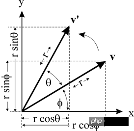
The point v(x, y) is rotated θ around the origin to v'(x', y')

Then there is:
x = r * cos(ϕ )
y = r * sin(ϕ )x' = r * cos(θ ϕ) = r * cos(θ) * cos (ϕ) - r * sin(θ) * sin(ϕ ) // Cosine formula
y' = r * sin(θ ϕ) = r * sin(θ) * cos(ϕ) r * cos(θ) * sin(ϕ ) // Sine formula
So:
x' = x * cos(θ) - y * sin(θ)
y' = x * sin(θ) y * cos(θ)
So the rotation matrix:
Stretching matrix
Assume the x-axis, The expansion and contraction ratios of the y-axis are kx and ky respectively. Then there is:
x' = x * kx
y' = y * ky
So:
Compound transformation
What if p(x, y) is first translated (transformation matrix A), then rotated (transformation matrix B), and then stretched (transformation matrix C)?
p' =C(B(Ap)) ==> p' = (CBA)p //Matrix multiplication combination rate
Now the arrow at any angle o is very simple:
First put p is rotated 45 degrees to become a rhombus, transformed intoM1Telescopic x-axis, y-axis:
x' = size * cos(o/2) = x * √2 * cos(o/2) y' = size * sin(o/2) = y * √2 * sin(o/2)
That is: kx = √2 * cos (o/2); ky = √2 * sin(o/2) This gives you an arrow at any angle. Transform toM2
If the direction of the arrow is not pointing to the right, you can get an arrow in any direction by performing a rotation. Transformed toM3
, then sincep' =C(B(Ap)) ==> p' = (CBA)p, we can calculate it first Extract M3M2M1, and then transform p accordingly, you can get arrows at any angle and direction.
The width and height of p are the side lengths of the arrow. By adjusting, you can get an arrow with any side length.
React component
For ease of use, this arrow is encapsulated into a React component.
Example
Simple arrow

##Simulate select

Divergent arrows

props
安装使用
npm install rc-arrow --save
import Arrow from 'rc-arrow' class Hw extends Component { render() { return (
以上就是本文的全部内容,希望对大家的学习有所帮助,更多相关内容请关注PHP中文网!
相关推荐:
The above is the detailed content of How to use css to achieve arrows of any size, direction and angle. For more information, please follow other related articles on the PHP Chinese website!


| type | default | description | |
|---|---|---|---|
| number | 90 | The opening angle of the arrow, angle system | |
| number | 0 | The direction of the arrow, pointing to the right by default | |
| string | - | The color of the arrow | |
| string | 10px | arrow side length |