CSS3 allows us to use custom fonts
There are also some good text effects
Using custom fonts requires using @font-face rules
Of course you must first have a custom text file
<p class="demo">Payen S.Tsung</p>
@font-face {    font-family: myDIYfont; /*自定义字体名*/
    src: url('Ginga.ttf'); /*字体文件*/}.demo {    font-family: myDIYfont;}
If we also have a font file in bold format
You can use it like this
@font-face { font-family: myDIYfont; src: url('Ginga_bold.ttf'); font-weight: bold;}.demo { font-family: myDIYfont;}@font-face Each browser has compatibility issues
We can add format format after the srcattribute like this src: url('Ginga.ttf') format('truetype');
Browser compatibility:
url('font.eot?#iefix' ) format('embedded-opentype'), /* IE6-IE8 */
url('ont.woff') format('woff'), /* chr ome、firefox */
url('font.ttf') format('truetype'), /* chrome, firefox, opera, Safari, Android, iOS 4.2+*/
Introducing two
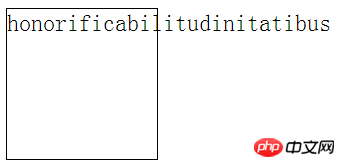
<p class="demo">honorificabilitudinitatibus</p>
.demo { width: 100px; height: 100px; border: 1px solid black;}
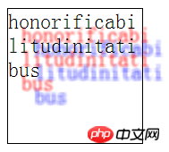
For all line breaking rules for non-Chinese, Japanese and Korean text, we can use word-wrap to force line breaks
.demo { width: 100px; height: 100px; border: 1px solid black; word-break: keep-all;}
In fact, the two are the same
Only it is the shadow of the text rather than the box shadow
It is also very performance consuming and should be used sparingly
Attribute values include horizontal shadow distance, vertical shadow distance, blur radius (optional), color (optional)
You can also define multiple shadows
The difference between box-shadow It has no shadow size and shadow mode
.demo {    width: 100px;    height: 100px;    border: 1px solid black;    word-break: break-all;    text-shadow: 10px 10px 2px red,                 20px 20px 3px blue;
}
<p class="demo">this is a text</p>
.demo { text-shadow: 2px 2px 5px;}
The above is the detailed content of Sample code sharing for CSS3 fonts and text effects. For more information, please follow other related articles on the PHP Chinese website!


