
Gradient color before CSS3PicturesOnly background images can be used
The gradient color syntax of CSS3 allows us to save the cost of downloading images
And in There is a better effect when changing the browser resolution
The rgb color standard we are familiar with is composed of r (red), g (green), b (blue) The colors are superimposed and changed to form various colors
The value is 0~255, or 0~100%
rgba is based on rgb and adds the alpha opacity parameter
.demo { width: 100px; height: 100px; background-color: rgb(255, 0, 0);}
.demo { width: 100px; height: 100px; background-color: rgba(255, 0, 0, 0.5);}
alpha takes a value of 0~1, the smaller the value, the more transparent it is
gradient means "inclination" , linear means "linear"
Gradient color is a smooth transition between multiple colors to form brilliant colors
Linear gradient The linear-gradient parameter has the direction of the gradient (optional) and any number of gradient colors
.demo { width: 100px; height: 100px; background: linear-gradient(red,lime,blue);} Note that what I wrote here is background, not background-color
(In fact, the gradient color is the function of background-image) 
If the gradient direction is not filled in, the default is from top to bottom
The gradient direction has the following attributes values
to top, to bottom (default), to left, to right
to top left, to top right, to bottom left, to bottom right
or fill in the angle xxxdeg
For example, to top left means the direction is towards the upper left
.demo { width: 100px; height: 100px; background: linear-gradient(to top left,red,lime,blue);}
Angle 0deg is equivalent to to top, increasing the angle is equivalent to clockwise rotation
.demo { width: 100px; height: 100px; background: linear-gradient(20deg,red,lime,blue);}
After each color, you can add the position of each color gradient
.demo { width: 100px; height: 100px; background: linear-gradient(red 30%,lime 50%,blue 70%);}
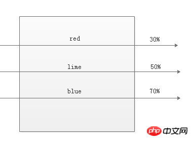
If you do not fill it in, the browser will divide it evenly by default. For example, the three color values default are 0%, 50%, and 100%
There is also an uncommon function repeating-linear-gradient to use We can repeat the linear gradient
.demo { width: 100px; height: 100px; background: repeating-linear-gradient(red, rgba(100,100,100,0.5),blue 50%);}
The result is such an ugly gradient color
radial meaning It is "radial and radial"
It is a gradient center that radiates outwards. The gradient
.demo { width: 200px; height: 100px; background: radial-gradient(red,lime,blue);}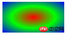
is similar to the linear gradient
but the first The first parameter (optional) is the gradient shape and position of the radial gradient.
You can use circular circle or elliptical ellipse (default)
.demo { width: 200px; height: 100px; background: radial-gradient(circle,red,lime,blue);}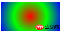
Yes Use the shape at position format to define the position of the gradient center
.demo { width: 200px; height: 100px; background: radial-gradient(circle at 30% 30%,red,lime,blue);}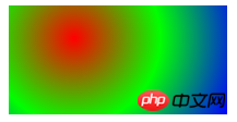
The gradient position can be in percentage form or in pixel form
If you only write one value When, the other value defaults to 50% of the middle position
.demo { width: 200px; height: 100px; background: radial-gradient(circle at 30%,red,lime,blue);}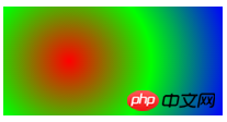
Gradient size If you don’t want to use keywords, you can also use the numeric form
.demo { width: 200px; height: 100px; background: radial-gradient(100px 100px at 50px 50px,red,lime,blue);} means the gradient size is 100px*100px, and the gradient position is 50px*50px 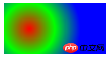
The radial gradient also has a function that repeats the gradient
The usage is similar to the linear gradient, here it is No more explanation
.demo { width: 200px; height: 100px; background: repeating-radial-gradient(red 10%,lime 20%,blue 30%);}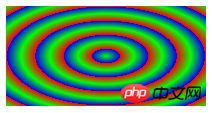
The above is the detailed content of Detailed explanation of color values RGBA and gradient colors in CSS3 (picture). For more information, please follow other related articles on the PHP Chinese website!


