When the <a href="//m.sbmmt.com/wiki/919.html" target="_blank">float</a> attribute of an element If it is not none, a float will occur.
<p class="float">float</p>
.float {
  float: left;
  width: 100px;
  height: 100px;
  background-color: #ddd;
}Floating will cause elements to break away from the document flow. The specific performance is:
The parent element is highly collapsed, that is, it will not contain floating elements.
For example, the above code will appear as

The height of the parent element is collapsed
The text is wrapped.

Text wrapping effect
You can notice that the width of the .normal element here covers .float element, but there is no text under the .float element, which means that the text is "squeezed" out. This is because although it will break away from the document flow, it will not Break away from the text flow. This effect is also the original intention of the float attribute. The code is as follows:
<p class="float">float</p>正常元素正常元素正常元素正常元素正常元素正常元素正常元素正常元素正常元素正常元素正常元素正常元素正常元素正常元素正常元素正常元素正常元素正常元素正常元素正常元素正常元素正常元素正常元素正常元素正常元素正常元素正常元素正常元素正常元素正常元素正常元素正常元素正常元素正常元素正常元素正常元素正常元素正常元素正常元素正常元素正常元素正常元素正常元素正常元素正常元素正常元素正常元素正常元素正常元素正常元素正常元素正常元素正常元素正常元素正常元素正常元素正常元素正常元素正常元素正常元素正常元素正常元素正常元素正常元素正常元素正常元素正常元素正常元素正常元素正常元素正常元素正常元素正常元素正常元素正常元素正常元素正常元素正常元素正常元素正常元素正常元素正常元素正常元素正常元素正常元素正常元素正常元素正常元素正常元素正常元素正常元素正常元素正常元素正常元素正常元素正常元素
body {
  background-color: #ccc;
}
.float {
  float: left;
  width: 100px;
  height: 100px;
  background-color: #ddd;
}
.normal {
  background-color: #fff;
}The margins of floating elements will not be merged.
For related content about margin merging, you can click here. Once the
element is floated, it will become an inline block element, that is, <a href="//m.sbmmt.com/wiki/927.html" target="_blank">display</a>: inline-block.
The text wrapping mentioned above.
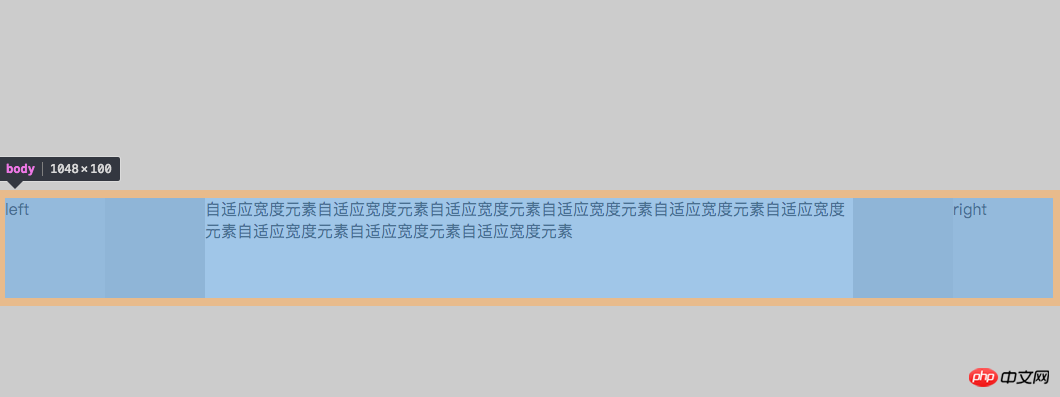
Write a three-column layout with fixed width on the left and right and adaptive middle.
<body>
  <p class="left float">left</p>
  <p class="right float">right</p>
  <p class="mid">自适应宽度元素自适应宽度元素自适应宽度元素自适应宽度元素自适应宽度元素自适应宽度元素自适应宽度元素自适应宽度元素自适应宽度元素</p>
</body>
body {
  background-color: #ccc;
}
.float {
  float: left;
  width: 100px;
  height: 100px;
  background-color: #ddd;
}
.left {
  float: left;
}
.right {
  float: right;
}
.mid {
  height: 100px;
  background-color: #fff;
  margin: 200px; /*故意加上了上下 margin 值*/
}Here I deliberately added the margin value, you can see the effect:

Three column layout
body also falls down along with the margin of .mid. This can be explained by the merging of margins introduced earlier.
ps: When I first wrote this three-column layout, the html was written like this
<body>
  <p class="left float">left</p>
  <p class="mid">自适应宽度元素自适应宽度元素自适应宽度元素自适应宽度元素自适应宽度元素自适应宽度元素自适应宽度元素自适应宽度元素自适应宽度元素</p>
  <p class="right float">right</p>
</body>
As above, write the middle adaptive element in the middle. In fact, this is more logical. But if you write it like this, it won't work. The elements on the right will fall down, because the .mid element is a block-level element and will occupy the entire line. .left will not fall down. Because it is originally a floating element separated from the document flow.
Here I only write methods that do not produce meaningless tags.
If there is a sibling element behind the floating element, you can add the <a href="//m.sbmmt.com/wiki/917.html" target="_blank">clear</a> attribute to its sibling element.
If the text surrounds that part of the code, add clear:left<a href="//m.sbmmt.com/wiki/974.html" target="_blank"> or </a>clear:both to .normal. The specific usage of clear will not be elaborated here.
Add pseudo-class or pseudo-element to the element to be cleared.
.float::after {
  content: '';
  display: block;
  visiability: hidden;
  height: 0;
  clear: both;
}For information on the use of ::after, please see the MDN documentation.
BFC (Block Formatting Context), that is, block-level formatting context, its official explanation Yes:
Floating, Absolutely positioned elements (
<a href="//m.sbmmt.com/wiki/902.html" target="_blank">position</a>isabsoluteorfixed), inline block elementdisplay:inline-block, tablecelldisplay:table-cell, table titledisplay:table-captionand<a href="//m.sbmmt.com/wiki/923.html" target="_blank">overflow</a>elements whose attribute value is notvisible(except that the value is propagated to the viewport<a href="//m.sbmmt.com/css/css-rwd-viewport.html" target="_blank">viewport</a>) will create a new block-level formatting context.
In summary, it must meet one of the following conditions:
float is not none
position is not <a href="//m.sbmmt.com/wiki/188.html" target="_blank">static</a> or relative
display is table-cell, table-caption, inline-block, flex, inline-flex
overflow is not visible
As long as you add any of the above attributes to the parent element to meet the conditions, that is, adding BFC to the parent element can clear the floating of the child element.
The above is the detailed content of CSS Float and Float Clear (BFC) Simple Tutorial. For more information, please follow other related articles on the PHP Chinese website!


