Found a total of 10000 related content

Operation process of creating a new BPMN diagram in Microsoft Office Visio
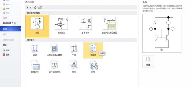
Article Introduction:We need to open the Microsoft Office Visio software first, then we click the [File] menu, then select [New], then click [Flowchart], then in the [Flowchart] interface, select [BPMN Diagram], and click [Create] on the right. We enter the drawing interface of [BPMN Diagram] and use the mouse to click and hold the object in [BPMN Basic Shape] on the left, and drag it to the main window on the right. Then we use the mouse to click and hold the object in [BPMN Event] on the left , and drag it to the main window on the right
2024-06-01
comment 0
559

Representing Graphs
Article Introduction:Representing a graph is to store its vertices and edges in a program. The data structure for storing a graph is arrays or lists. To write a program that processes and manipulates graphs, you have to store or represent data for the graphs in the compu
2024-08-09
comment 0
768
jpgraph图表使用引出类 就无法输出图表
Article Introduction:
jpgraph图表使用引入类 就无法输出图表本帖最后由 h9zhou 于 2014-05-12 15:31:35 编辑 jpgraph图表使用问题,在显示图表的php文件一引入类 ,就无法输出图表,图表就变成一个叉,是jpgraph不支持吗在问个问题 jpgraph&nb
2016-06-13
comment 0
982

How to make charts in navicat
Article Introduction:How to create a chart in Navicat? Connect to the database Select the query from which to create the chart Select Chart from the menu bar Configure chart options (data series, category fields, titles, etc.) Preview and save the chart
2024-04-23
comment 0
497

How to draw function images in WPS tables. Charts can help you
Article Introduction:WPS tables integrate powerful function functions and data processing functions, allowing users to provide an intuitive function image when dealing with mathematical function problems. Let's teach you how to use the chart function in WPS tables to draw function images. [Operation Instructions] First, we enter the coordinates of the function image we want to draw in the Excel table, taking the quadratic function as an example. Select the entered data and click [Chart] in the [Insert] column. In the chart dialog box, select [XY (Scatter Plot)]. After clicking OK, a function image will be displayed intuitively. If you modify the data in the table, the image will also change accordingly.
2024-02-09
comment 0
1198


How to make a chart
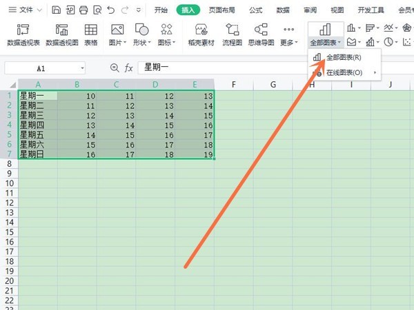
Article Introduction:Production steps: 1. Open the Excel document, create a table and fill in the data; 2. Select the data in the table; 3. Click the "Insert" - "Chart" option; 4. In the menu that opens, select the required chart type; 5. On the generated chart, you can modify the data content, font, direction, distance, etc. as needed.
2019-06-15
comment 0
48157

How to make a bar chart in WPS How to make a bar chart in WPS
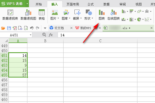
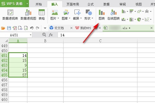
Article Introduction:Recently, many friends have asked me how to make a bar chart with WPS. Next, let us learn how to make a bar chart with WPS. I hope it can help everyone. How to create a bar chart in WPS? How to make a column chart with WPS 1. First open the WPS table and select the data, as shown in the figure below. 2. Then click "Insert" in the task tab above, as shown in the figure below. 3. Then you can click "Chart" to insert the chart, as shown in the figure below. 4. Finally, you can see the histogram. Select a style to add it, as shown in the figure below.
2024-08-20
comment 0
507

Optimization of legends and descriptions for Vue statistical charts
Article Introduction:Optimization of legends and descriptions of Vue statistical charts In web development, statistical charts are a common way to present data. Vue is a popular JavaScript framework that helps us build interactive and dynamic web applications. When we use Vue to create statistical charts, we often need to add legends and descriptions to the chart to improve readability and user experience. This article will introduce how to optimize the legends and descriptions of Vue statistical charts, and provide code examples. Using legends Legends are used to explain different elements in a chart
2023-08-17
comment 0
771

How to create dashboard charts using Highcharts
Article Introduction:How to use Highcharts to create a dashboard chart requires specific code examples. Preface: Dashboard chart is a common data visualization tool that displays data in the form of a dashboard to make the data more intuitive and easy to understand. Highcharts is a powerful JavaScript charting library that supports multiple chart types, including dashboard charts. This article will introduce how to use Highcharts to create dashboard charts and provide specific code examples. Step 1: Introduce Highcharts
2023-12-17
comment 0
552

How to make charts and data analysis charts in PPT
Article Introduction:In the era of data analysis, it is crucial to produce high-quality data analysis charts in PPT. This article will comprehensively explain how to make chart data analysis charts in PPT, covering many aspects such as data preparation, chart selection, design and beautification, and adding dynamic effects. By following the steps in this article, readers will master the skills to create clear, beautiful, and engaging PPT chart data analysis diagrams, improving the effectiveness of presentations and reports.
2024-03-25
comment 0
920

How to insert a chart in word
Article Introduction:Sometimes in order to display the data more intuitively, we need to use charts to display it. But when it comes to charts, many people think that they can only be operated on Excel. In fact, this is not the case. Word can also directly insert charts. How to do it? Just take a look and you'll find out. 1. First we open a word document. 2. Next we find the "Chart" tool button in the "Insert" menu and click it. 3. Click the "Chart" button and select a suitable chart. Here we can select a chart type at will and click "OK". 4. After selecting the chart, the system will automatically open the excel chart, and inside The data has been entered, we just need to change the data. If you have already prepared the form here,
2024-03-20
comment 0
663

Implementation of area chart and scatter chart functions of Vue statistical chart
Article Introduction:The area chart and scatter chart functions of Vue statistical charts are implemented. With the continuous development of data visualization technology, statistical charts play an important role in data analysis and display. Under the Vue framework, we can use the existing chart library and combine it with Vue's two-way data binding and componentization features to easily implement the functions of area charts and scatter charts. This article will introduce how to use Vue and commonly used chart libraries to implement these two statistical charts. Implementation of area charts Area charts are often used to show the trend of data changes over time. In Vue, we can use v
2023-08-20
comment 0
1410

Implementation of pie chart and radar chart functions in Vue statistical charts
Article Introduction:Implementation of the pie chart and radar chart functions of Vue statistical charts Introduction: With the development of the Internet, the demand for data analysis and chart display is becoming more and more urgent. As a popular JavaScript framework, Vue provides a wealth of data visualization plug-ins and components to facilitate developers to quickly implement various statistical charts. This article will introduce how to use Vue to implement the functions of pie charts and radar charts, and provide relevant code examples. Introducing statistical chart plug-ins In Vue development, we can use some excellent statistical chart plug-ins to help us implement
2023-08-18
comment 0
1637

How to make a bar chart with WPS_How to make a bar chart with WPS
Article Introduction:1. First open the WPS form and select data, as shown in the figure below. 2. Then click [Insert] in the task tab above, as shown in the figure below. 3. Then you can click [Chart] to insert the chart, as shown in the figure below. 4. Finally, you can see the histogram. Select a style to add it, as shown in the figure below.
2024-04-19
comment 0
851

How to make a combination chart in Excel How to make a combination chart in Excel
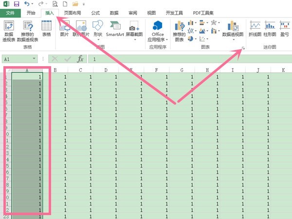
Article Introduction:Many friends fill in a lot of data when using Excel forms. To display multiple data in the same data chart, you need to make a combination chart. Many people don’t know how to make it. To address this problem, today The software tutorial is here to share the operation methods with the majority of users, hoping to bring help to everyone. How to make a combination chart in Excel: 1. First, open Excel, drag the mouse to select the data area for making the chart, click the insert option above the main interface, then click the expand icon in the lower right corner of the chart area, and in the pop-up dialog box for inserting the chart Click on all the charts above, and then click on the combination chart at the bottom of the left column. Then first select a combination chart type at the top of the right area. 2.
2024-08-30
comment 0
1177

How to optimize the design of ppt charts
Article Introduction:When we are making ppt, in some cases we need to insert some data into the ppt. If we want to analyze these data more intuitively, we need to make them into ppt charts. Speaking of ppt charts, everyone may be familiar with them, but have you experienced aesthetic fatigue after seeing too many conventional charts? So, today I will talk about how to optimize the design of ppt charts. 1. This lesson is the fifth section of our ppt course [Optimal Design of Infographics], and then we first understand the charts. 2. The charts are divided into [bar chart] [line chart] [pie chart]. 3. Let’s take a look at bad charts. The first type is the built-in chart that belongs to general situations. 4. The second is that it is not advisable to take screenshots from other charting software. 5. Then there is the third type of graph display
2024-03-20
comment 0
385

Making Interactive Charts: Creating Pie Charts and Dashboard Charts with Plotly.js, Part 5
Article Introduction:If you've been following this series since the beginning, you may have noticed that Plotly.js uses the same scatter type to create line and bubble charts. The only difference is that we have to set mode to lines when creating a line chart and markers to mode when creating a bubble chart. Likewise, Plotly.js allows you to create pie charts, donut charts, and gauge charts by using the same value for the type property and changing the values of other properties based on the chart you want to create. Creating a Pie Chart in Plotly.js You can create a pie chart in Plotly.js by setting the type attribute to pie. There are other attributes such as opacity, visible
2023-09-03
comment 0
1129

How to draw data charts in Excel Excel data chart drawing tutorial
Article Introduction:Excel tables are software that many users use in their daily work. Various data are filled in the forms. Many users want to draw charts to display data, but don’t know how to make them. To address this problem, today’s software tutorial is here The majority of users have shared two solutions. Let’s take a look at the detailed steps. Excel drawing data chart tutorial 1. Generate function graph. Open the data through Microsoft 365 Excel, then select all the data, click Insert on the top menu bar, find the chart area on the toolbar, click on the recommended chart, you can open the settings window (Figure 2). First, we can directly select the recommended icon on the left, preview the rendering on the right, and click OK to insert it into the table. Apart from
2024-08-30
comment 0
754
