Found a total of 10000 related content

Detailed method to add line chart effect on top of bar chart in excel2016 chart
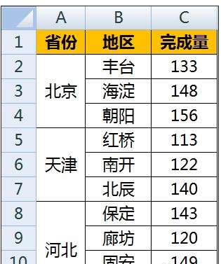
Article Introduction:As shown in the figure, it is the original data. Column A is the name of the province and city, column B is the lower-level address, and column C is the mapping data. Insert a blank row between the two first-level addresses in column A, so that the graphics in the two areas in the chart are separated and not connected together. Select all data areas and select [Insert]-[Chart]-[Area Chart]. The default generated chart style is as follows. The data in column C is displayed in blue as a series: Copy the data in column C of the original area, right-click the mouse in the chart area, and select [Paste]. In this way, a new red graphic series will be added to the chart, coinciding with the original blue area. Select the red series data and change the chart type to a line chart by right-clicking the mouse. Select [Line Chart with Data Markers] in the line chart, and then confirm. So, blue
2024-04-17
comment 0
547

How to export attendance data on DingTalk
Article Introduction:How does DingTalk export attendance data? You can take attendance data everywhere in DingTalk, but most users don’t know how to take attendance data everywhere. Next is a graphic tutorial on how to export attendance data from DingTalk brought to users by Peiwei. If you are interested, Players come and take a look! How to export attendance data on DingTalk 1. First open the DingTalk APP and enter the main page, and click the [Workbench] icon at the bottom; 2. Then on the workbench page, click the [Attendance Punch-in] button; 3. Then use the function shown in the figure below page, click on the [Statistics] function at the bottom to enter the special area; 4. Then on the statistics page, click on the [Export Report] function in the upper left corner; 5. Finally, on the attendance report page, click the blue [Export Report] at the bottom to complete.
2024-02-28
comment 0
1354

How to beautify the comparison diagram of PPT data chart page
Article Introduction:1. [The comparison relationship can be represented by a - chart] and then [analyze the problems in the table as shown in the figure]. 2. [Subtraction (what needs to be removed from the table)] is as shown in the figure. 3. [Addition (the part that needs to be added in the table)] is as shown in the figure. 4. The final effect is as shown in the figure. 5. Then open [icon source file-turn off background] [click the ‘+’ next to it] [turn off unnecessary elements]. 6. [Right-click - Change Chart Type - Select Column Column Chart] [Fill the column chart with light blue] [Adjust Gap Width]. 7. Then add a flag to each [country] and then select [Chart-Edit Data-Edit Data in Excel] and then [Sort Table in Excel]. 8. Then change [China’s bar chart fill to red] and then
2024-03-20
comment 0
747

How to align formulas in MathType_MathType tutorial to align formulas
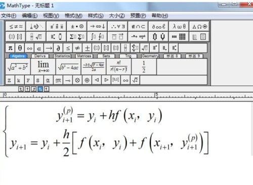
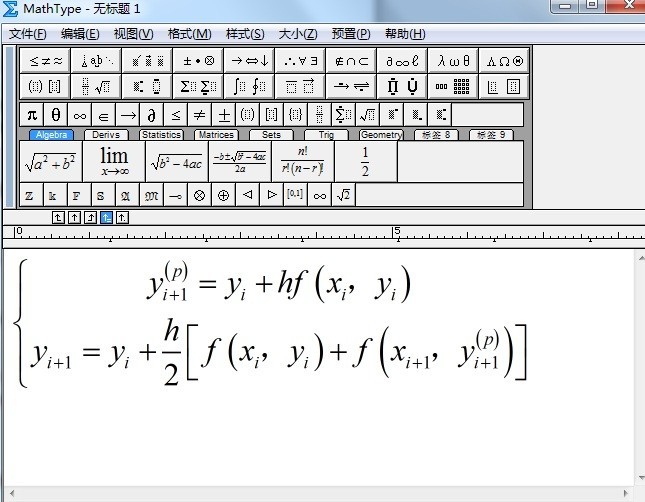
Article Introduction:1. First open the MathType software and use the formula template to edit. The written formula is as shown in the figure. During the writing process, the left half of the curly bracket template, upper and lower subscript templates, fraction templates, and square bracket templates will be used. 2. Then use the mouse to select two rows of formulas. At this time, the formulas are highlighted in blue. Click the [Format] menu in the upper menu bar and select the [Matrix]-[Change Matrix] option from its drop-down option. 3. After finally executing the above command, the matrix dialog box will open, as shown in the figure, select [Left] in the column alignment, and then click OK.
2024-04-23
comment 0
837

Detailed steps for designing business area charts with Edraw flow chart making software
Article Introduction:Open Edraw flow chart making software, select [New] - [Chart] - [Area Chart] - [Create] It is more complicated to draw an area chart from scratch without using templates or symbols, so you can start from scratch. In the symbol library on the left, select a suitable area chart template to help improve efficiency. Drag the mouse to the canvas to import the data. In the chart editing canvas, move the mouse close to the chart and a floating button will appear. Click the first item [Load data from file], and select the text you just edited, you can import it with one click. To make the chart look more beautiful, you can modify its color, select the color of the example, and [fill bar] at the bottom 】Select the color and replace it. After drawing, you can save it in the format you want.
2024-06-02
comment 0
687

How to match Excel table data to another table How to match Excel table data to another table
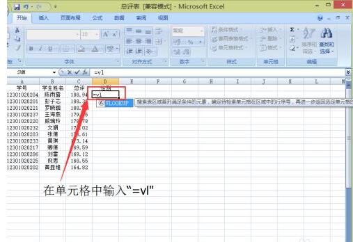
Article Introduction:Enter [=vl] in the cell. Click on the blue icon in the picture. The interface as shown in the figure appears. Click on the student name that matches the gender, then add a [,] after the data. In another table, select all data. Fill in the data appearing in Sheet1 in the overall evaluation table. Since the data that needs to be matched is in the second column of Sheet1, add [,2,] after the data (where [,] is a comma in English), and then click Enter. A row of gender matching is completed, as shown in the figure. Place the cursor in the lower right corner of the gender cell in the first row. When the plus sign appears, double-click the left button. This way all genders are matched, as shown in the picture.
2024-06-02
comment 0
512

Introduction to how to turn on airplane mode in Huawei mate10
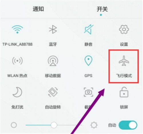
Article Introduction:Method 1: Turn on or off airplane mode through shortcut switches. Swipe down from the status bar to open the notification panel. On the notification panel interface, click Show more shortcut switches, click the airplane mode icon. When the icon lights up, airplane mode is turned on, and when the icon goes off, Turn off airplane mode. Method 2: Turn on or off airplane mode through settings. Open [Settings], click [Wireless & Networks], and turn on or off the [Airplane Mode] switch. After turning on airplane mode, the airplane mode icon will be displayed in the status bar. The phone will uniformly turn off wireless functions such as calls, data services, Bluetooth and WLAN. You will not be able to use calls and mobile data services, but you can manually turn on Bluetooth and WLAN functions.
2024-05-07
comment 0
952

Excel column chart visualization operation method
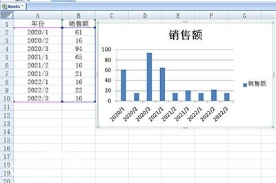
Article Introduction:First, let’s demonstrate the incorrect method of inserting a histogram. Just like the table below, directly select the table and then generate the histogram. The boss will definitely not understand such a picture and ask you to redo it. At this time, we only need to classify the data. Taking the table above as an example, here we separate the data from different years, such as staggering their data. Finally, use the histogram again, and then look at the data. Is it very intuitive? The histogram inside will be marked and displayed in different colors, which looks very comfortable.
2024-04-25
comment 0
474

How to turn on airplane mode on Huawei Honor v10
Article Introduction:1. Open the top shortcut menu. Swipe down on the home screen of your phone to bring up the top menu bar. In the notification panel interface, click the Show more shortcut switch and click the airplane mode icon. When the icon lights up, airplane mode is turned on. When the icon goes off, airplane mode is turned off. 2. Open [Settings] on your phone in settings, click [Wireless & Networks], and turn on or off the [Airplane Mode] switch. After turning on airplane mode, the phone will turn off wireless functions such as calls, data services, Bluetooth and WLAN. You will not be able to use calls and mobile data services, but you can manually turn on Bluetooth and WLAN functions. An airplane mode icon appears in the status bar.
2024-05-08
comment 0
346

PHP convert true color image to palette image
Article Introduction:This article will explain in detail how PHP converts true color images into palette images. I think it is quite practical, so I share it with you as a reference. I hope you can gain something after reading this article. PHP Convert True Color Image to Palette Image In computer graphics, true color images store the complete color information of each pixel, using 24-bit or 32-bit representation. Palette images use a palette in which a limited number of colors are stored, with the index of each pixel corresponding to the color in the palette. Converting a truecolor image to a palette image requires the following steps: 1. Create a palette First, you need to create a palette that contains the collection of colors to be used for the palette image. The number of colors should be less than or equal to 256 (8-bit mode). 2
2024-03-21
comment 0
653

Deep Blue Automobile announced that the total delivery volume of Deep Blue S7 exceeded 10,000 units!
Article Introduction:According to the official Weibo of Deep Blue Automobile, the total delivery volume of Deep Blue S7 new energy models has successfully exceeded 10,000 units, with the exact number being 10,239 units. The achievement of this milestone marks that the Deep Blue S7 has become the fastest new energy model to exceed 10,000 deliveries after its launch. Deep Blue Auto CEO Deng Chenghao also expressed joyfully on his personal Weibo that he was deeply excited about this achievement of Deep Blue S7. According to data previously announced by Deep Blue Auto, since the delivery started on June 30, the cumulative delivery volume of Deep Blue S7 has reached 9197 units. Since August, the new delivery volume of this model has exceeded 800 units, which shows that the sales momentum of Deep Blue S7 is still strong. Deep Blue S7 is the second model launched by Deep Blue Motors. It not only received widespread attention in the early stage of its launch, but also Excellent performance in the market.
2023-08-10
comment 0
1006

How to beautify an Excel table_A few simple steps to make the table look great and your boss will like it
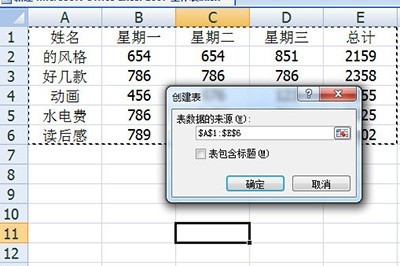
Article Introduction:1. We first press the shortcut key CTRT+T on the keyboard to create a table using the template that comes with Excel, and select the table. Remember to check Include table title. After clicking OK, our form will be beautified. 2. Then notice the total column, we can select it, then click [Click Format] - [Data Table] to choose a striking data bar color. Then select the sorting method as descending order, so that our data statistics will be displayed clearly. 3. Finally, we select the table and press the shortcut key ALT+F1 to quickly generate a statistical chart, which is very simple.
2024-06-04
comment 0
314

How to create a blank database in access2010_How to create a blank database in access2010
Article Introduction:Step 1: Double-click the Access2010 icon on the desktop to enter the background. Step 2: After entering the page, pay attention to the lower right corner of the page. You can modify the database name and storage location. Step 3: After the modification is completed, click Create. Step 4: At this time the database Created successfully, enter the fifth step of table creation: If you find it troublesome, you can use the online template shown on the page, provided that the computer must be connected to the Internet
2024-06-09
comment 0
304

How to operate MathType alignment formulas
Article Introduction:Open the MathType software and use the formula template to edit. The written formula is as shown in the figure. During the writing process, the left half of the curly bracket template, upper and lower subscript templates, fraction templates and square bracket templates will be used. The writing process must be done step by step. Skipping a template will lead to writing errors. Because the formula is written with the help of a matrix template, it can be adjusted by adjusting the matrix alignment. Use the mouse to select two rows of formulas. At this time, the formulas are highlighted in blue. Click the [Format] menu in the upper menu bar and select the [Matrix]-[Change Matrix] option from its drop-down option, as shown in the figure. After executing the above command, the matrix dialog box will open, as shown in the figure, select [Left] in the column alignment, and then click OK. After doing the above, the curly braces
2024-04-16
comment 0
1163

Introduction to how to enable eye protection mode in Huawei mate10
Article Introduction:Method 1: Quickly turn on or off eye protection mode, swipe down from the status bar to open the notification panel. In the notification panel interface, expand the shortcut switch bar and click the Eye Protection Mode icon to turn it on. Method 2: First open [Settings], click [Display]; [Eye Protection Mode], and then turn on the switch on the right side of the eye protection mode. After the eye protection mode is turned on, part of the blue light is filtered out, so the screen display color will be yellowish. ② You can also turn on the eye protection mode regularly, turn on the eye protection mode timing switch, and set the start time and end time of the eye protection mode as needed. The phone will turn on the eye protection mode regularly every day according to the time period you set. ③After turning on the eye protection mode switch, you can slide the color temperature slider left or right to adjust the color temperature to make the screen color temperature cooler or warmer.
2024-05-07
comment 0
999


How to display the percentage on the pie chart in spss Tutorial on how to display the percentage on the pie chart in spss
Article Introduction:First we import the data into SPSS software (as shown in the figure). Then we click [Graphics], select [Old Dialog Box (L)], and click [Pie Chart] (as shown in the picture). Then we put [Gender] in [Definition Partition], and in [Title] we can name the graphic. Click [OK] (as shown in the picture). Next, we will find from the results: [Male] represents the blue area, and [Female] represents the green area. But there is no specific proportion, so the picture needs to be processed (as shown in the picture). Then we right-click on the result graph, click [Edit Content], and select [In a separate window] (as shown in the picture). We right-click and select [Show Data Labels] (as shown in the figure). Then select [Percentage], and other parameters can also be adjusted.
2024-06-04
comment 0
1070

Python Django Project Case Study: From Concept to Release
Article Introduction:The project goal is to create a fully functional e-commerce platform that allows users to browse, search and purchase products. The platform should feature user registration, shopping cart management, and secure payment processing. Technology stack python3DjangoFrameworkMysql database html/CSS template Stripe payment gateway design and development 1. Database design Designed a relational database, which contains the following tables: User table: stores user information Product table: stores product details Order table: stores order information order item table : Store the details of the products in the order 2. Model creation A model corresponding to the database table was created using DjanGoORM. These models define the fields, validation, and behavior of the data. 3. View function compilation
2024-03-27
comment 0
683

What technologies does the vue framework include?
Article Introduction:The main technologies included in the Vue.js framework include: core technology: responsive system, component system, virtual DOM view layer technology: template engine, transition and animation data management technology: state management, data binding, form processing routing technology: Vue Router Other technologies: ecosystem, cross-platform support
2024-04-02
comment 0
636

What are the application examples of template programming in different fields?
Article Introduction:Templated programming is a paradigm for creating flexible, reusable code that is widely used in areas such as data structures, container libraries, metaprogramming, and graphics libraries. Specific examples include dynamic arrays, hash tables, priority queues, type erasure, and vertex shaders.
2024-05-08
comment 0
802
