Column chart in Excel is a common way to visualize data, but some people may not be familiar with its operation method. This time, PHP editor Banana will explain in detail the steps to create an Excel column chart, from constructing data to chart formatting. He will guide you step by step to easily create beautiful column charts and help you display data information more effectively. Welcome to continue. Read the following article for detailed instructions.
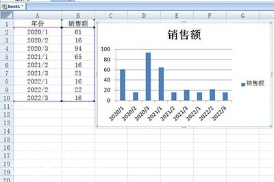
First demonstrate the wrong method of inserting a histogram. Just like the table below, directly select the table and then generate the histogram. The boss will definitely not understand such a picture and ask you to redo it.

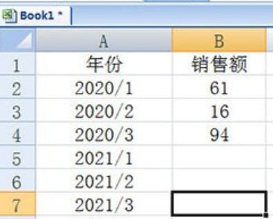
At this time we only need to classify the data. Taking the above table as an example, here we separate the data of different years, such as staggering their data. open.

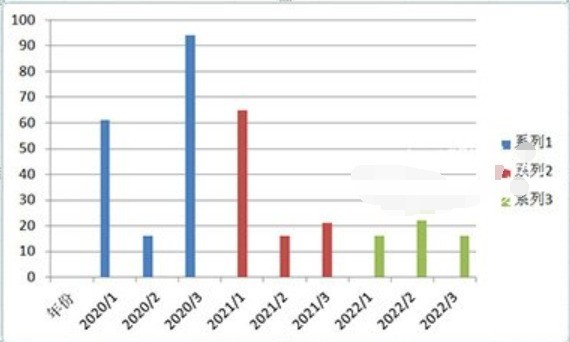
Finally use the histogram again, and then you look at the data. Is it very intuitive? The histogram inside will be marked and displayed in different colors, which looks very Comfortable.

The above is the detailed content of Excel column chart visualization operation method. For more information, please follow other related articles on the PHP Chinese website!


